An inviting brand for
London’s top place makers
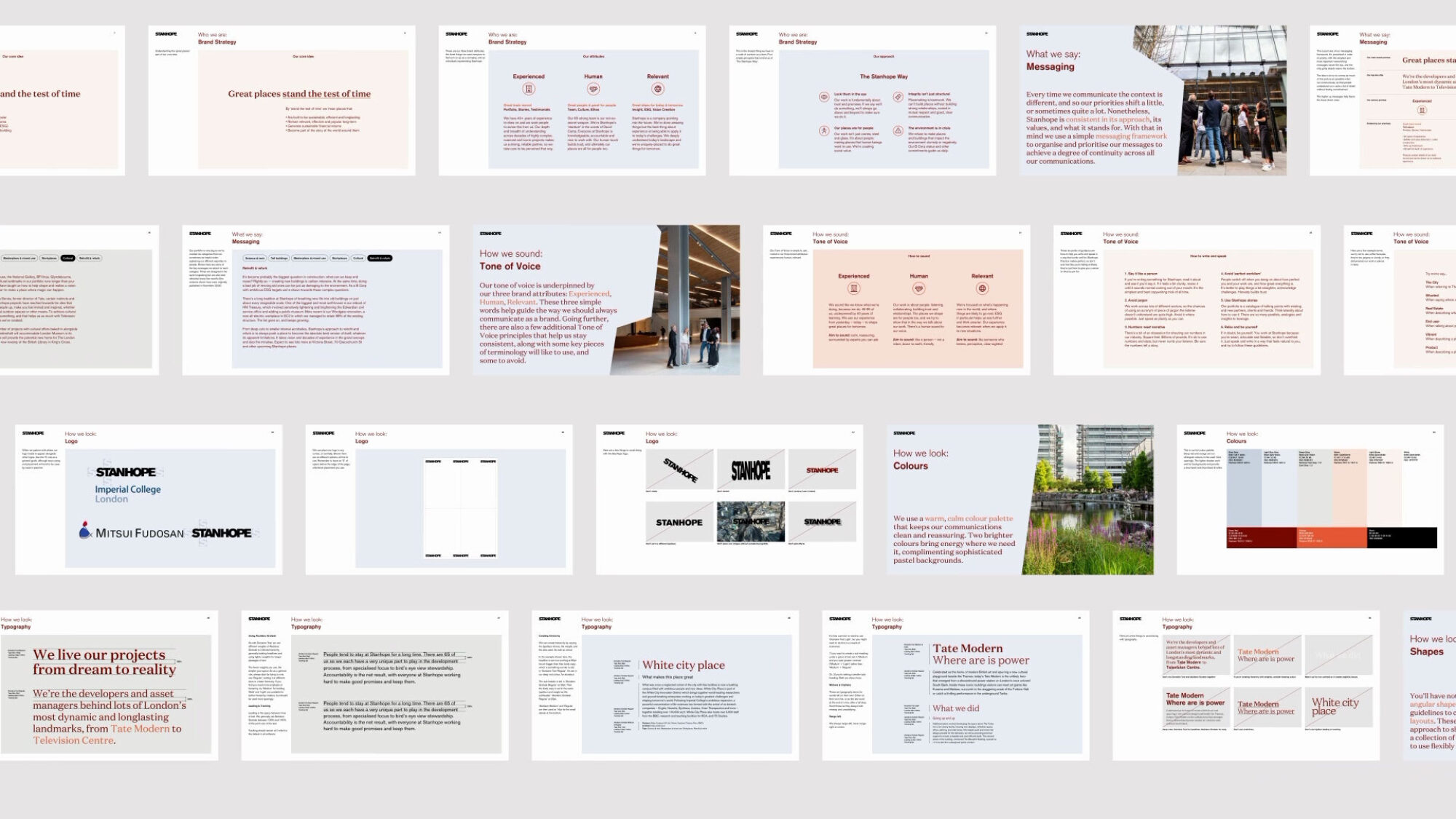
Stanhope have built one of the most respected names in the business of place making, from Tate Modern to Television Centre. But such a strong position can make you seem out of reach. Forty years in, Stanhope needed to feel a bit more inviting, without losing poise.
Great places stand
the test of time
We wanted to help Stanhope capitalise on their longstanding position in business, plus the fact that their places endure. These seven words clarify the purpose of the business, tying into other talking points such as Stanhope’s mature team and sustainable place management.
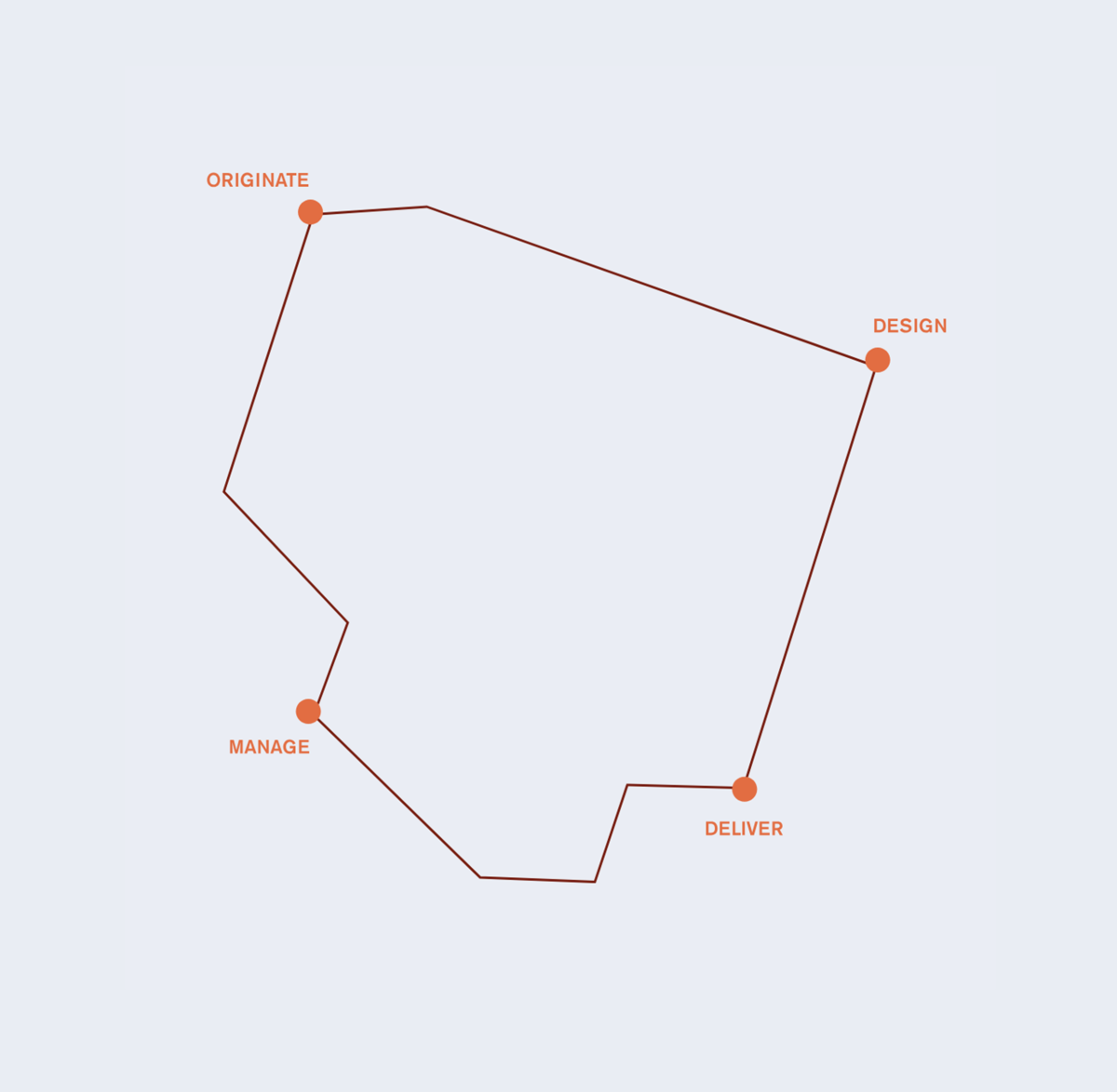
Beyond the core positioning statement we helped Stanhope identify three, easy to remember, one-word attributes to help teams think and communicate consistently. We used these to set out a key messaging framework for sales, bringing hierarchy to talking points.
Oh, High
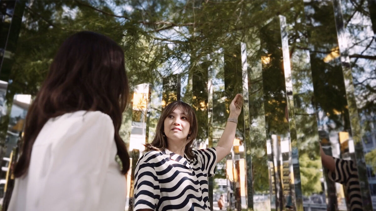
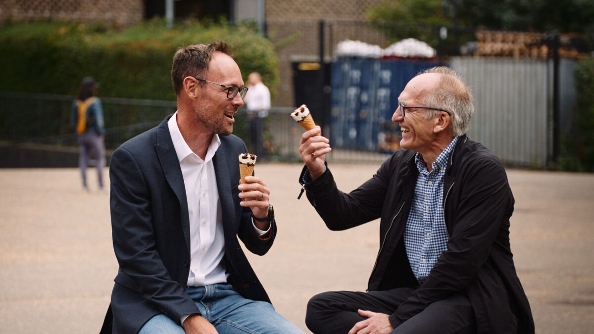
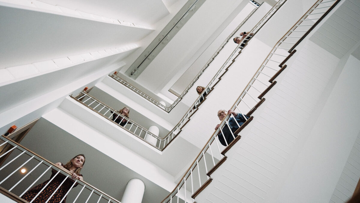
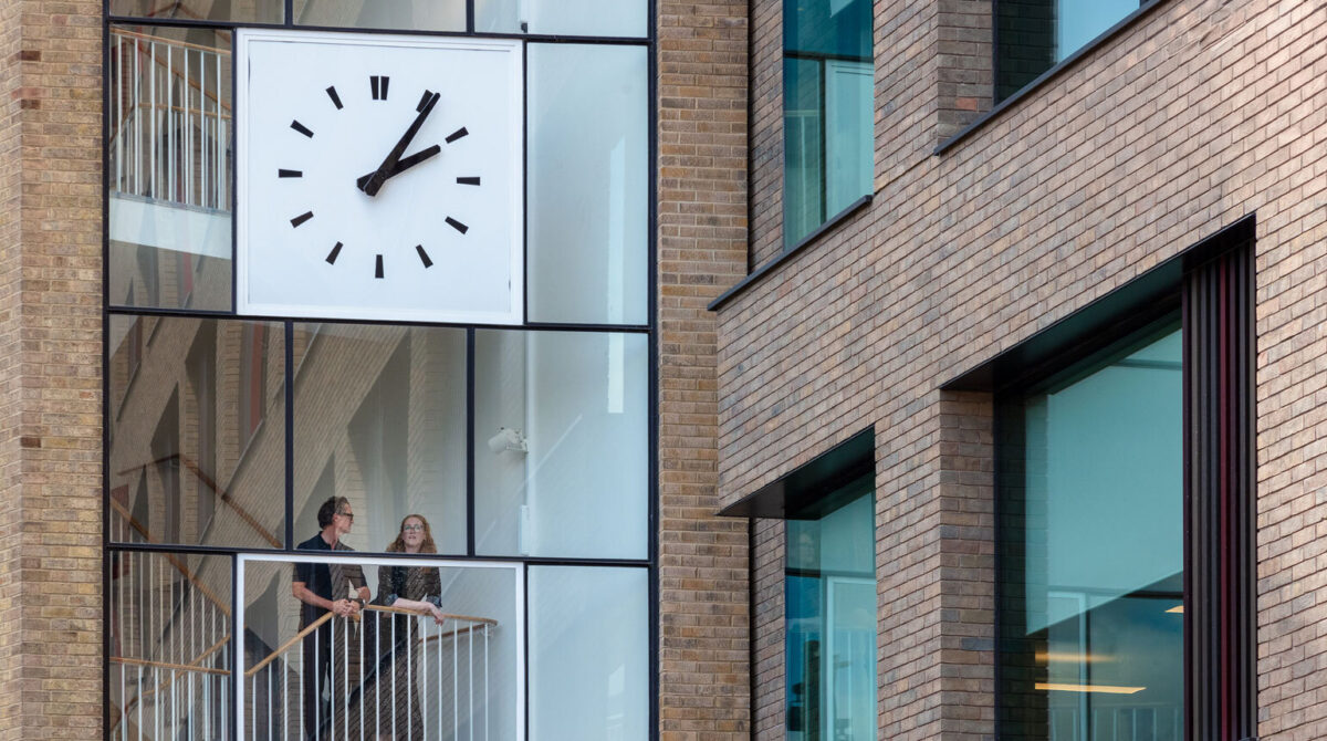
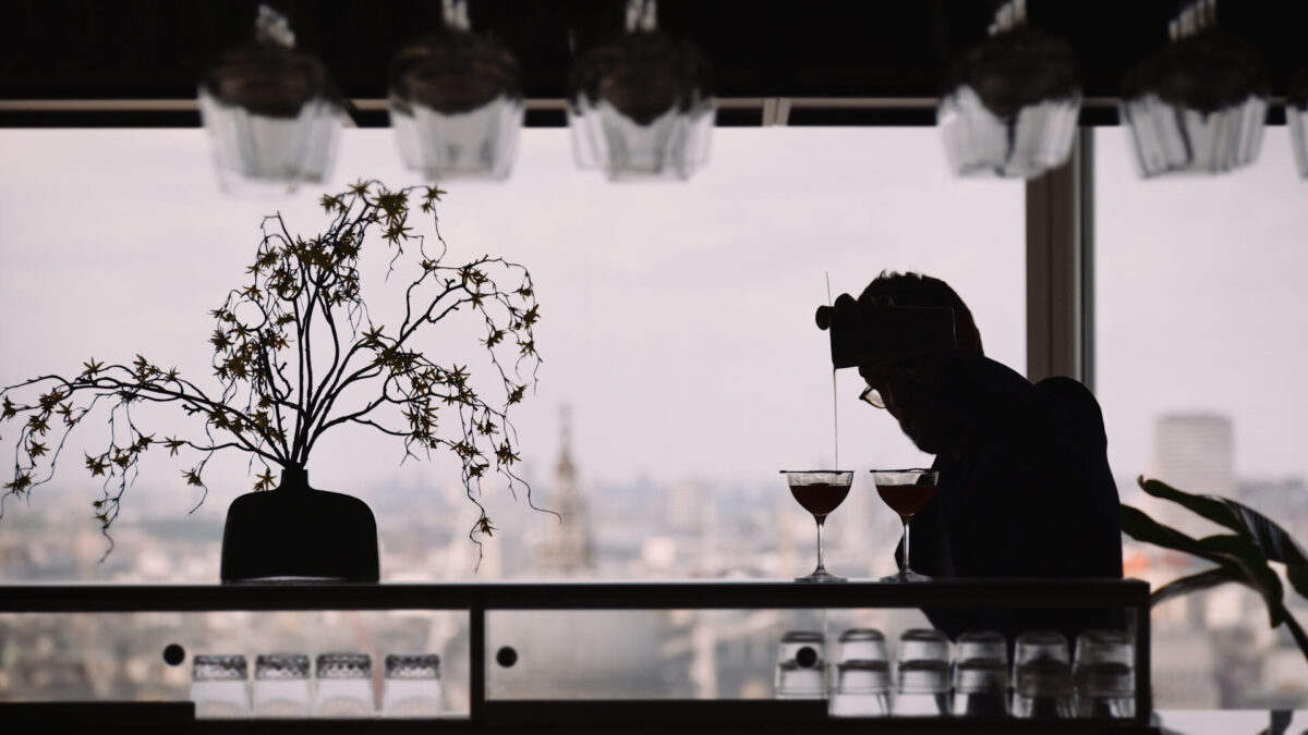
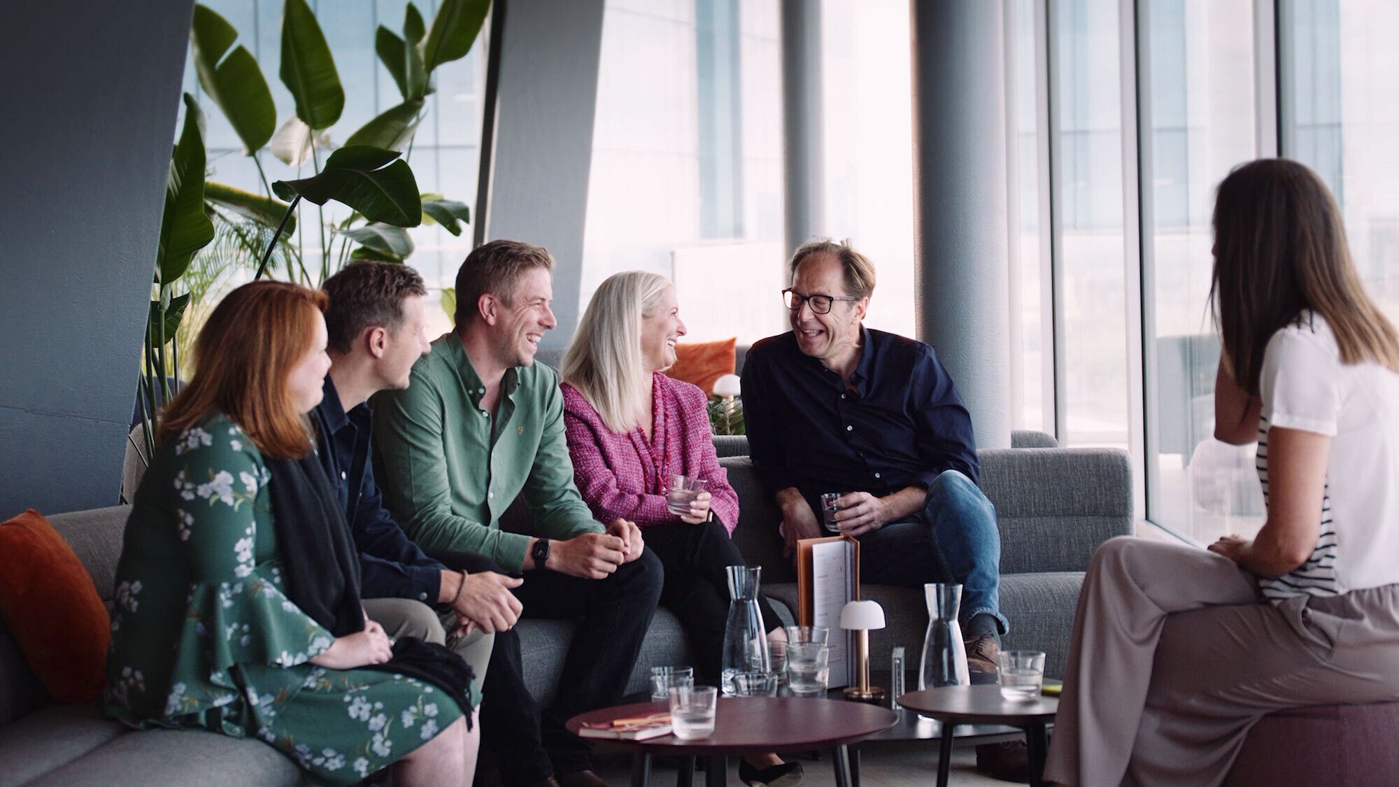
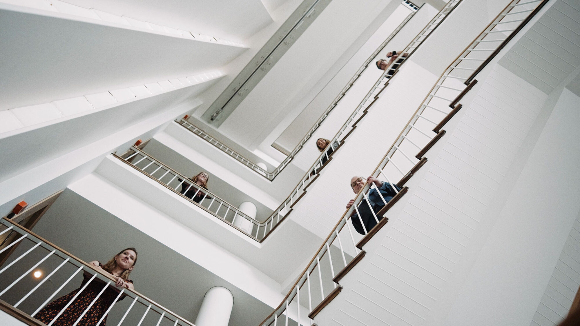
Without taking away from Stanhope’s towering portfolio of buildings and places, we needed to build up the firm’s human side. So we shot teammates exploring Stanhope classics like Television Centre, relaxed and proud of their work. Better than team headshots alone.


A Visual Refresh
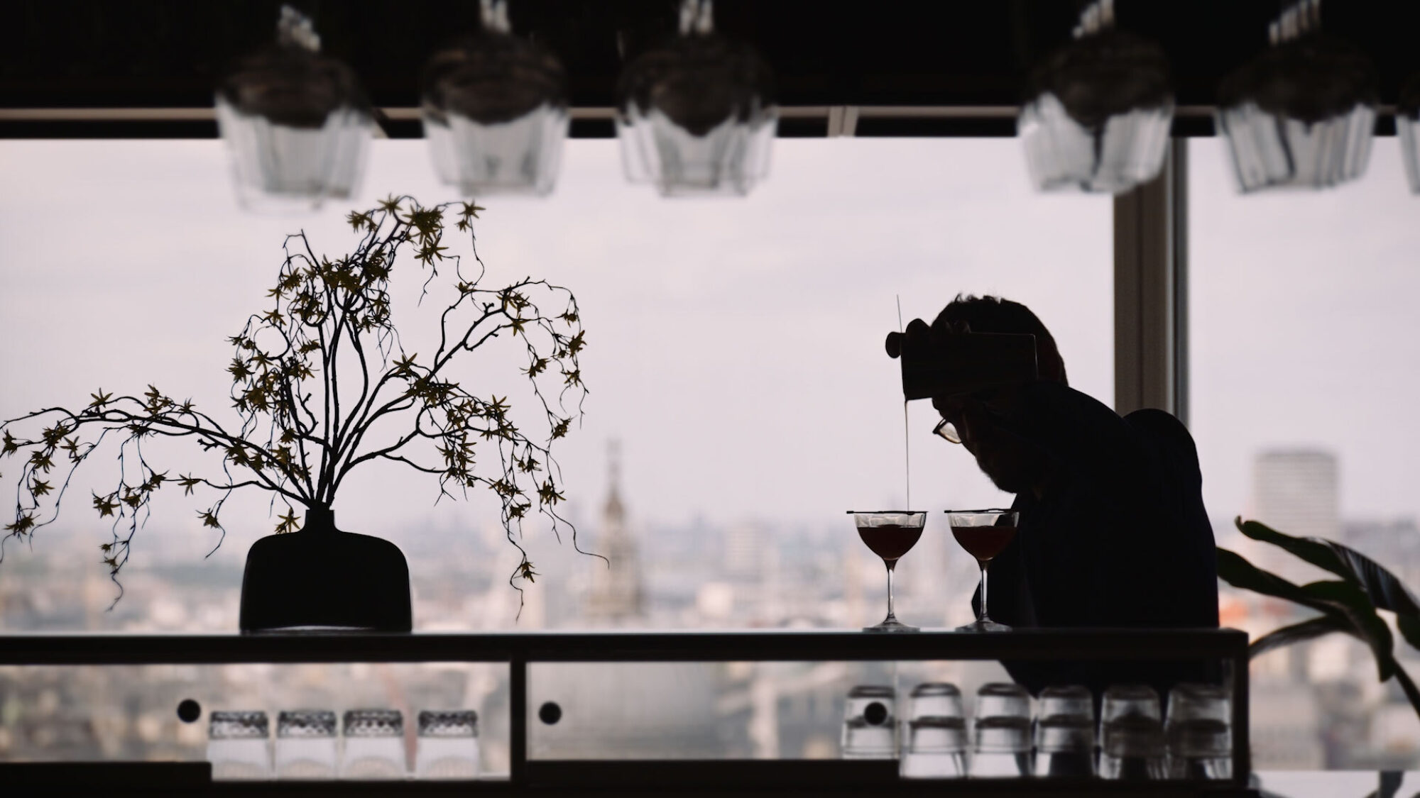
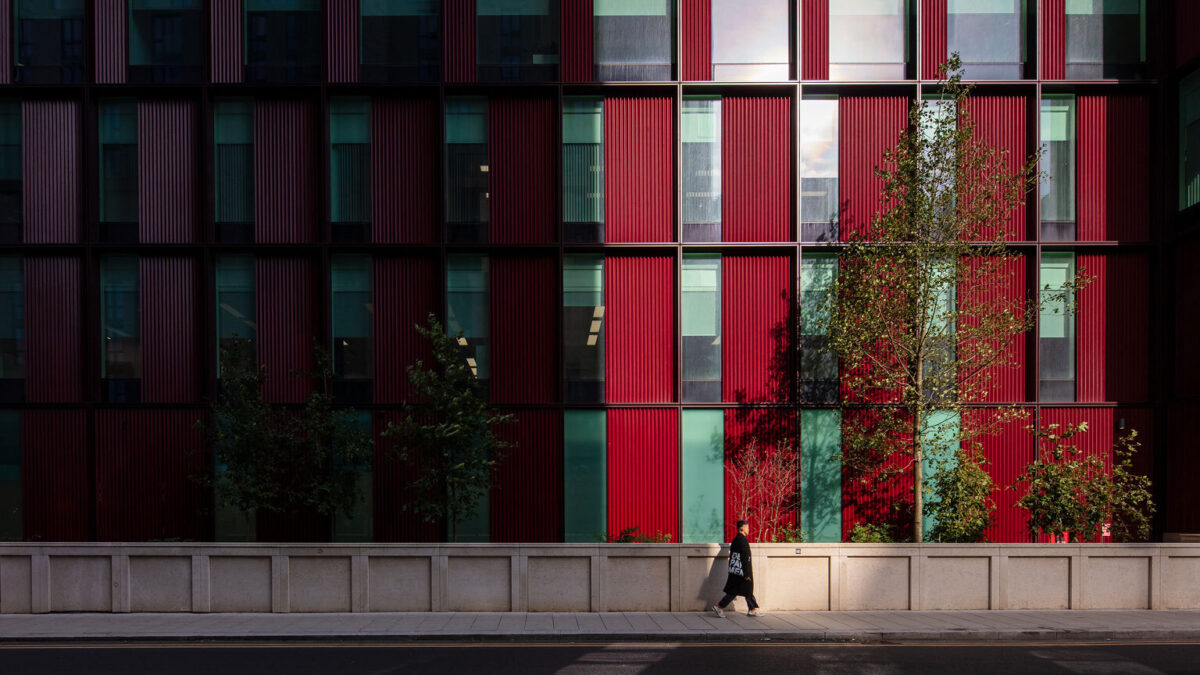
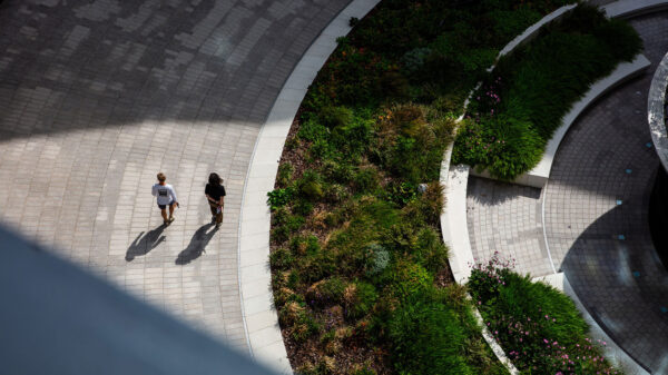
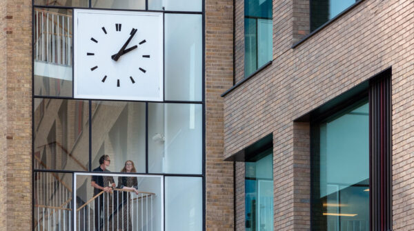
We pivoted Stanhope’s look and feel away from primary colours and stark black & white, adding subtle shades of stone and glass, with warm burgundy and optimistic orange. A dynamic new ‘viewfinder’ device crops images and suggests an endless energy for new angles and ideas.

“I love Lovers. We’ve been in business for 40 years, so putting our brand in the hands of new people is always a little bit daunting. They’ve been incredibly wise, kind and hardworking. We’re in a much stronger position thanks to their help.”

Places, Not
Property


Strong
Foundations