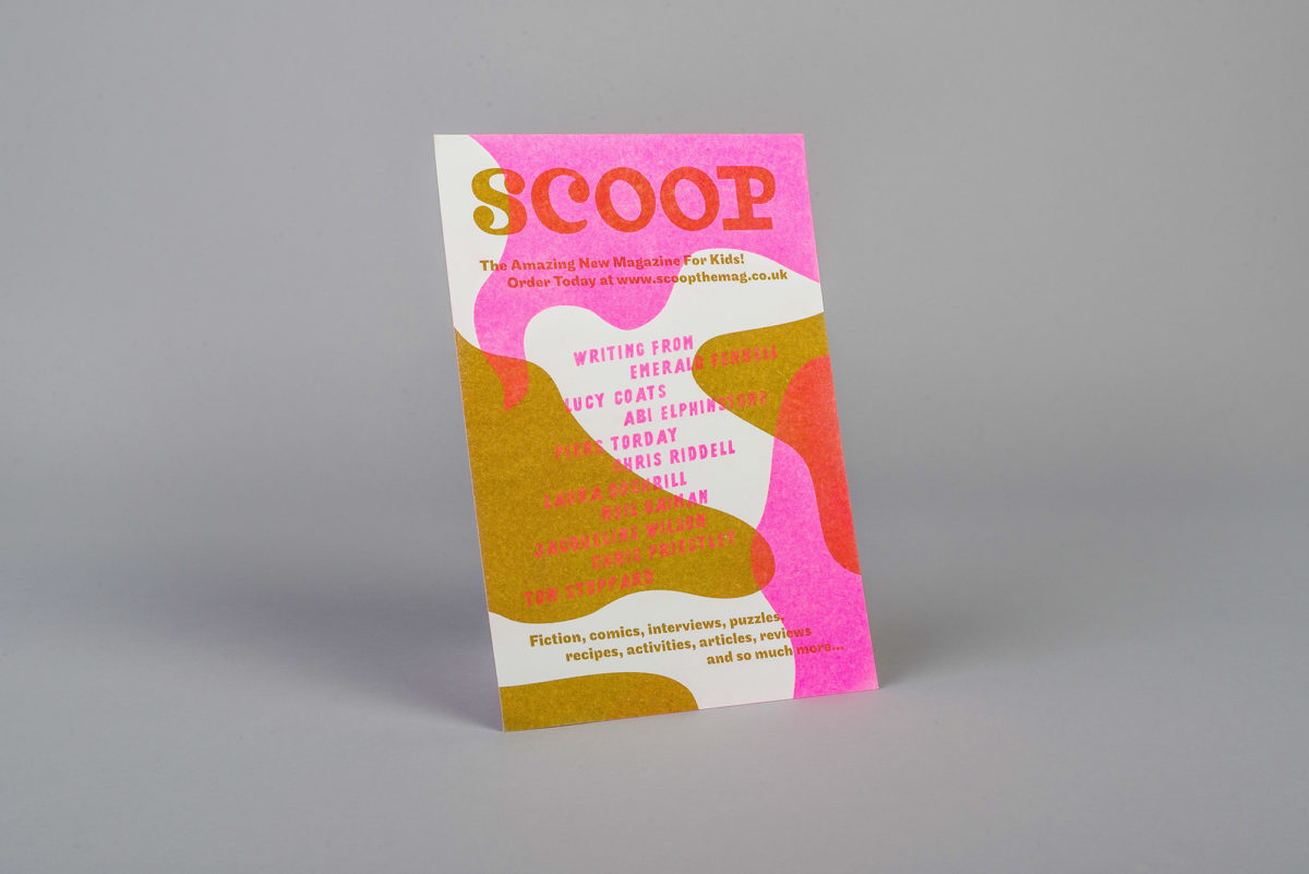
A beautiful mag
to get kids reading
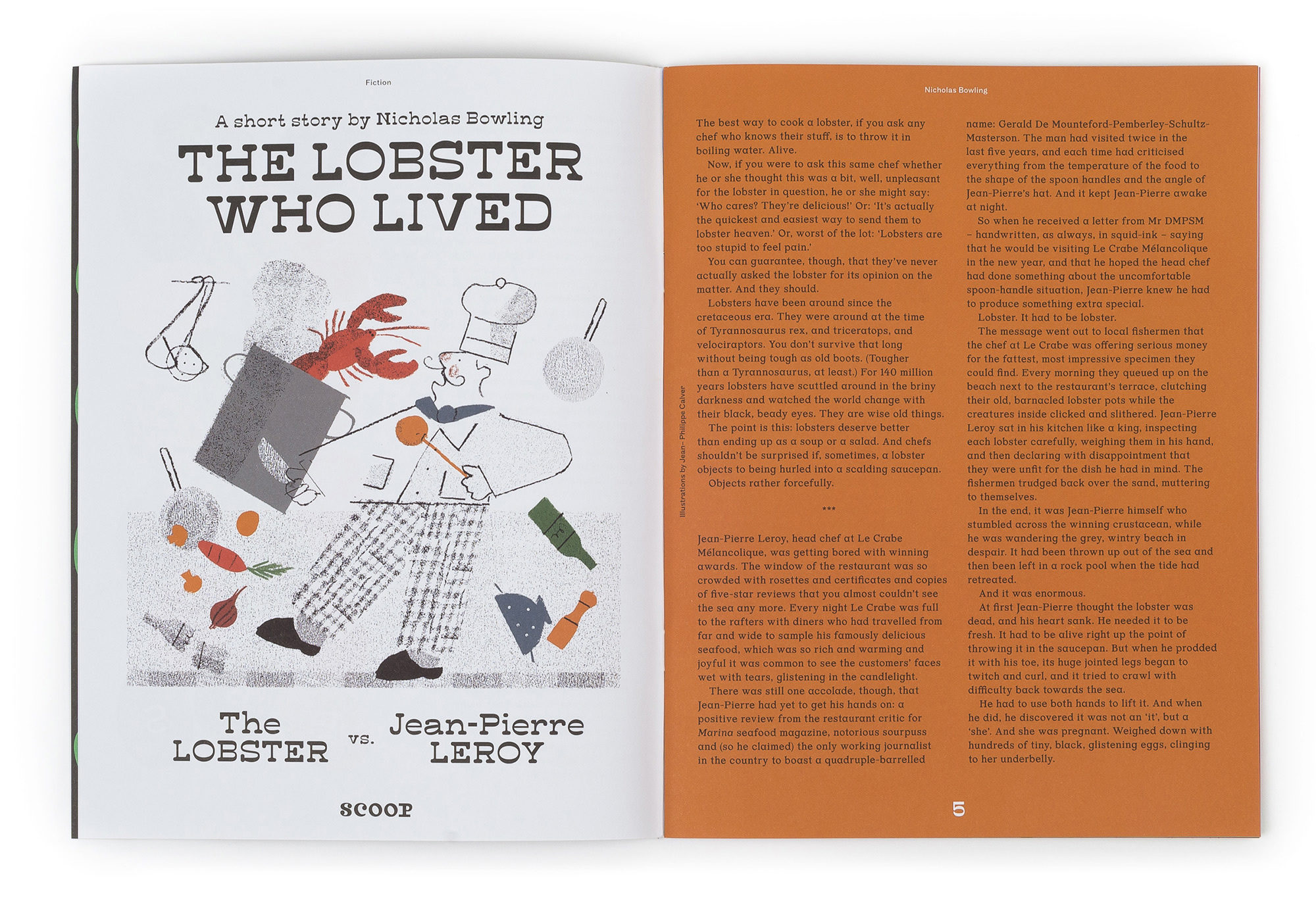
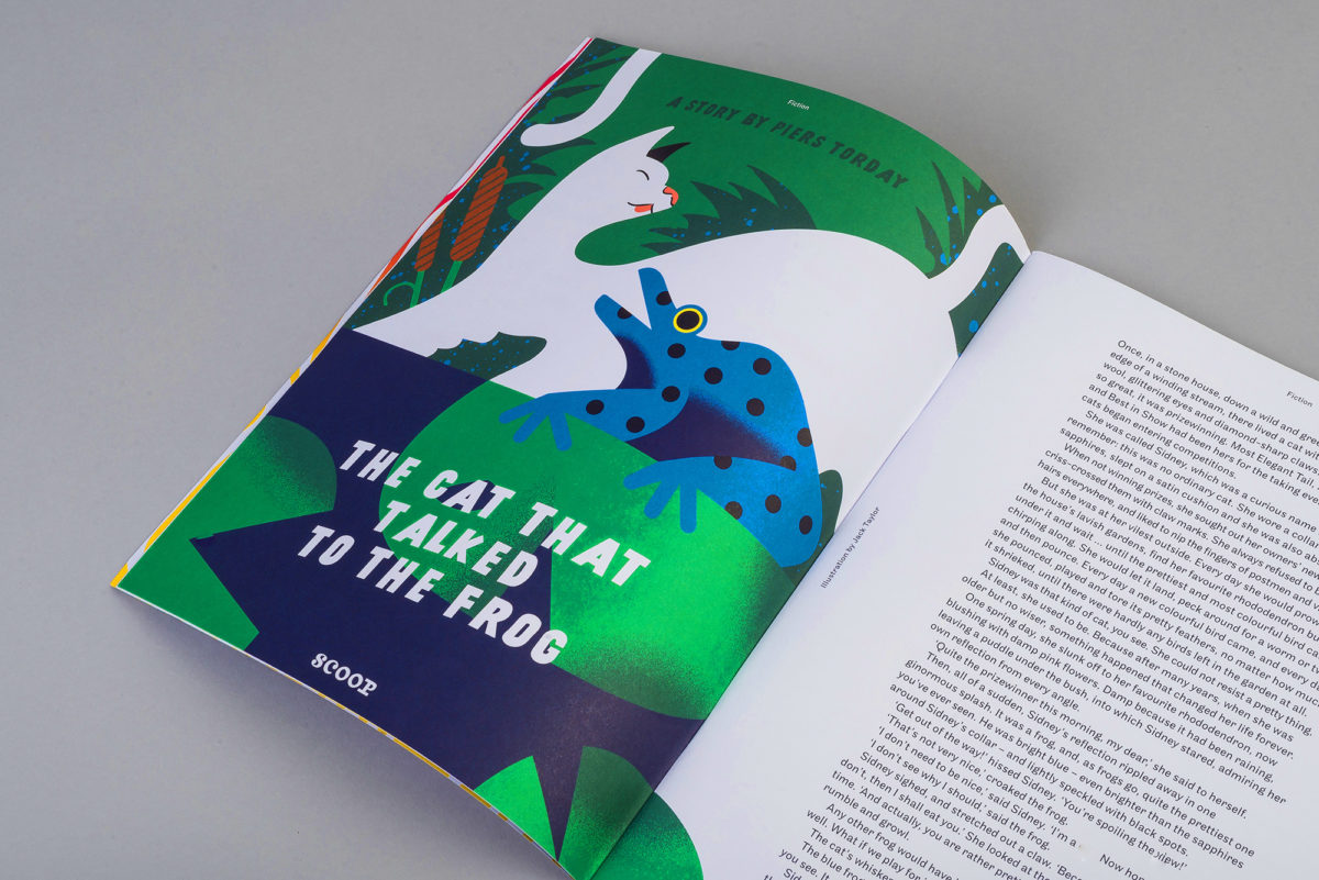
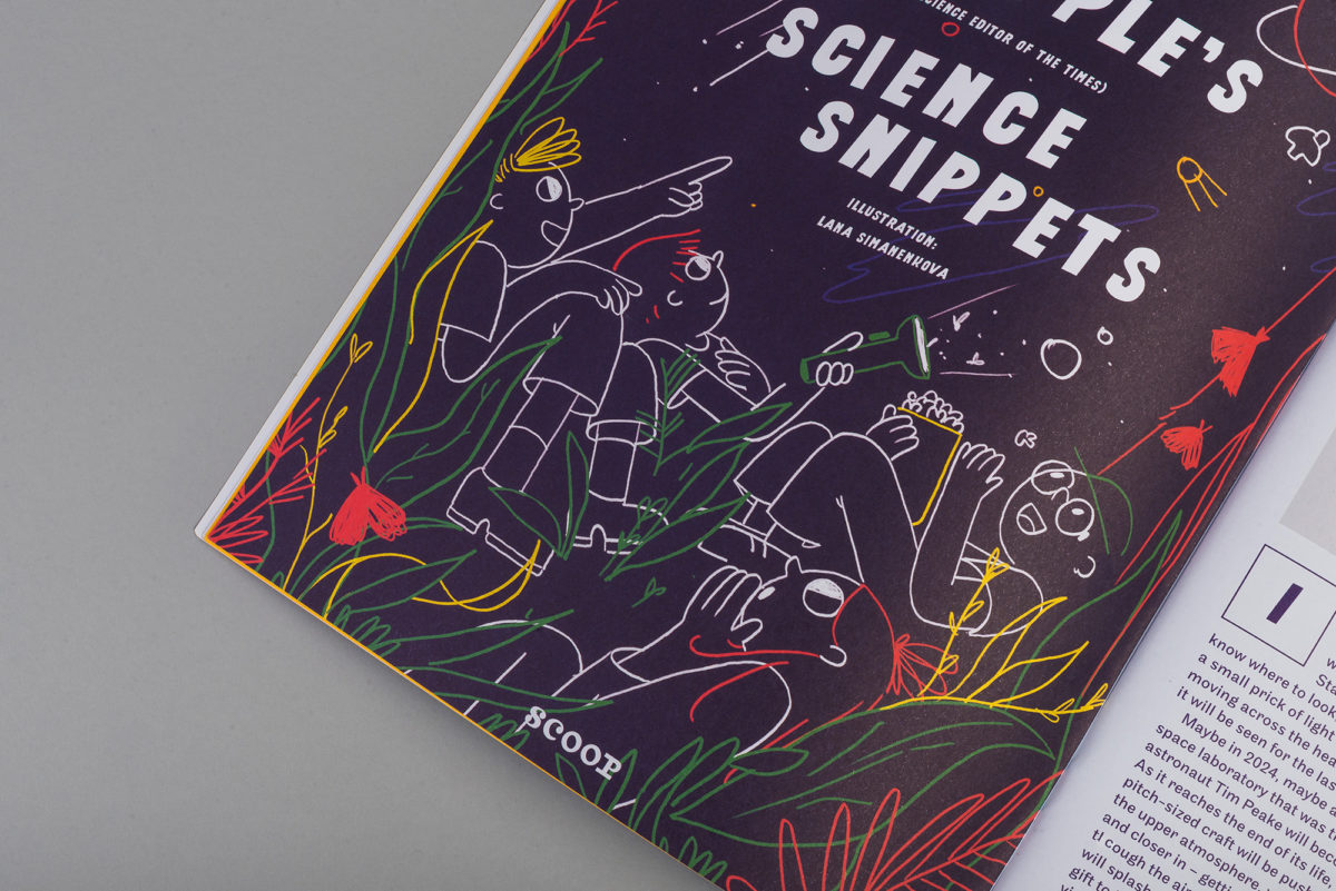
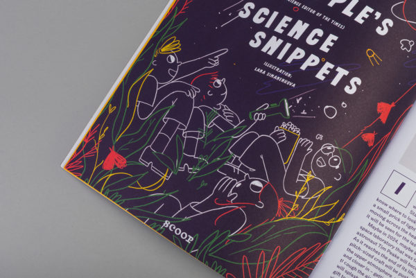
Scoop is a monthly magazine on a mission to inspire a love of reading and stories in youngsters 8 and up. We had the pleasure of designing it from scratch and helping to establish an editorial approach powered by big, beautiful, engaging illustrations.
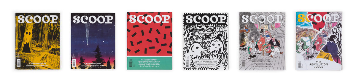
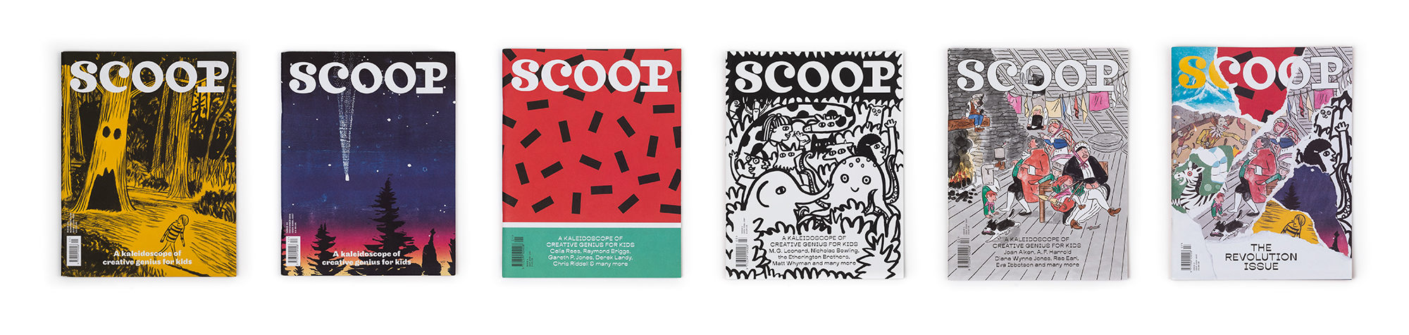
From the get go, Scoop need to be something bright, bold and beautiful, taking great stories, games and articles and zinging them to life for little readers (and their parents). We designed an identity that would bring the magazine the longevity it deserves.


How Curious
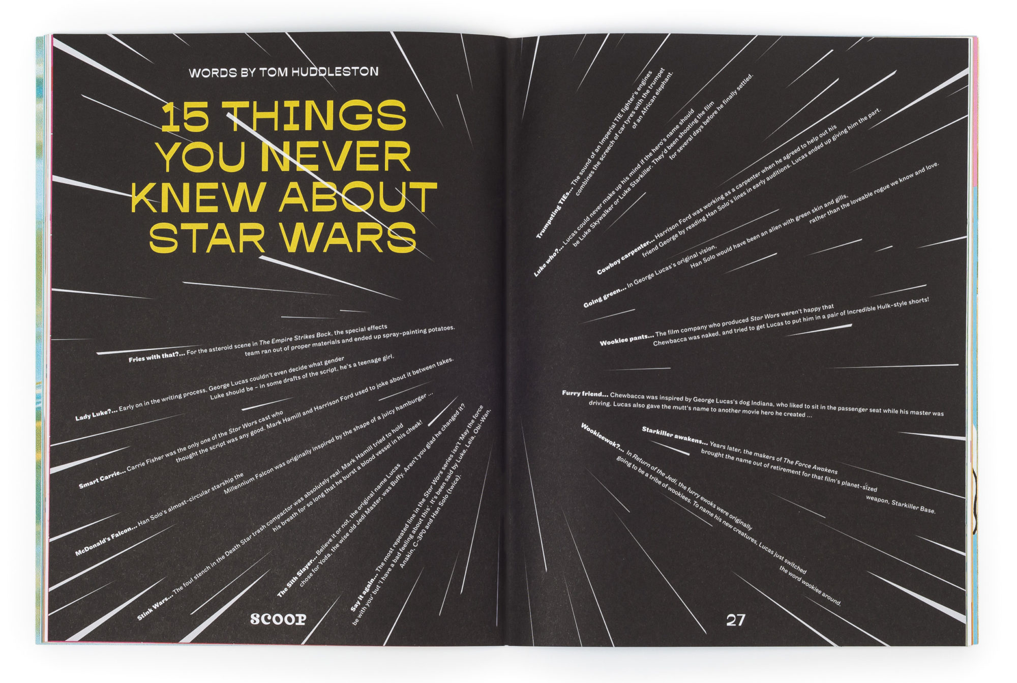
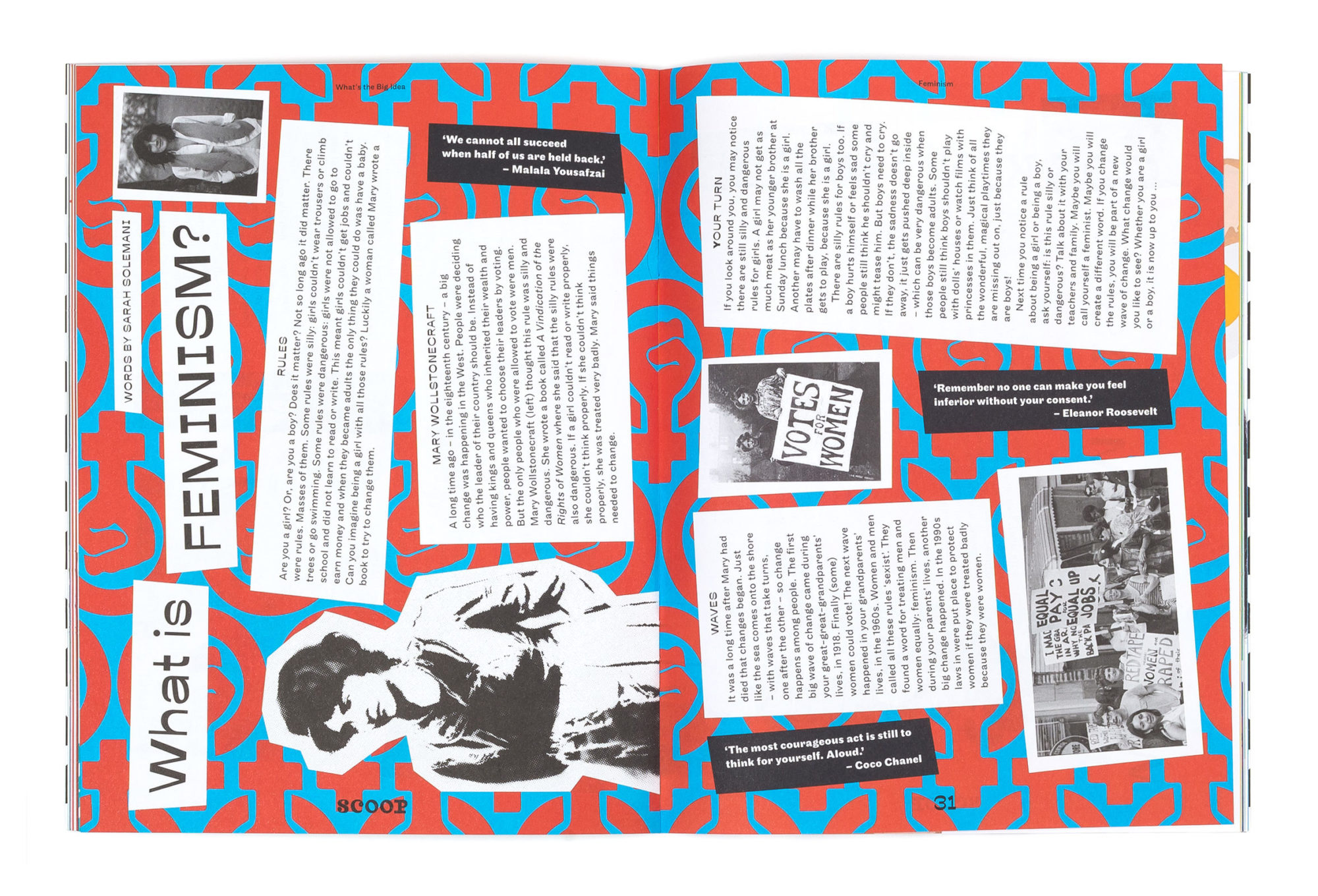
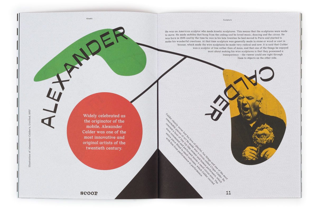
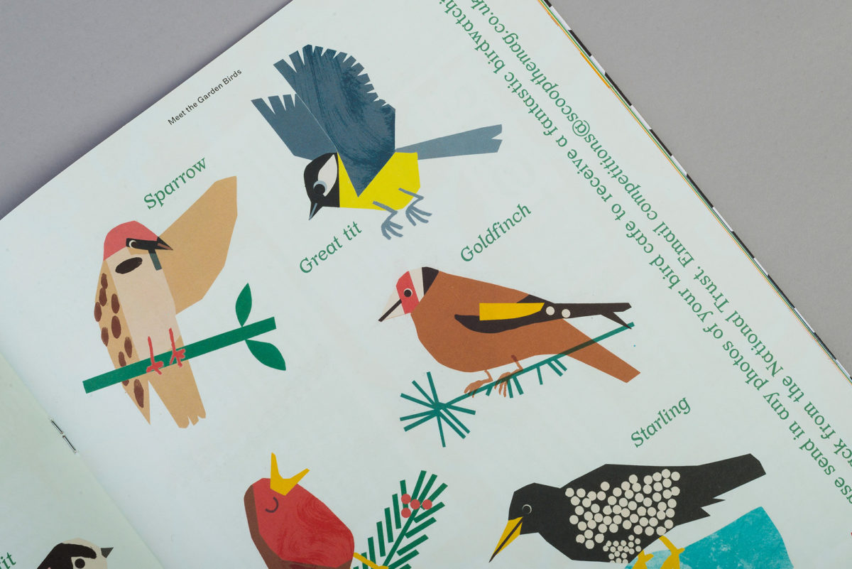
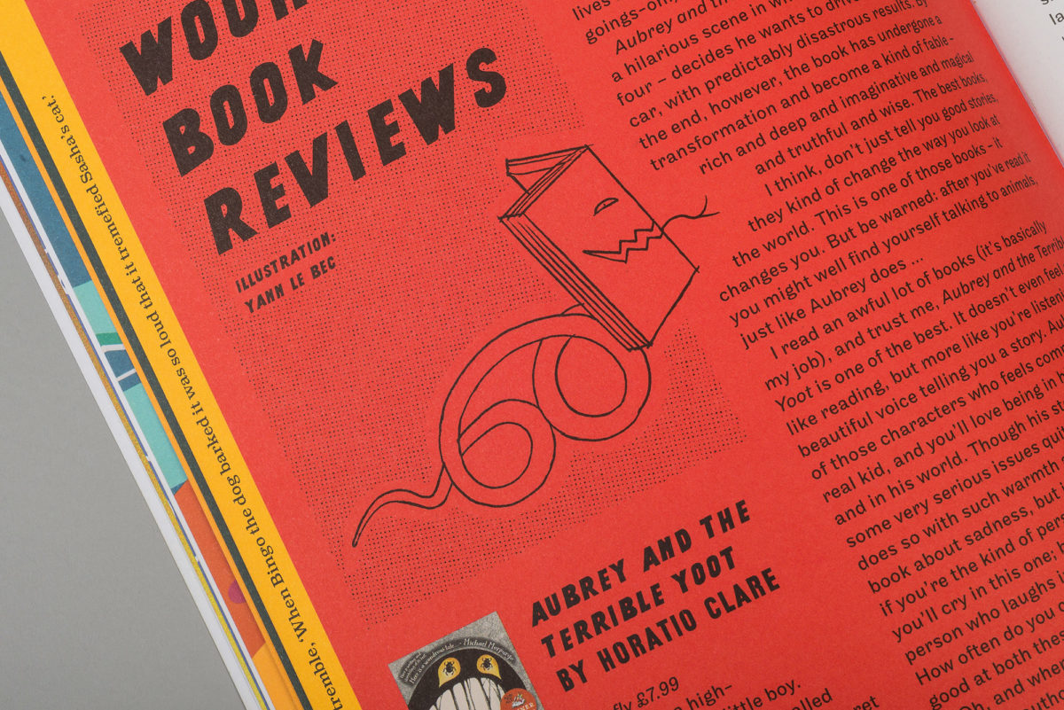
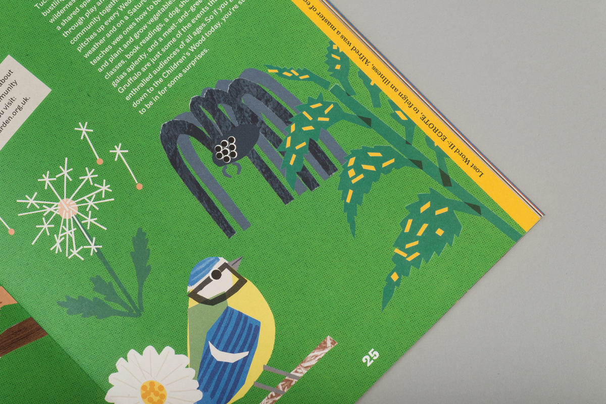
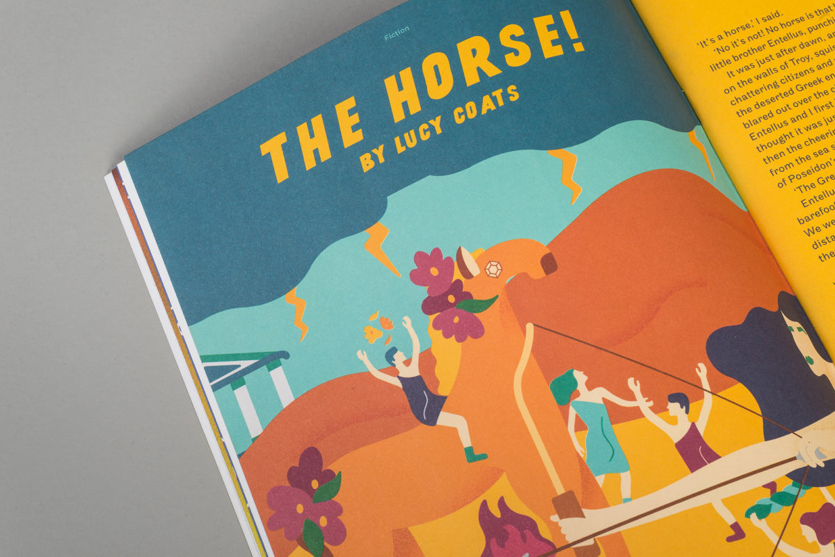
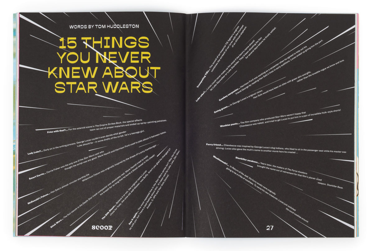
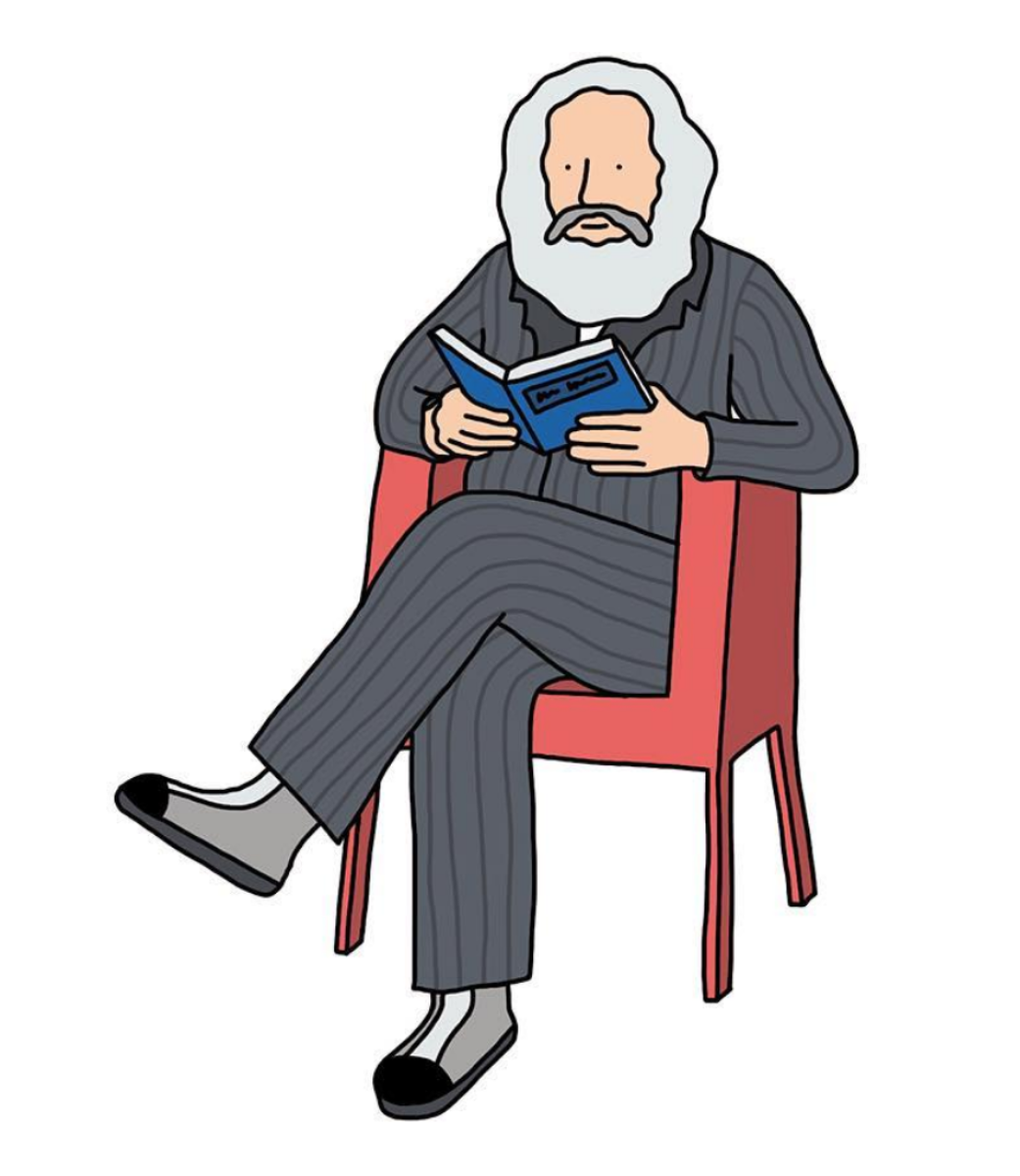
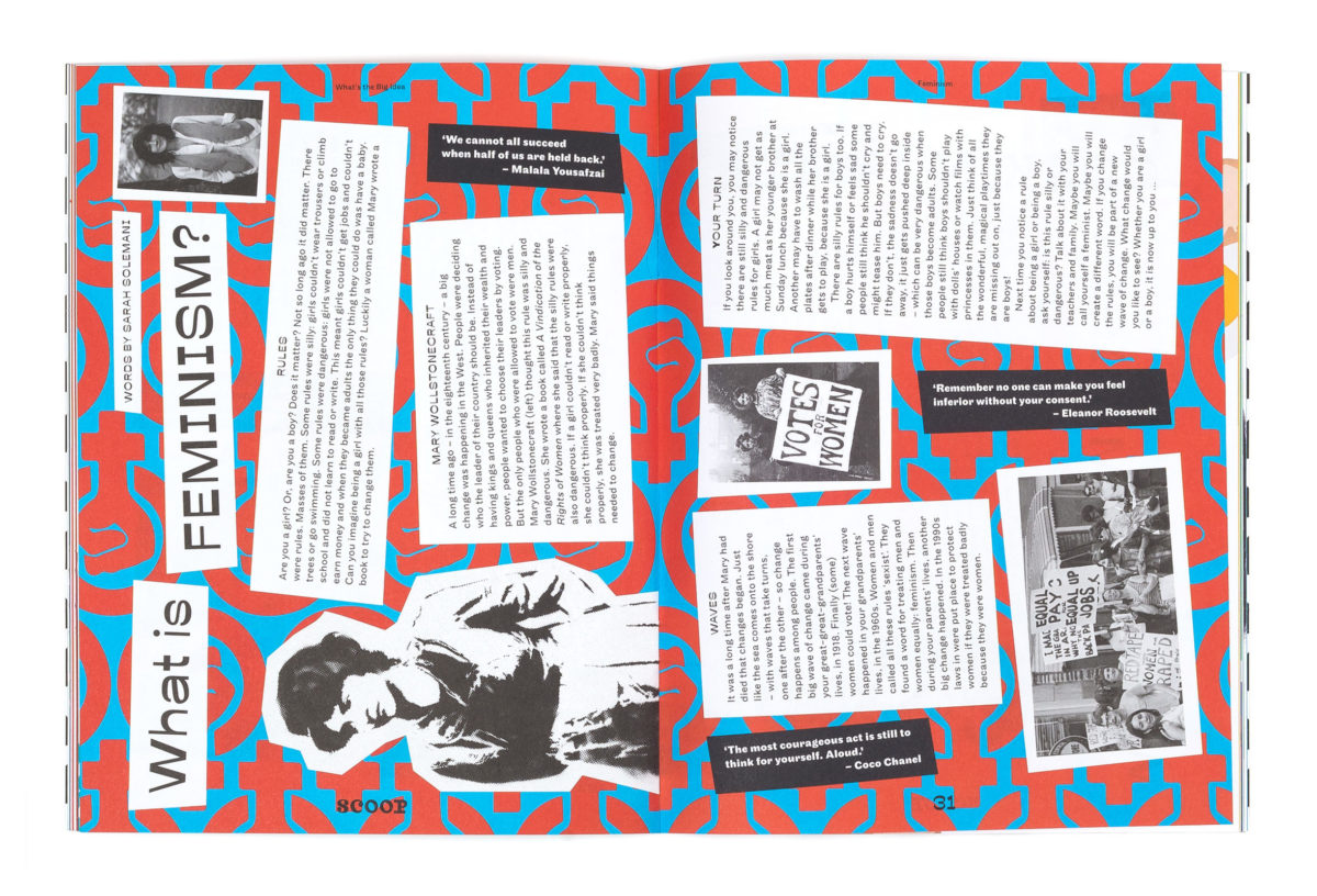
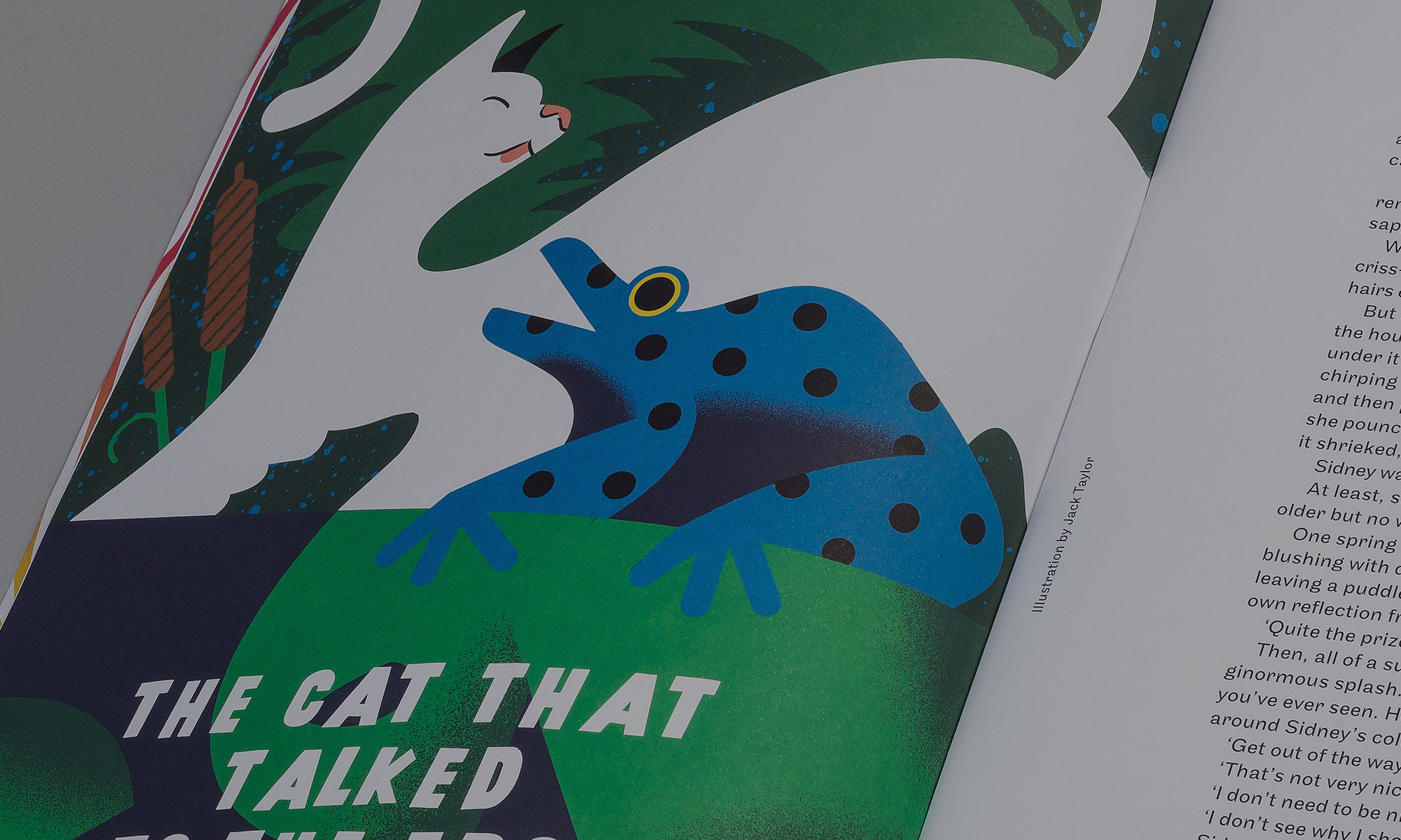
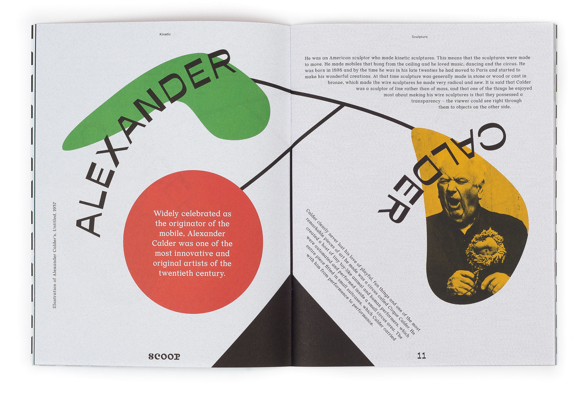
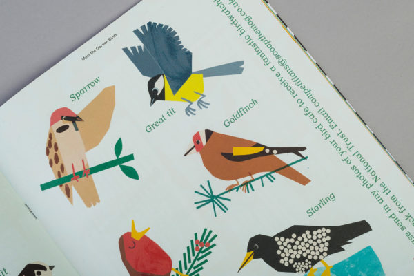
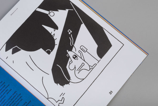
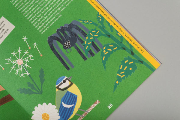
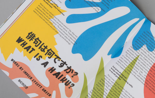
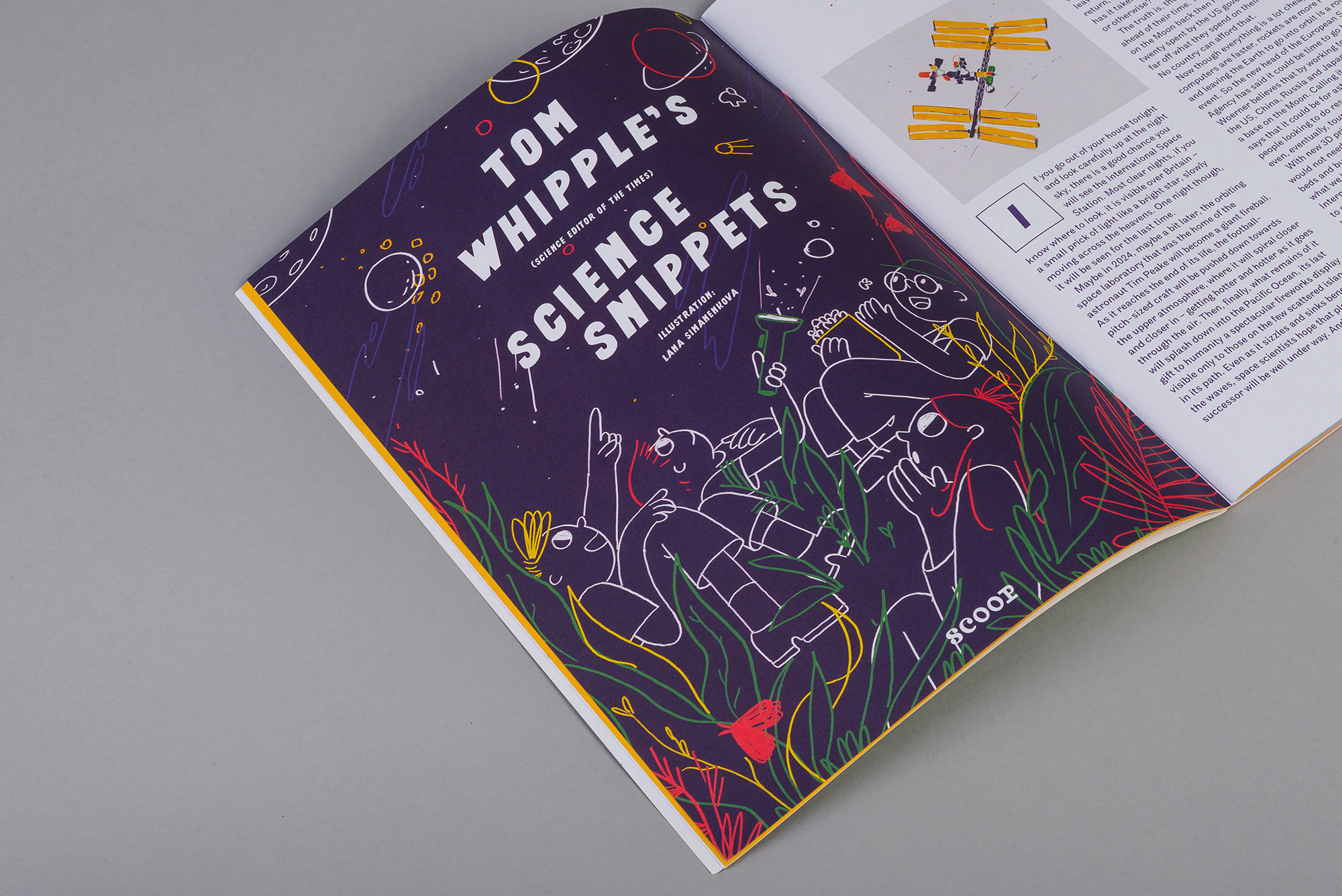
Scoop’s entire design approach is driven by the mission to get kids inspired and wanting to read. To achieve that we made sure layouts never get boring, with tons of flexibility per issue. Illustration helps bring each spread to life, setting a look for designers to uphold.


Consistently Flexible
Part of the secret of Scoop’s success has been its ability to stay flexible over issues without losing its signature look. Typefaces and layouts have evolved whilst always retaining a distinctive ‘Scoopyness’ that readers always recognise easily.