Making complex data
easier to understand

Tony Seba and Jamie Arbib co-authored ‘Rethinking Humanity’, a pioneering piece of thought leadership on the future of our civilisation. Their immediate challenge was communicating and compressing Rethinking Humanity into digestible visual aids, models and charts.
Lovers were invited to help Tony and Jamie distill their 80 page book into a tiered messaging framework, enabling them to tell their story concisely around the world in different contexts. We focused on using the right words, alongside a toolkit of supporting visuals.
Visualising Ideas
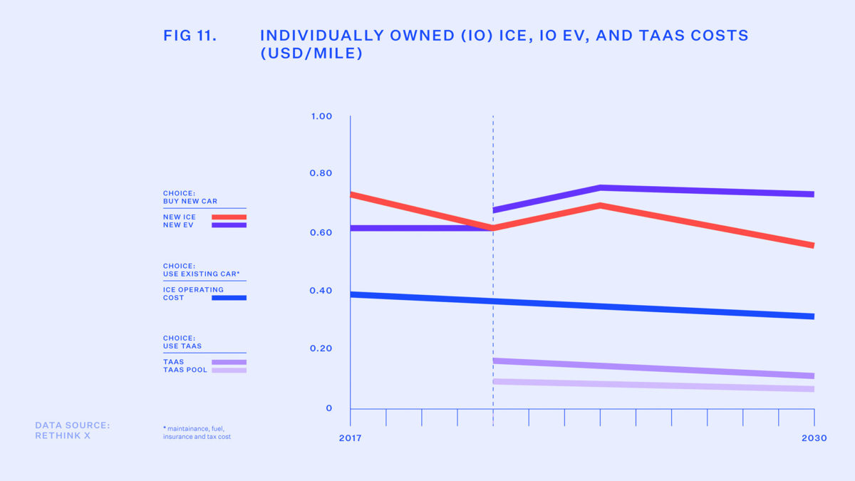
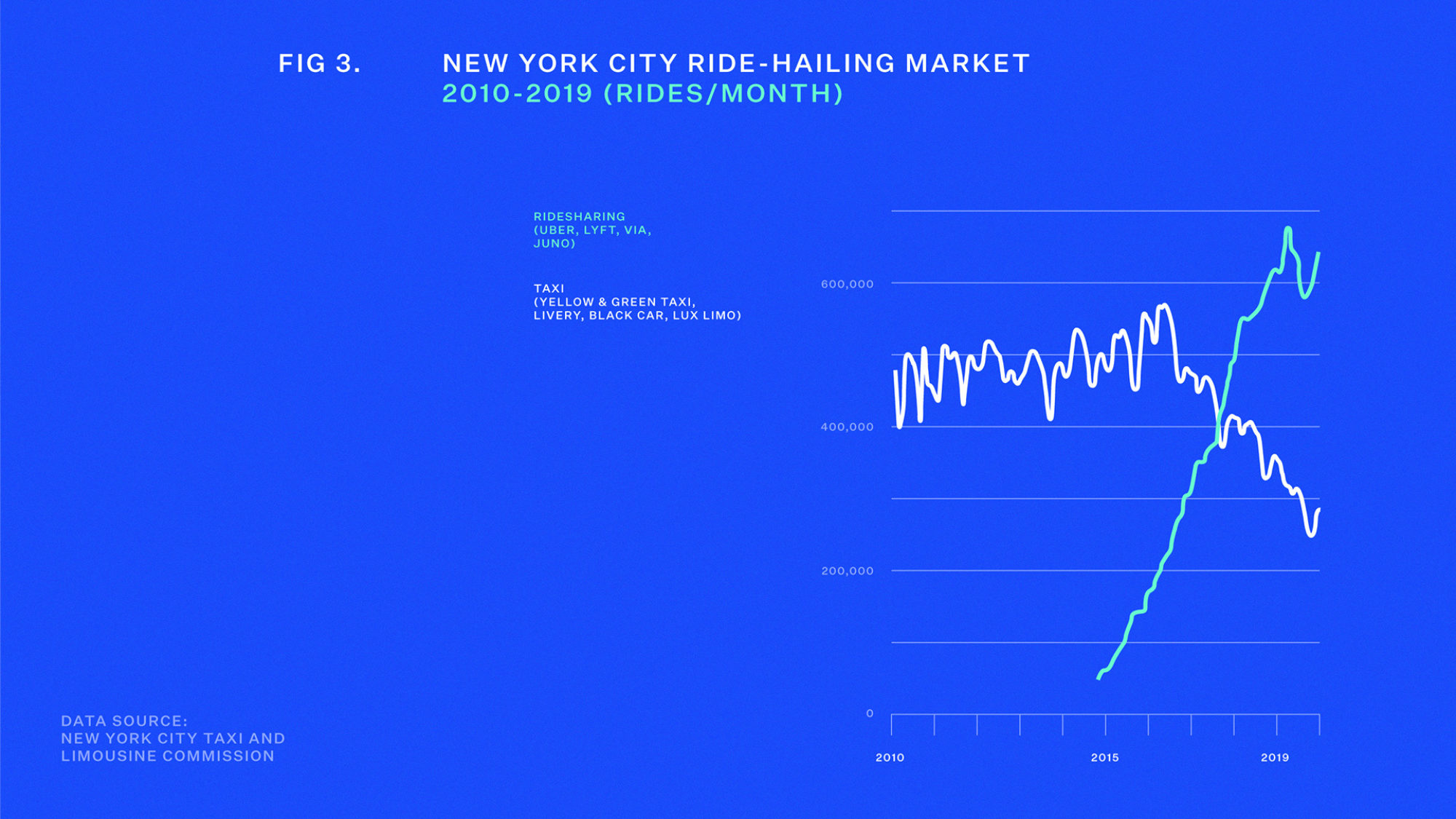
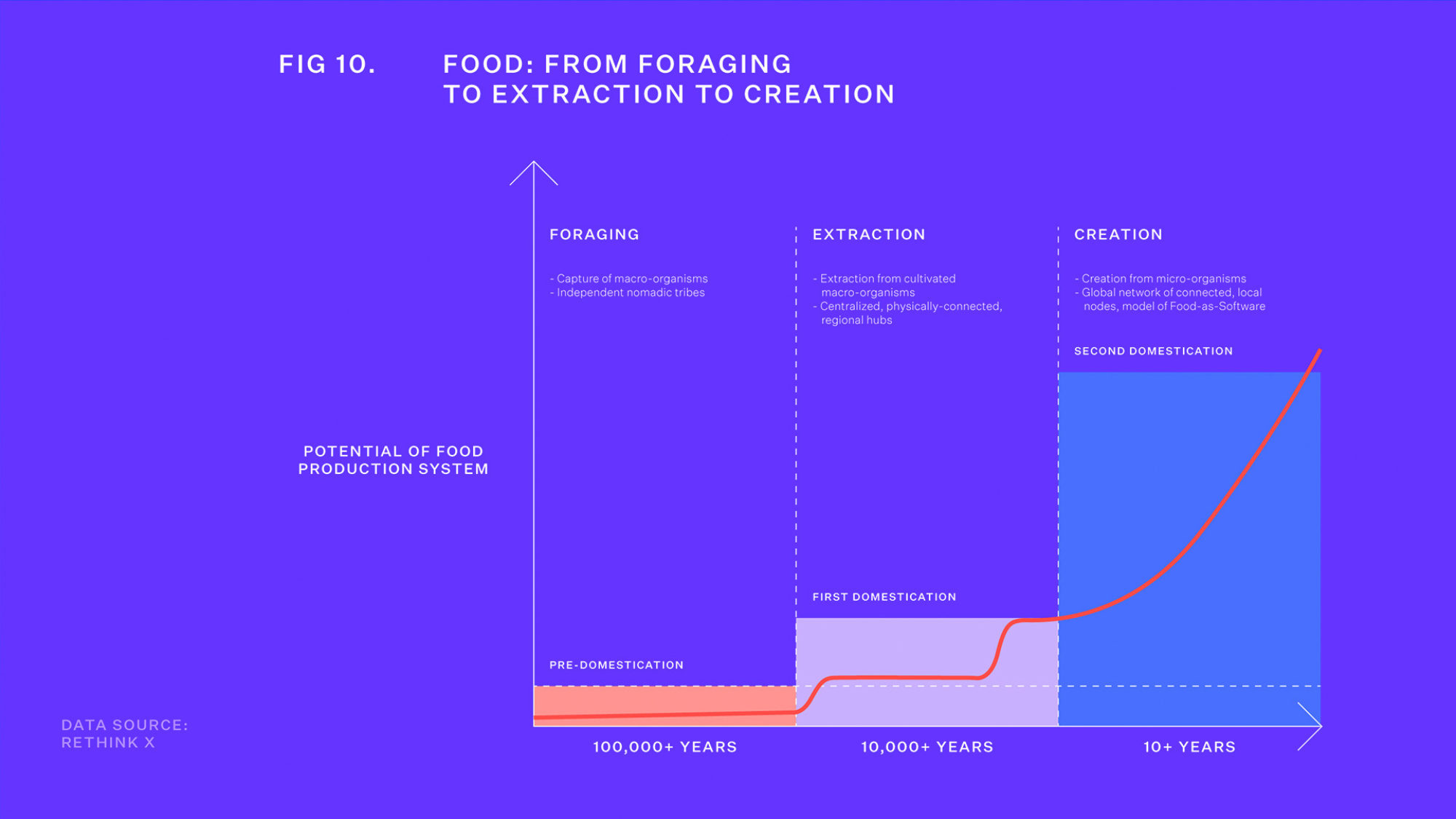
So many of the observations and concepts in Rethinking Humanity are derived from data the human eye can’t quite grasp. As visual creatures, it was essential to translate the most important ideas to visual communications, so they could actually register with audiences.

Dimensionality
Most graphs and charts move from left to right / up to down. We decided to turn the perspective through 90 degrees and allow audiences to almost ‘ride’ our models, enabling them to journey into humanity’s emerging possibility space. This really brought our message to life.


