Branding a think tank’s
biggest ever thought

Tony Seba & Jamie Arbib have worked together for decades, examining how change ripples through different sectors in society, from information to transport. Rethinking Humanity would be their most comprehensive work to date: a window on the future of humankind.
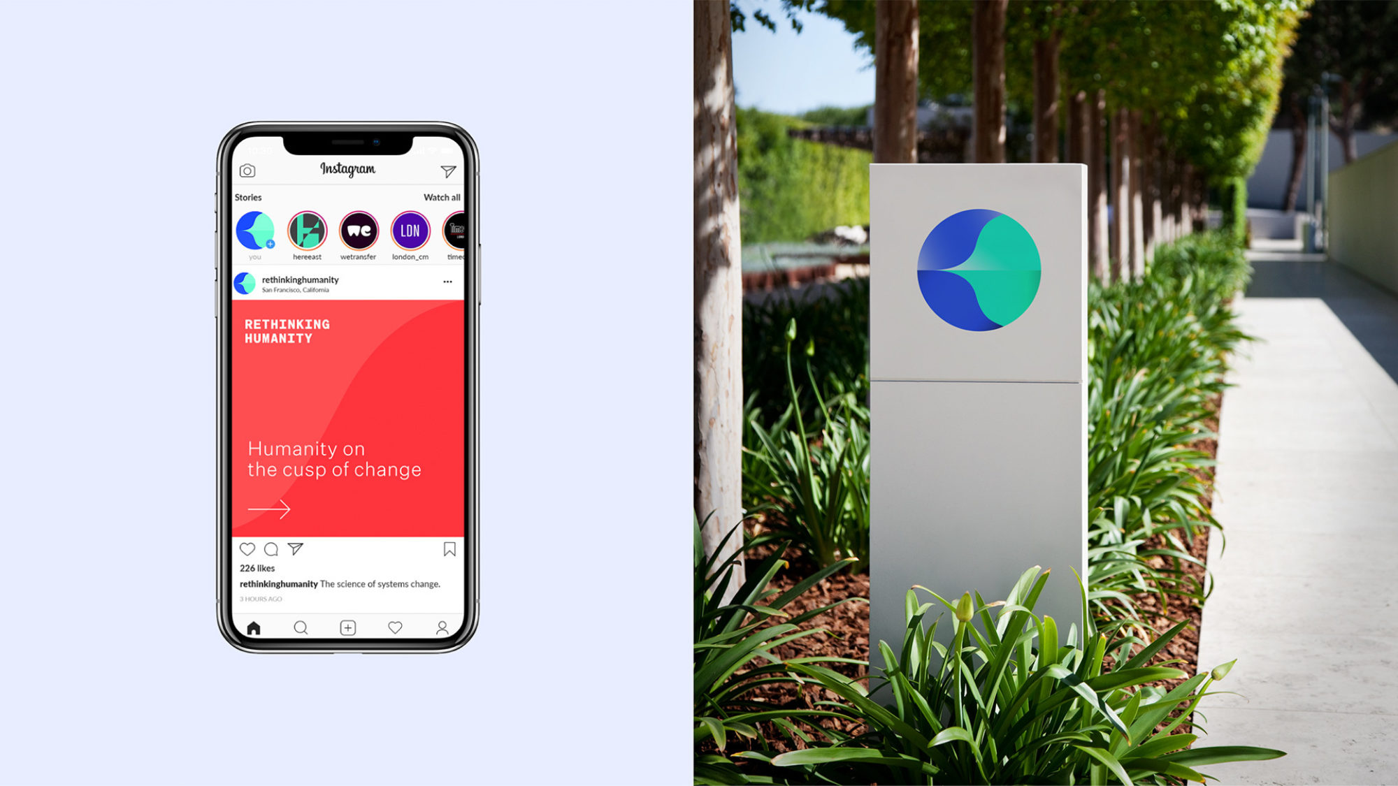
Lovers were invited to give Rethinking Humanity its own identity, helping it to land and circulate amongst thought leaders and captains of industry. The branding would need to enable Tony, Jamie and the Rethink X team to convey the work’s key ideas and help them stick.
A Window of
Opportunity
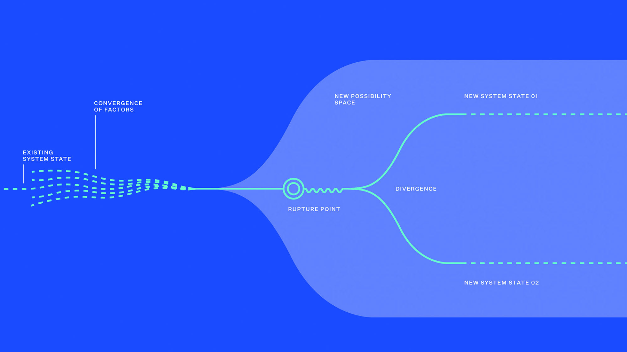
We named the central device in Tony & Jamie’s thinking, ‘The Convergence Window’: a vast possibility space emerging between 2020 and 2030, triggered by technology convergence across the world. This space, shown on a time axis, became our primary branding element.
A New Messaging
Framework
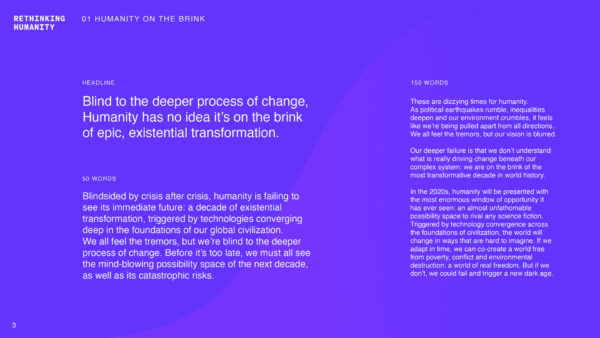
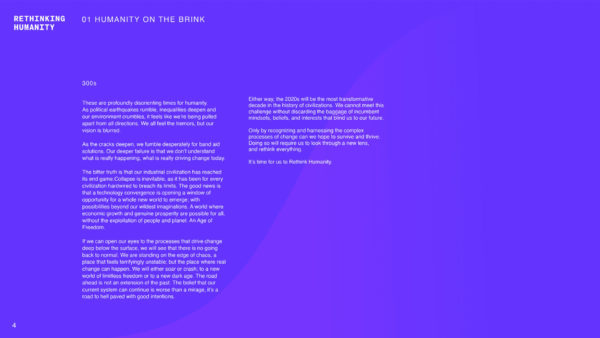
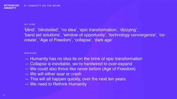
We guided Tony and Jamie through a process of distillation to arrive at new text, capturing the entirety of Rethinking Humanity. Along the way we were able to help coin clear, memorable phrases and key terms to help Rethinking Humanity stick with audiences.
Showing Humans
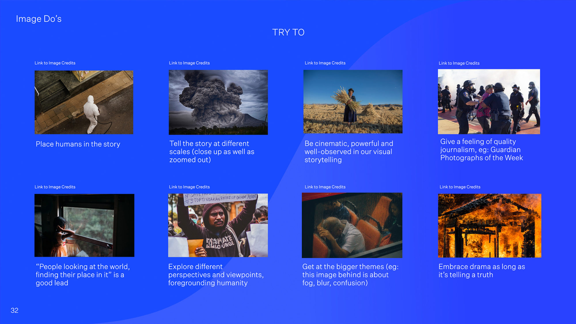
It can be tempting, when explaining complex theories and models, to focus only on diagrams, charts and graphs. But with a title like ‘Rethinking Humanity’ it was going to be important to find ways to allude to the human interest stories at the heart of these ideas.
Motion & Emotion
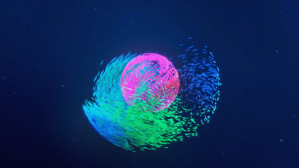
There’s nothing quite like turning a graph towards you and riding it like a rollercoaster, especially when it’s referring to your future. We created a set of ‘speed of light ride’ CGI fly-throughs that helped bring the complex theories and graph shapes to life for people.

