An elegant brand for
Architecture’s finest
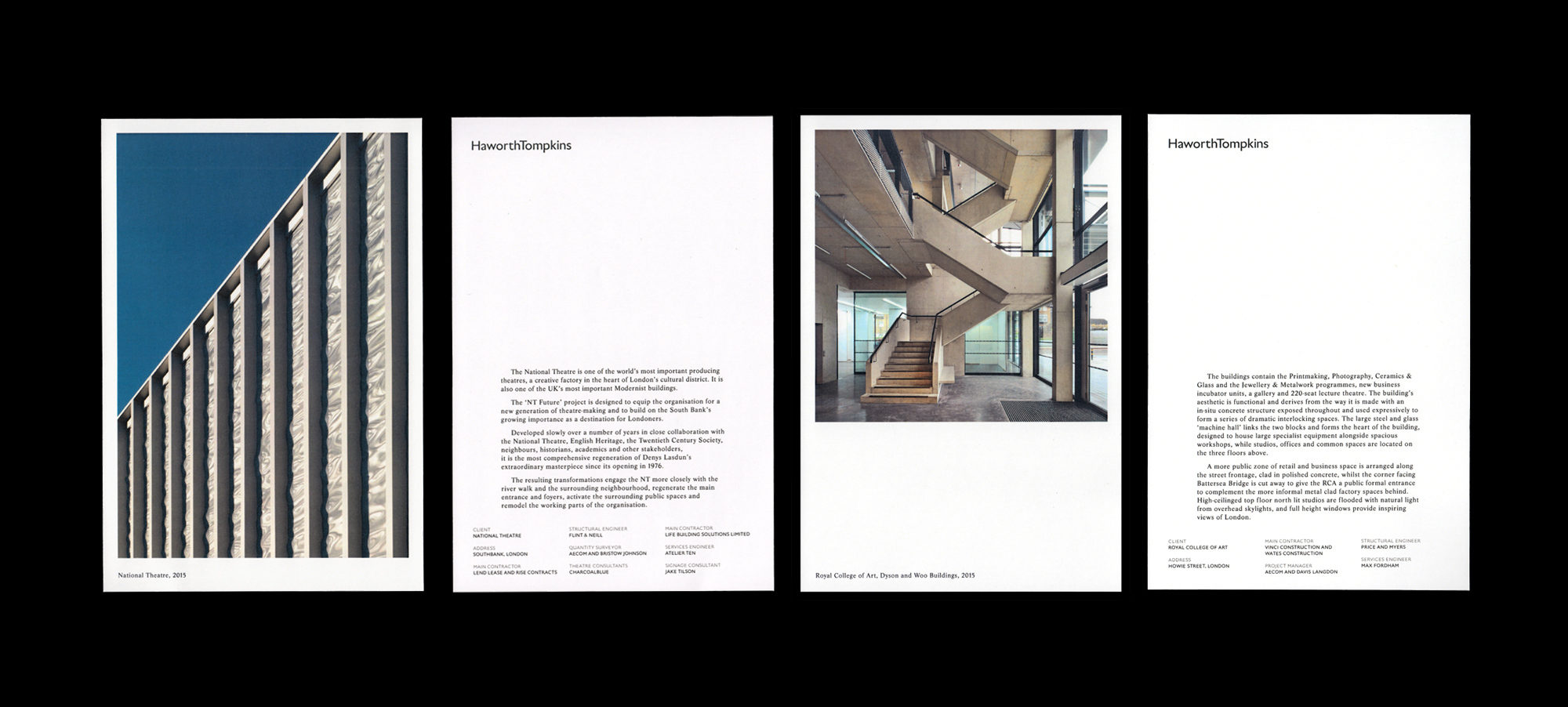
Architecture firms need great brand identities too you know. Haworth Tompkins is a world-famous, multiple Stirling Prize winning team of architects based in London. You’d imagine they might want their brand to big them up quite a bit. On the contrary.
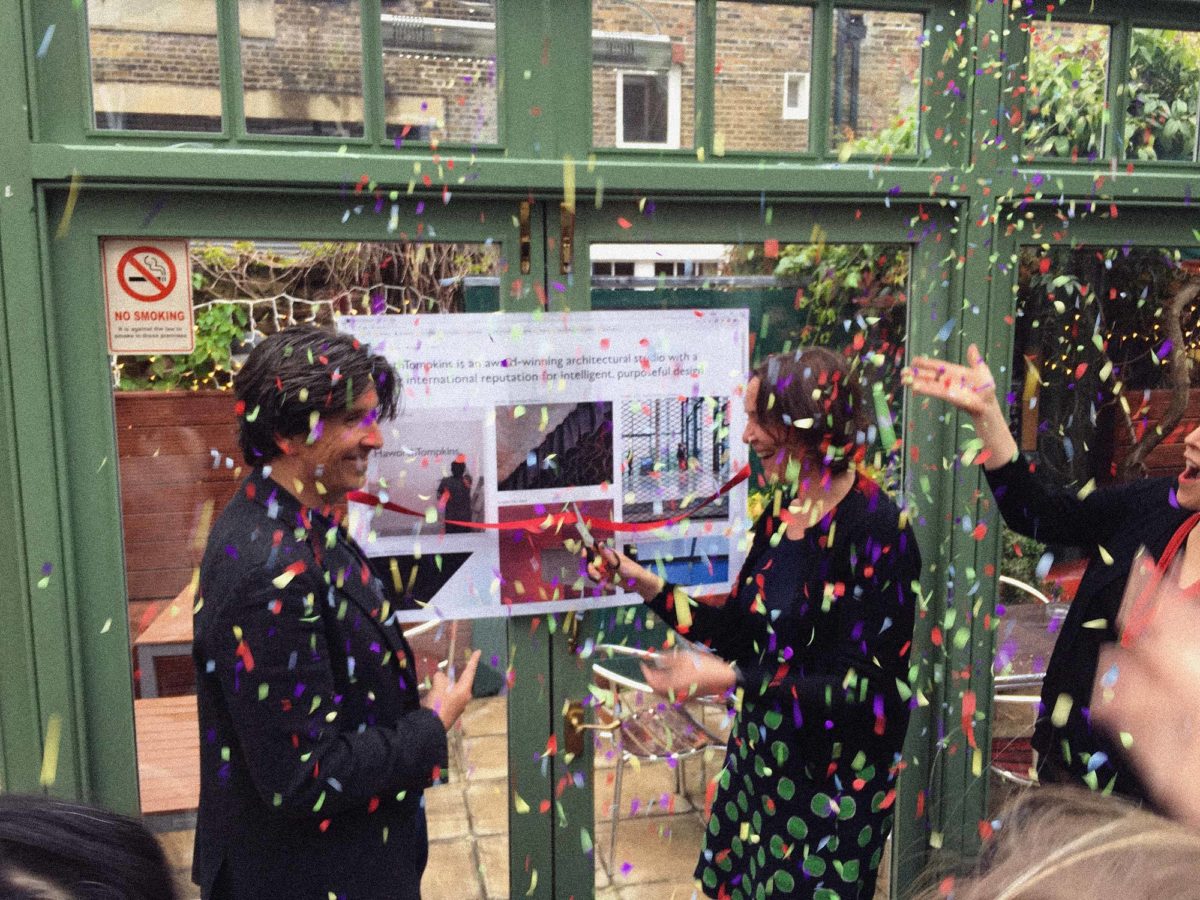
Lovers were invited to get to know Haworth Tompkins and develop a brand identity capturing their true character and approach to architecture. We worked closely over several months to develop a new identity and online presence they could be quietly proud of.

Quietly Radical
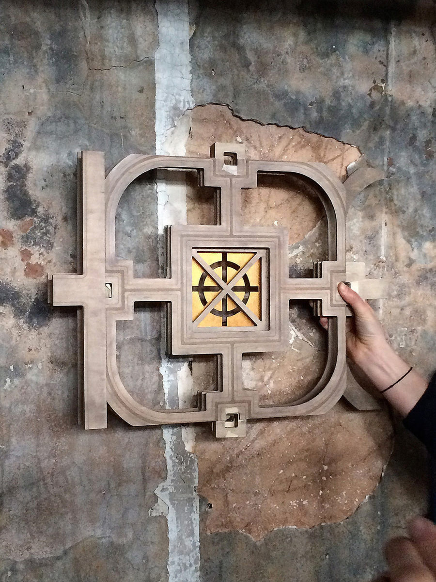
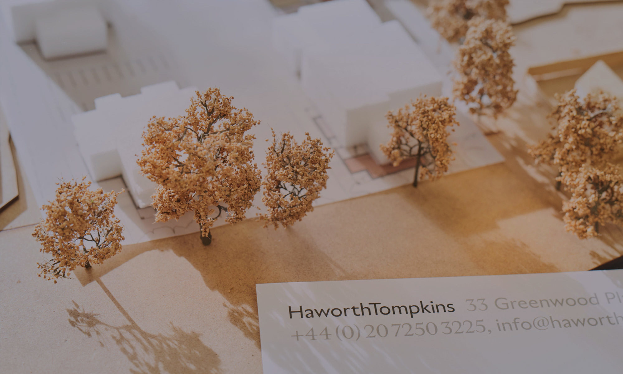
Real understanding takes some time, but you can’t let it take forever. Through visits and conversations we identified a number of ‘quietly radical’ strands running through the practice, from non-egotism to insistence on physical model-making as a thinking tool.


H to the T
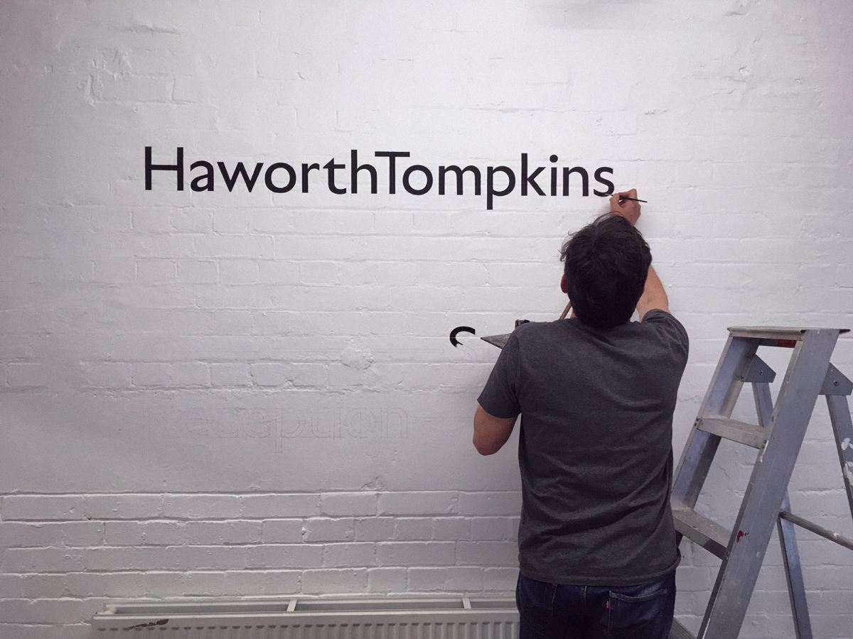
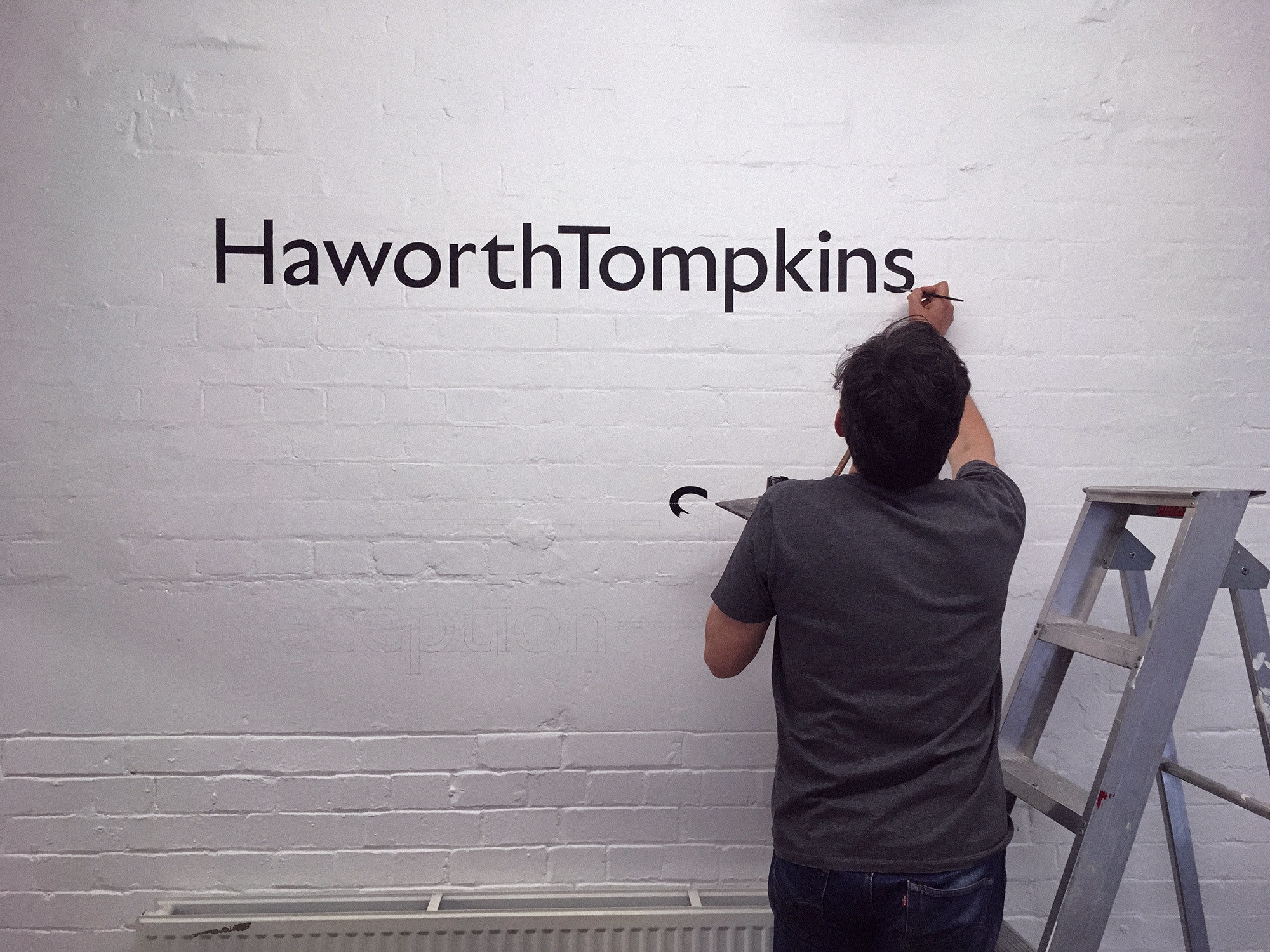
The founders of Haworth Tompkins see their company as being something much greater than themselves as individuals. We looked for a way to subtly move from two distinct surnames, to a one-word feel — allowing this word to be re-owned by the entire company and team.

“When you’re doing a rebranding exercise you hope that the people you’re working with are going to see you and listen carefully to what you’re about. Lovers are great listeners. I can’t really speak highly enough about them, they’re a great outfit to work with.”

Showcasing Work
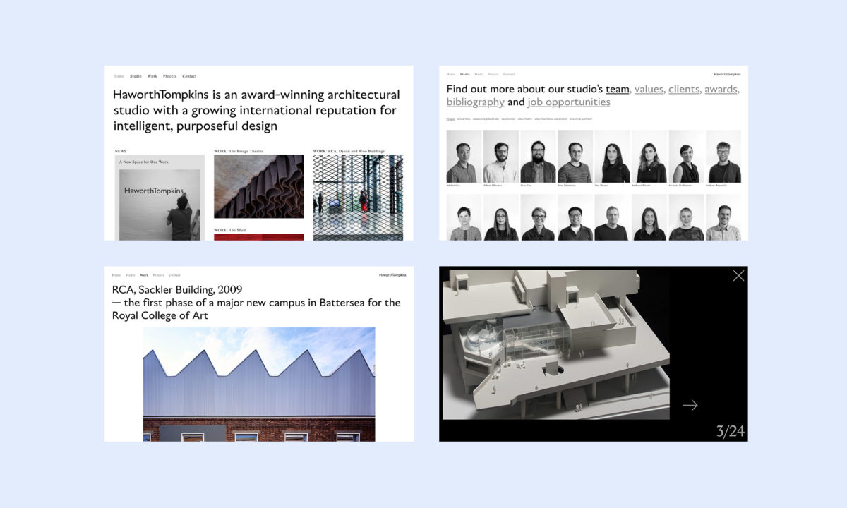
We let built projects take the limelight in the new Haworth Tompkins website, but we also made sure the practice’s personality found new ways to shine through. Playful team photos and behind-the-scenes windows let soul shine through alongside ‘work work’.


