An identity toolkit
for a civic revolution

Public Practice is a movement to revive the public mindset amongst London’s brightest planners architects. The project needed an identity that said “no” to flashy architecture and “yes” to the undervalued idea of civic collaboration. Whizz-bang branding was off limits.
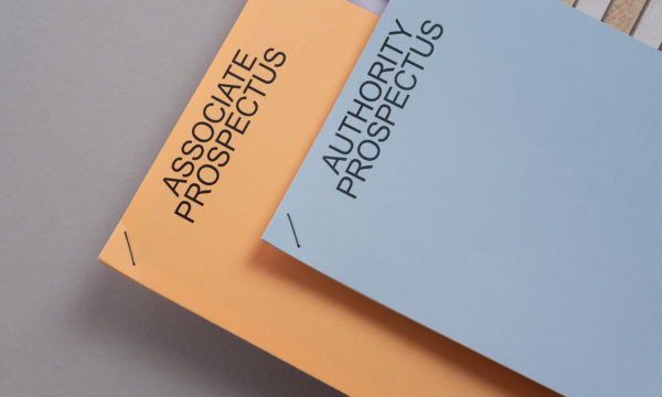
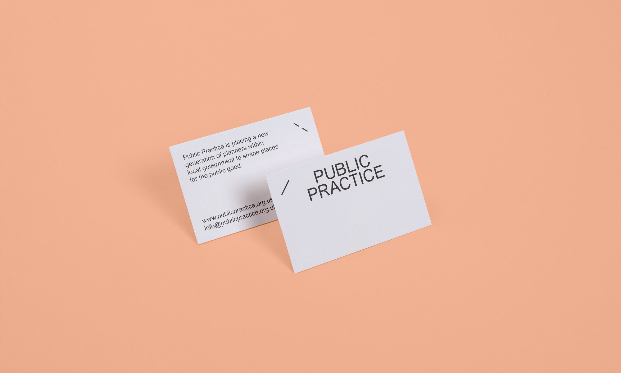
Lovers were invited to design a brand identity that would celebrate modesty, downsize ego but carry a pleasing, professional tone. Our municipal colour palette and pared-back, almost mundane typography gave a nod to the golden era of civic architecture in Britain.

Mobilising
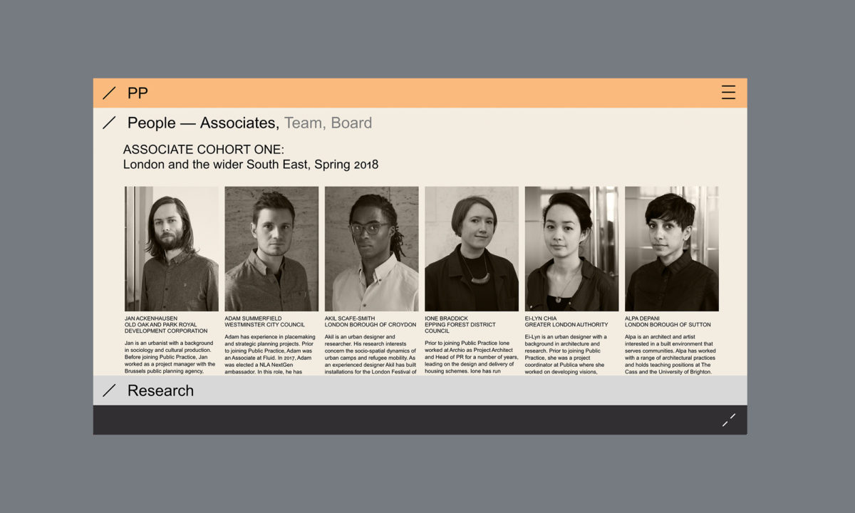
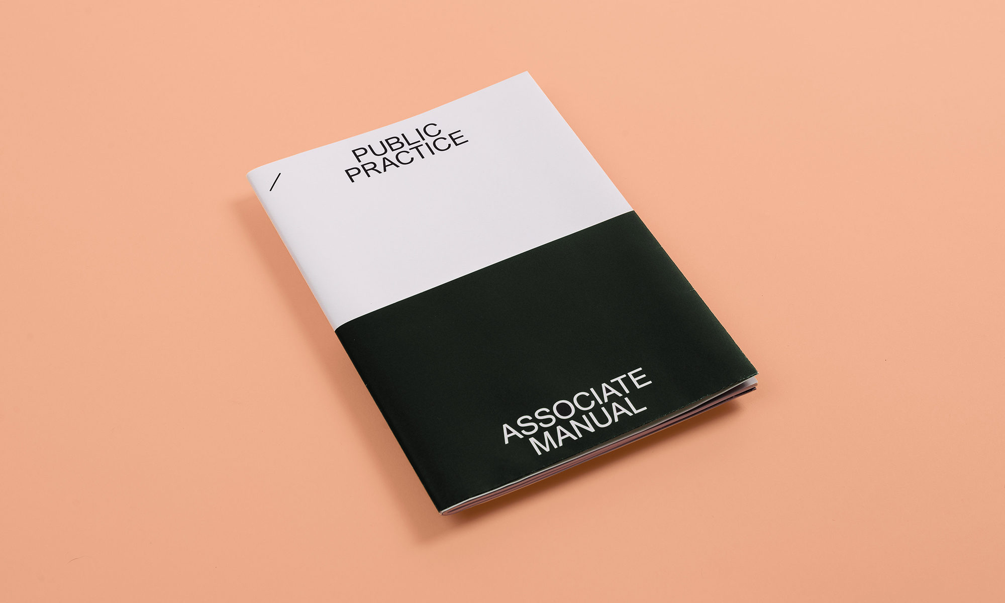
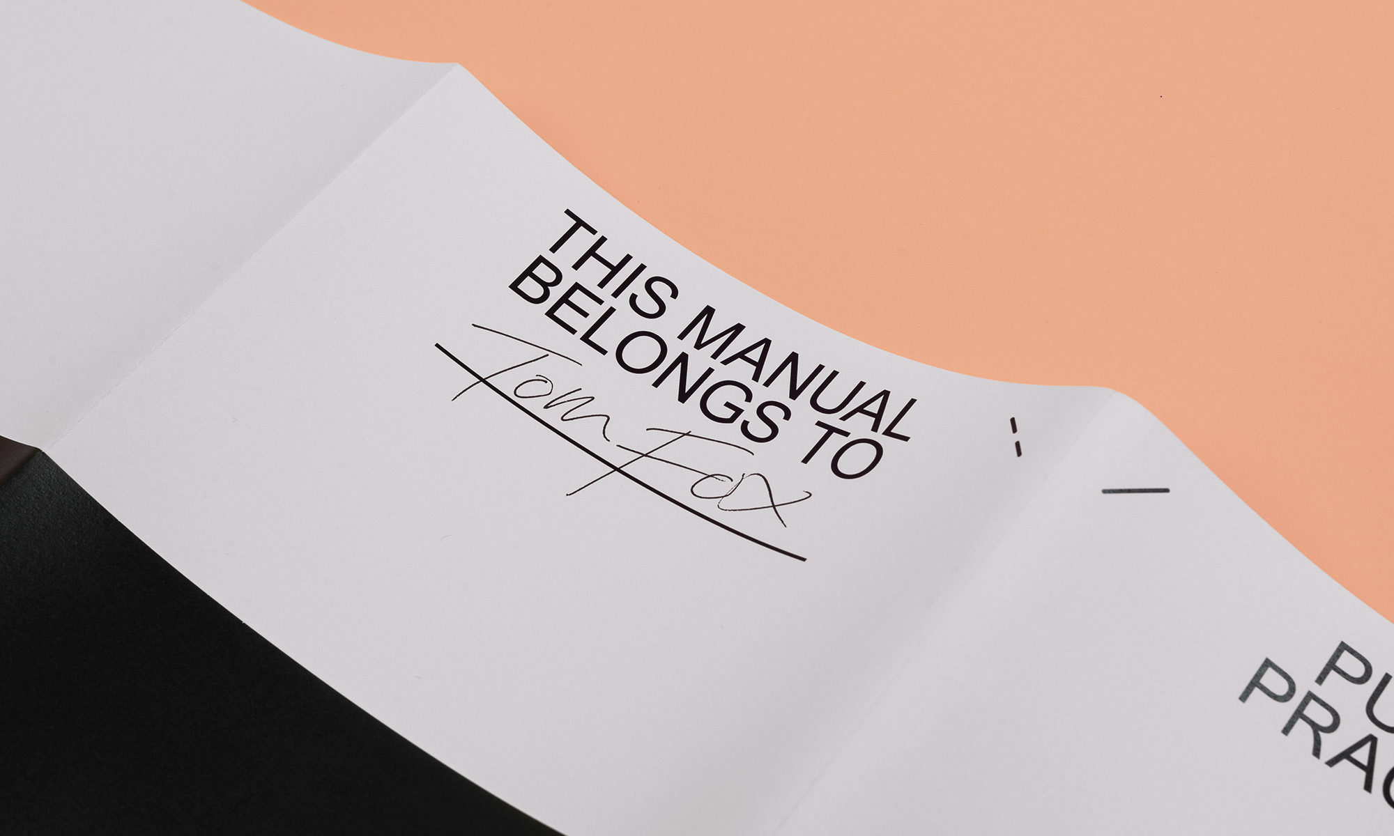
The Cohort
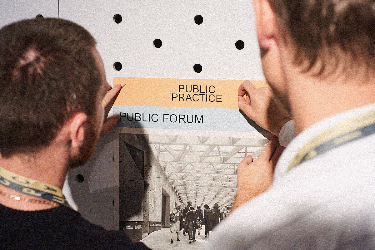
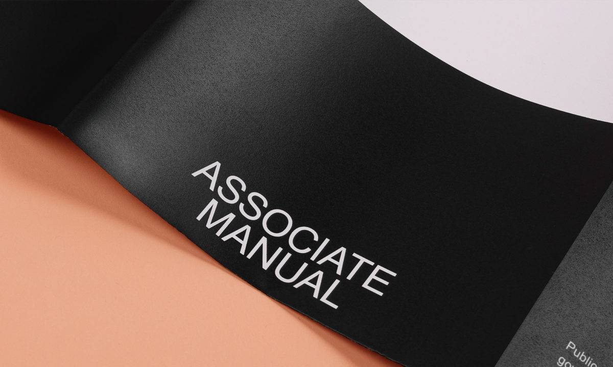
Founded on a cohort model, it was crucial to develop a consistent set of materials to onboard participants. Associate manuals and other pieces sported the functional identity, united with a binding staple motif that champions pragmatism and knuckling down.

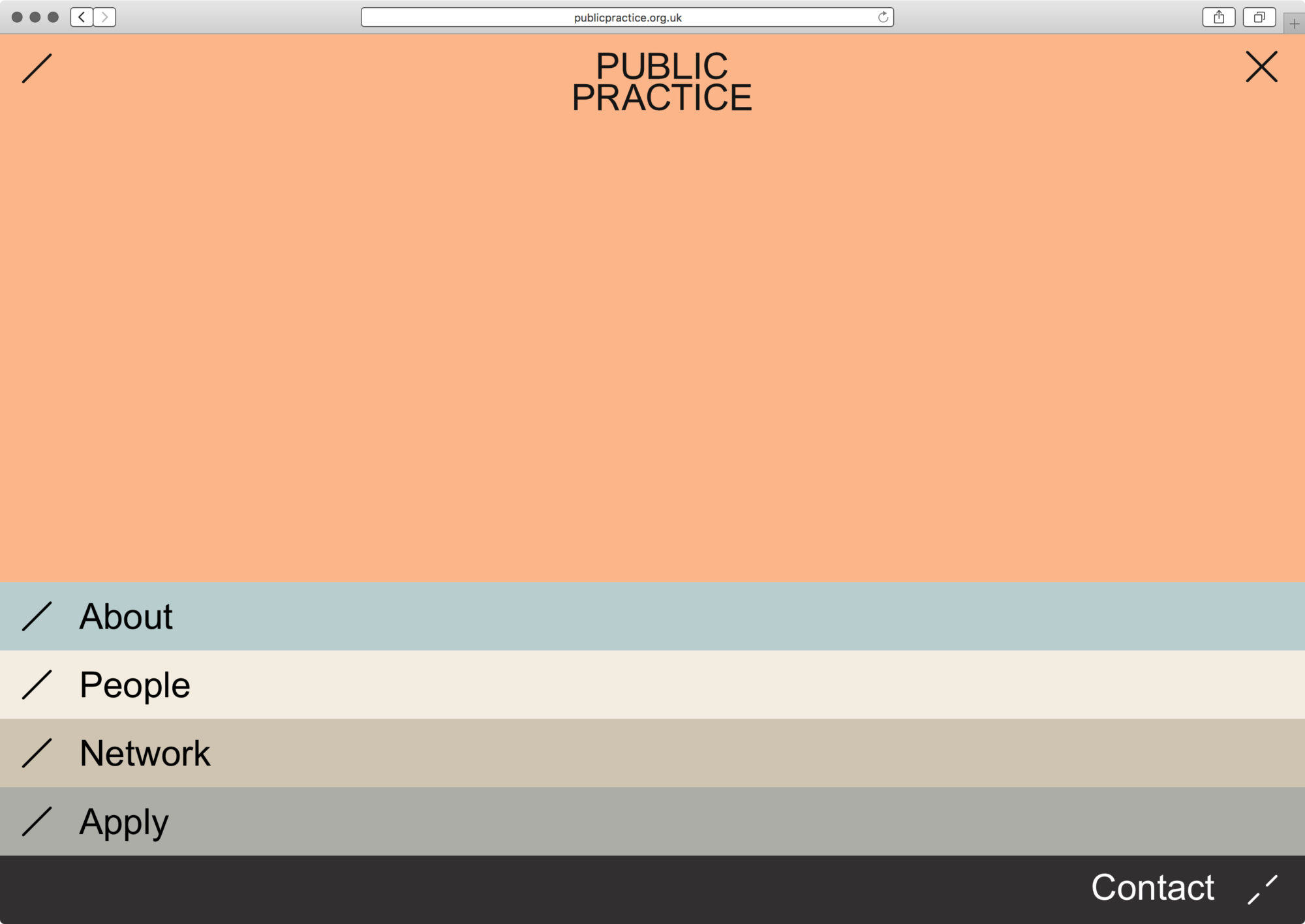
No Gloss
The Public Practice site takes visitors through a set of honest explanations without fuss or frill. Rejecting clichés of architectural pizzazz its functional aesthetic reminds visitors to rediscover their true professional potential. We went ‘gloriously bureaucratic’.