An acrobatic brand for
NYC’s erotic mecca

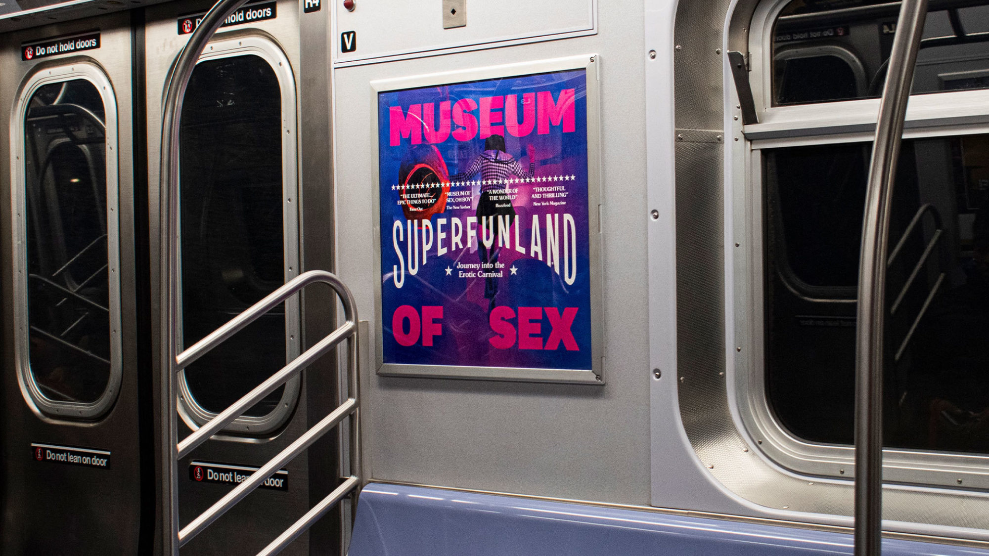
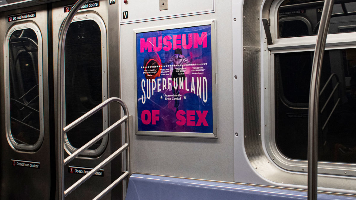
SuperFunland would be the most ambitious show ever to open at New York’s Museum of Sex. This carnal cornucopia would need an identity that bridged fantasy playground appeal with cultural hotspot clout, manifesting from signage to subway ads.
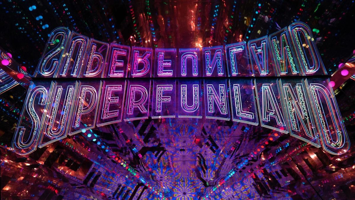
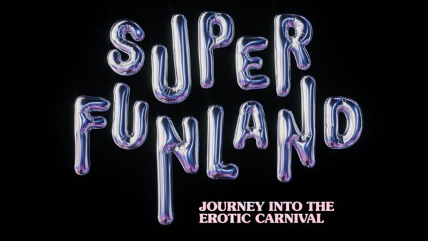
Lovers were invited to originate the identity for SuperFunland, signalling to visitors what flavour of fun experience awaits them on 5th Ave. We were asked to channel the show’s curatorial inspiration, rooted in 19th Century Coney Island. Cue bendy lettering and flashy signs.


Roll Up
Roll Up
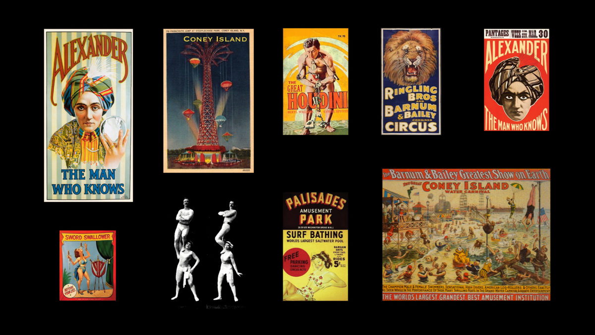
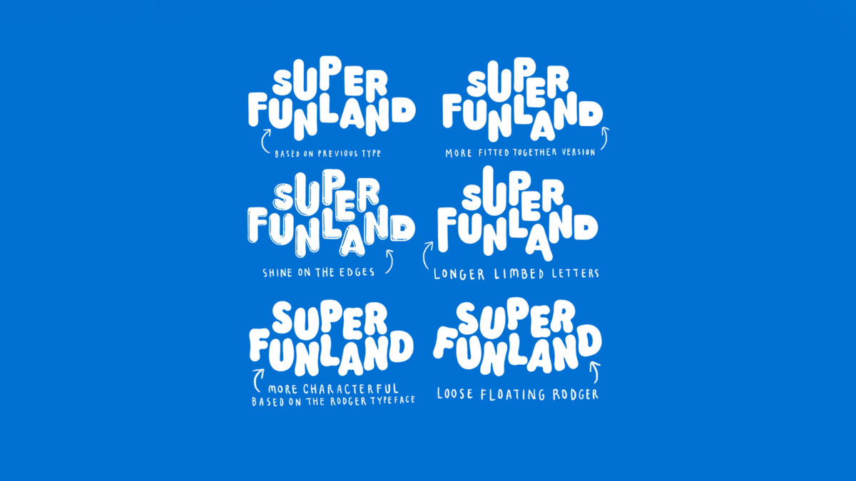
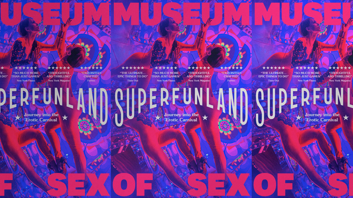
The museum’s biggest exhibition to-date drew great influence from the history of Coney Island, once a permissive playground for New York’s sexual side. Part circus, part pleasure garden, Coney Island’s 19th Century posters inspired our bold and playful, but modern typography.

It Takes Two
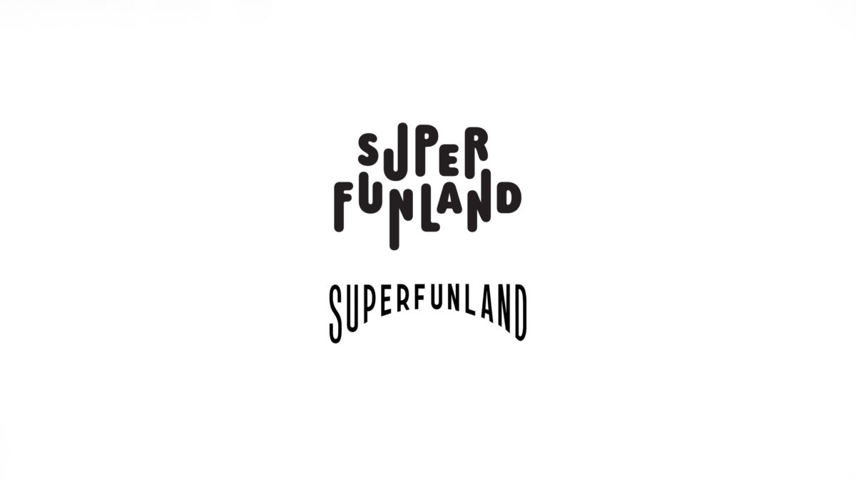
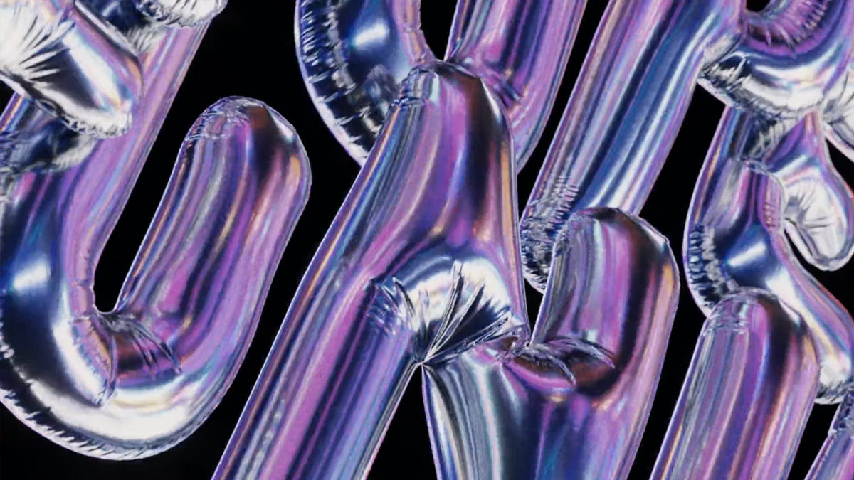
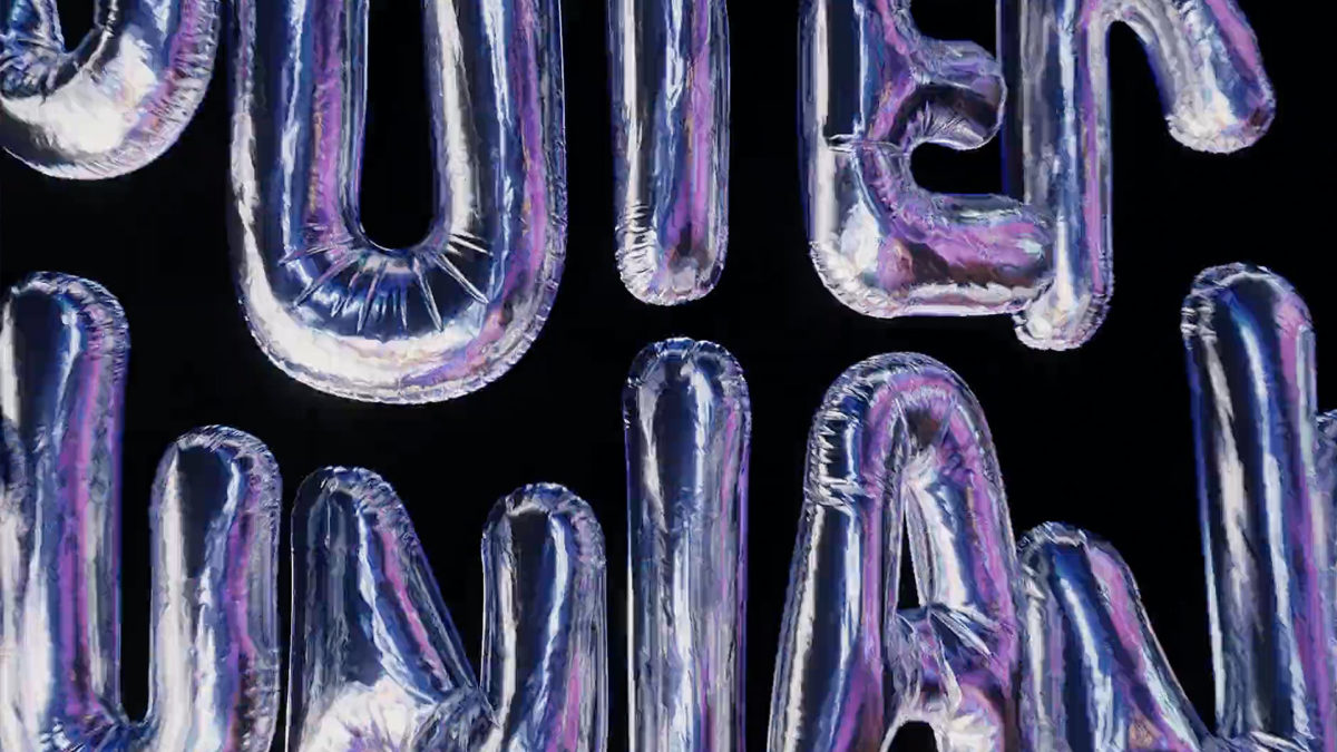
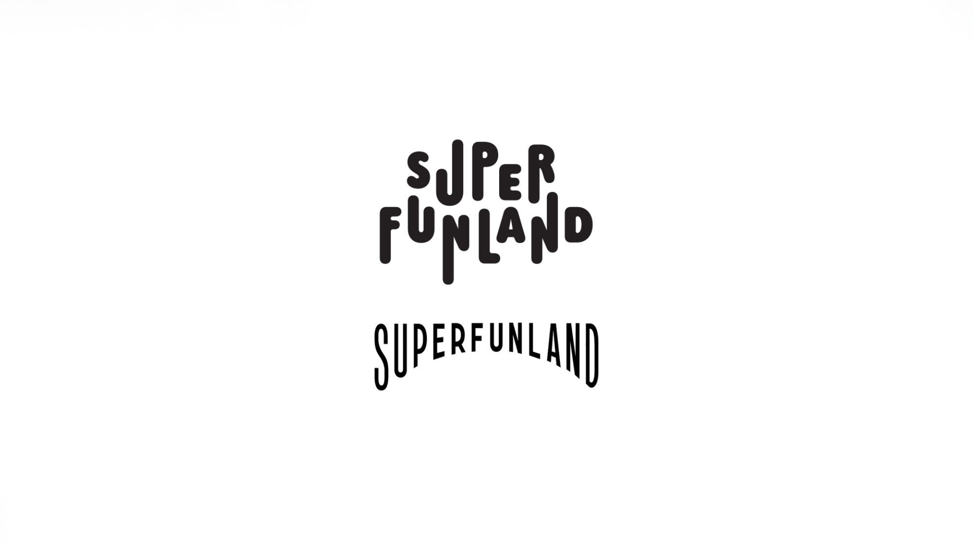
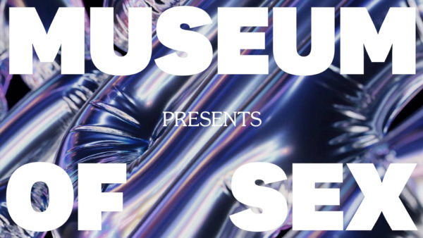
We arrived at two complimentary logos which could be used differently in different contexts. One had all the structural dexterity of an ‘Alexander: The Man Who Knows’ poster, whilst the other gave us a balloonish approach we could animate with more freedom digitally.



“How could we not work with Lovers? It’s been a fantastic experience. Great group of talent that have been relevant for us here in New York City.”

