Branding & packaging
for a family of merchants
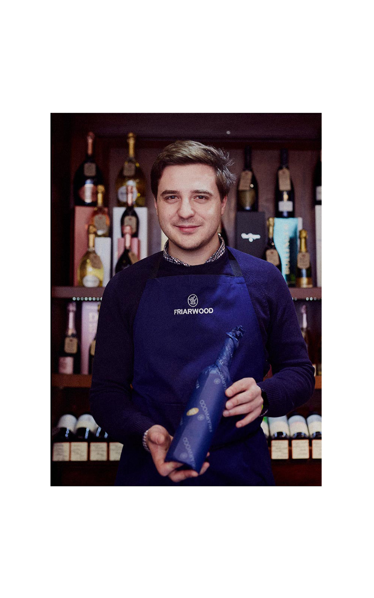
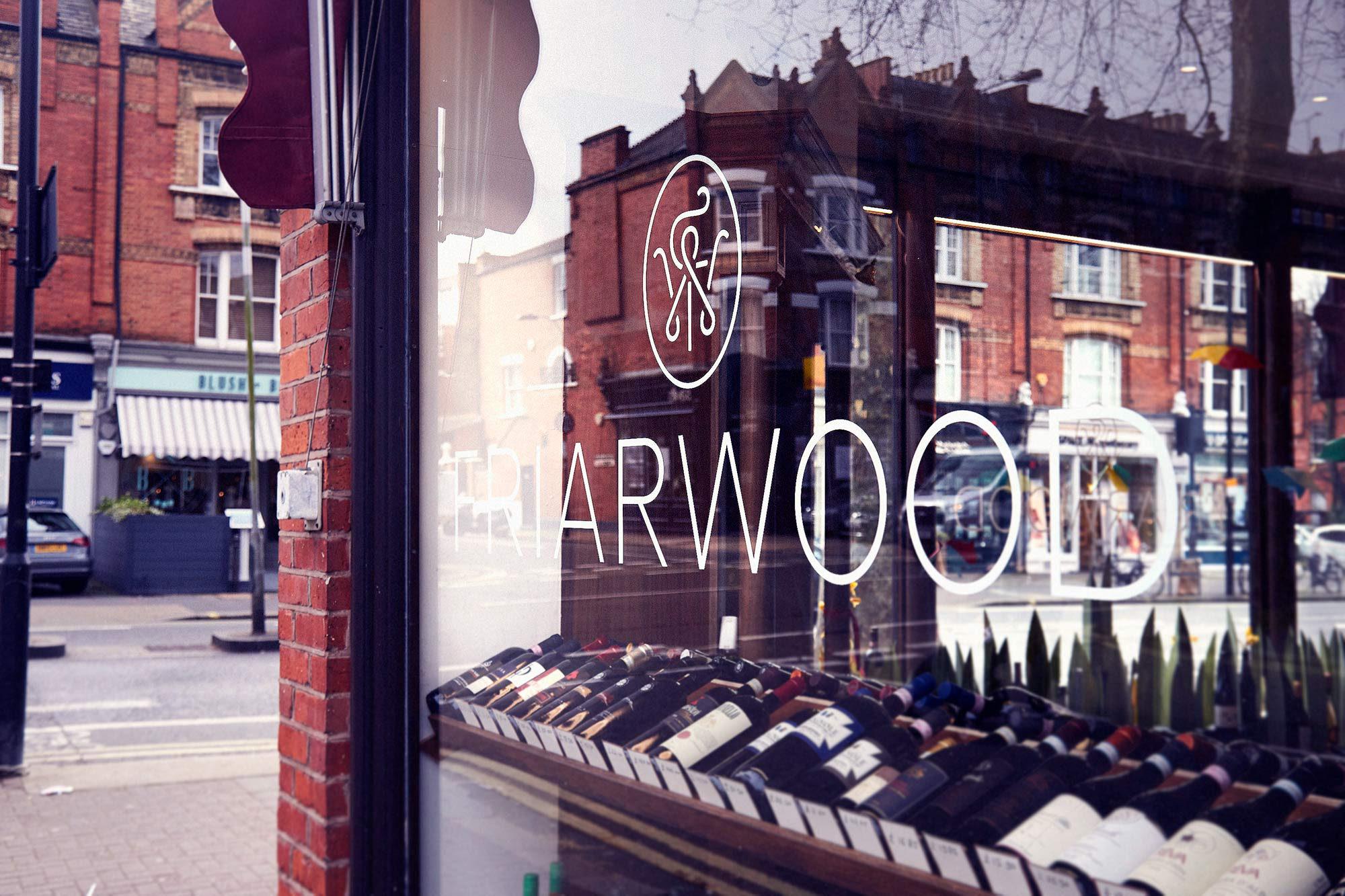
Nestled in a beautiful corner of Parson’s Green is a cosy cellar of Bacchanalian bliss named Friarwood. Thirsty for a new direction from a new generation of managers, the problem was the fusty old logo and dull burgundy packaging. This called for a new brand identity.
THE BRIEF
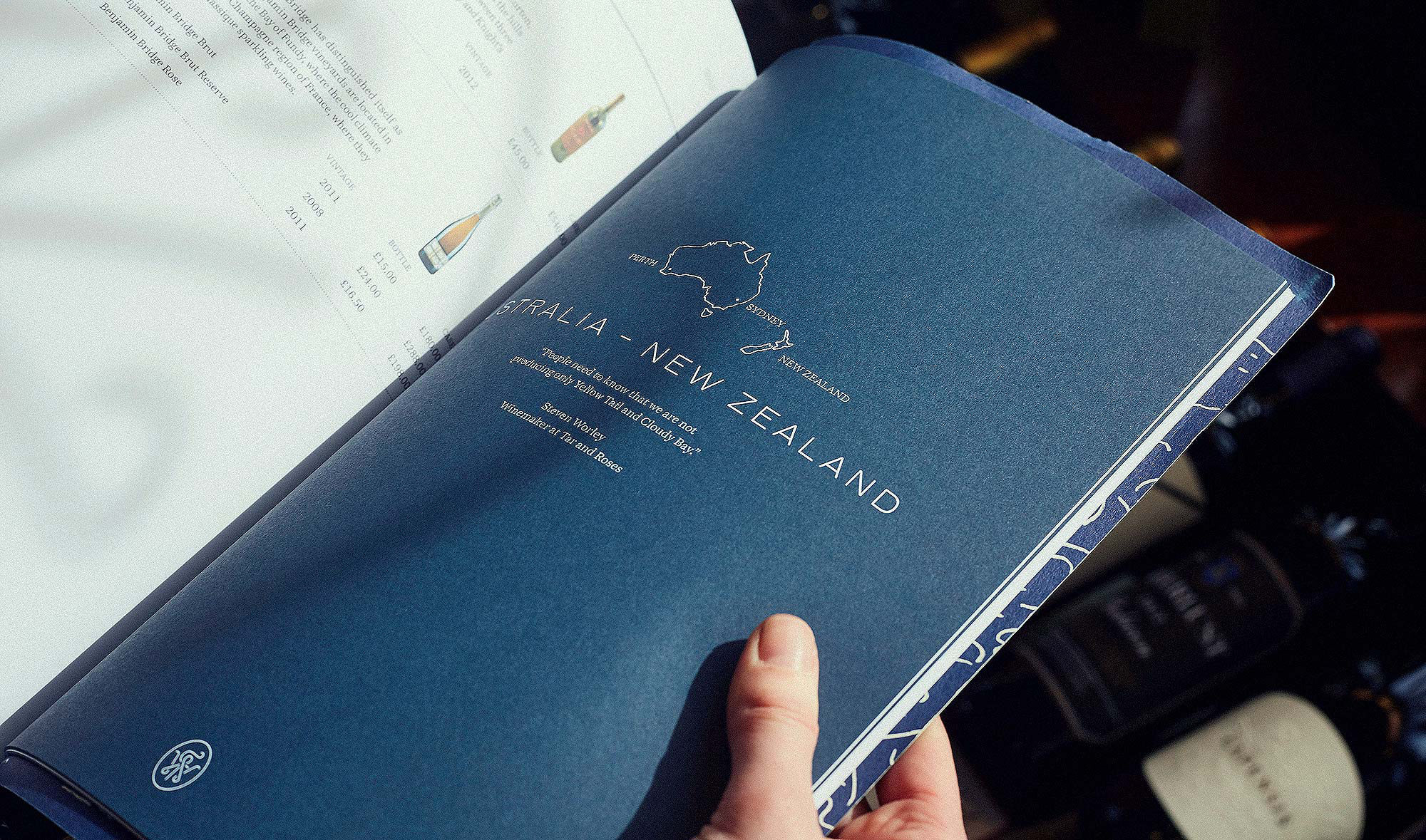
Lovers were invited to reimagine the Friarwood brand without losing its heritage (the business had been trading since the 1970s). The challenge called for old and new to slosh together in a smart, modern system that could still frame vintage gems from the cellar.

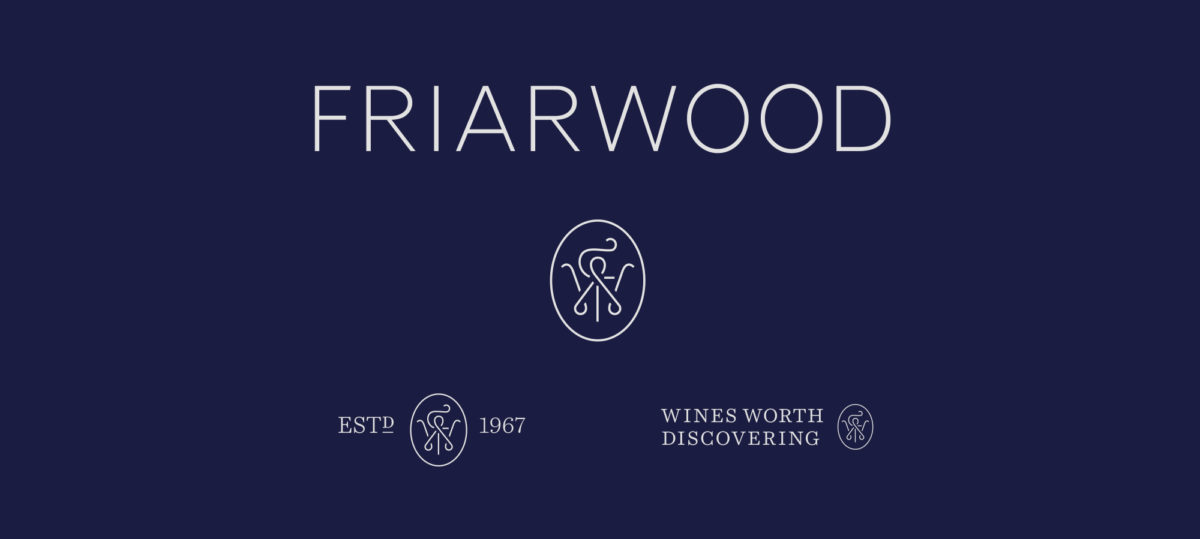
Well Aged
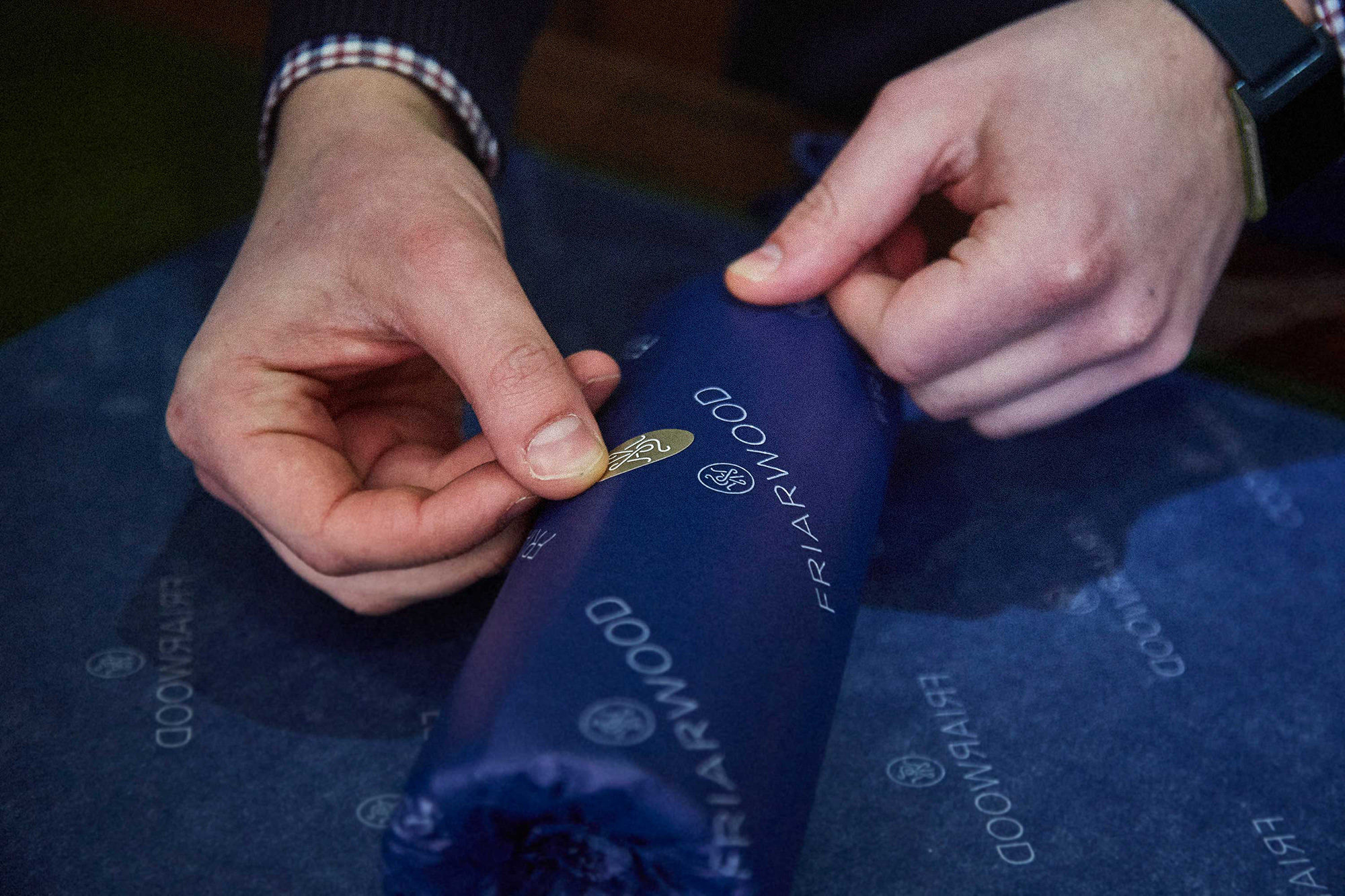
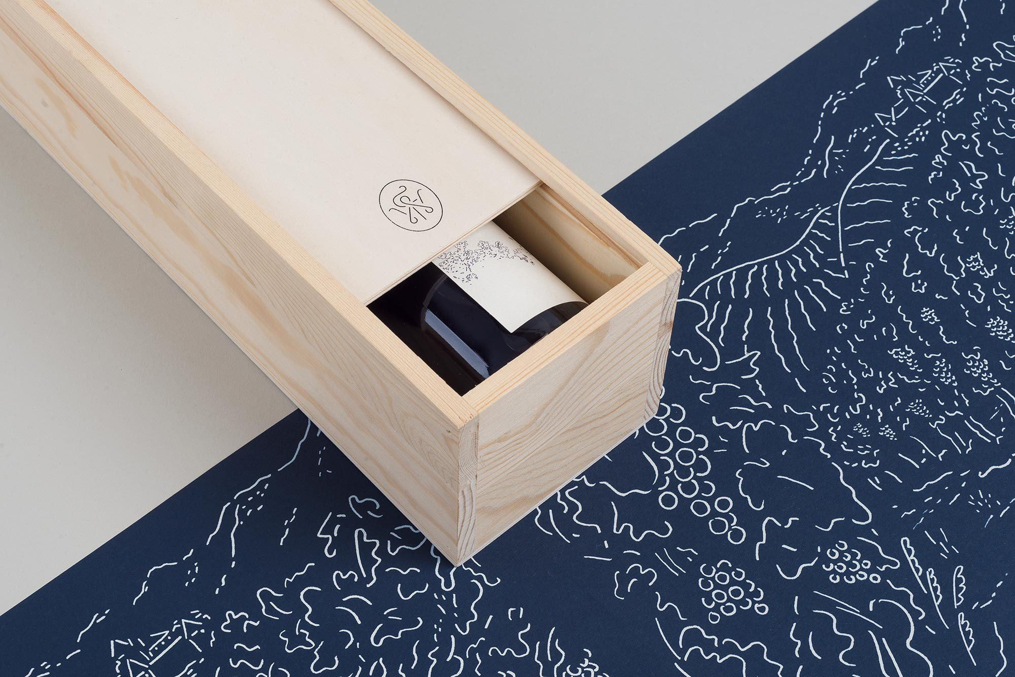
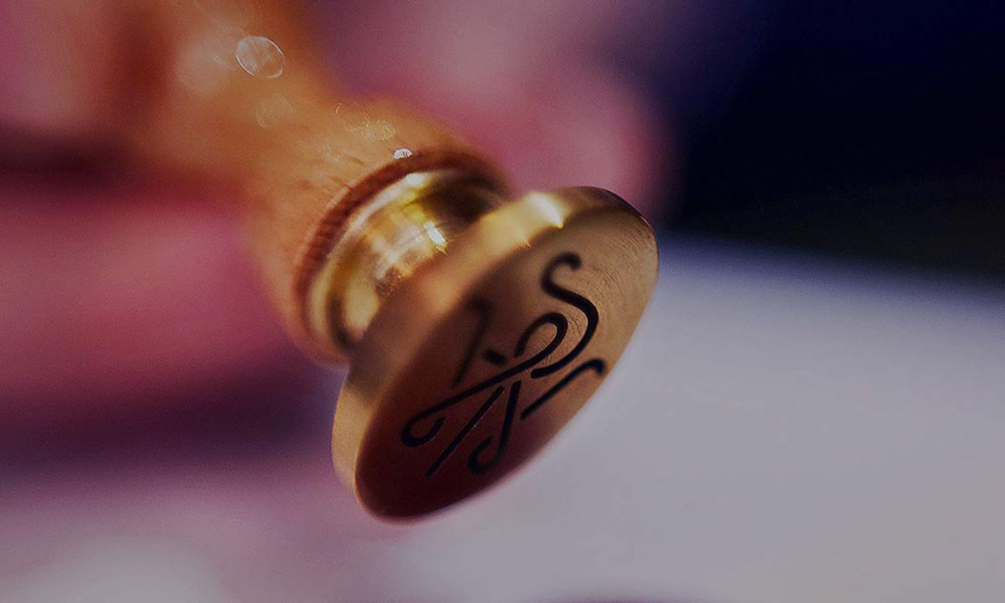
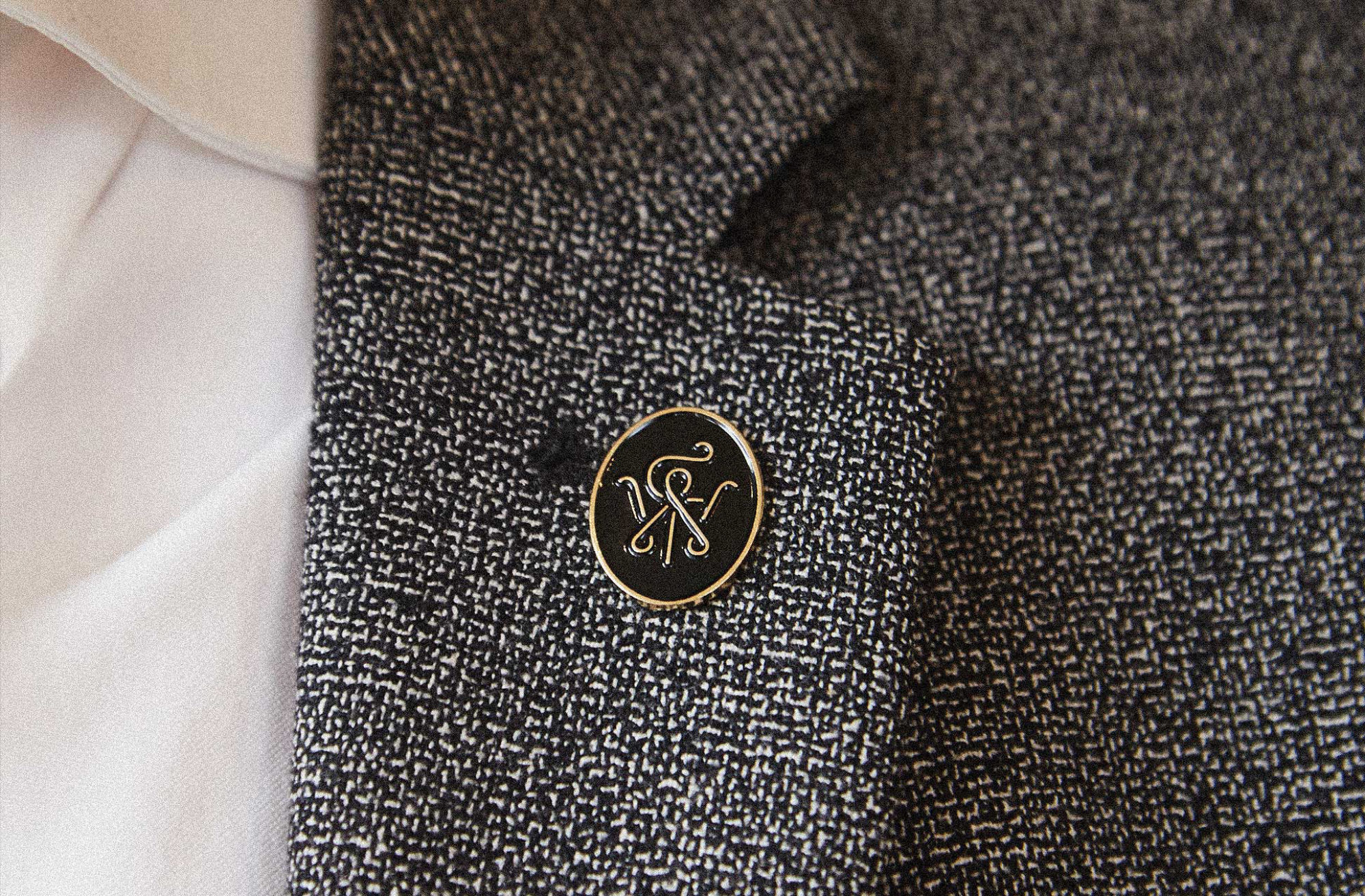
THE OLD WITH THE NEW
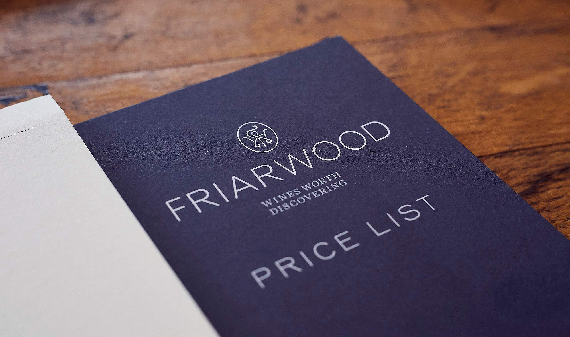
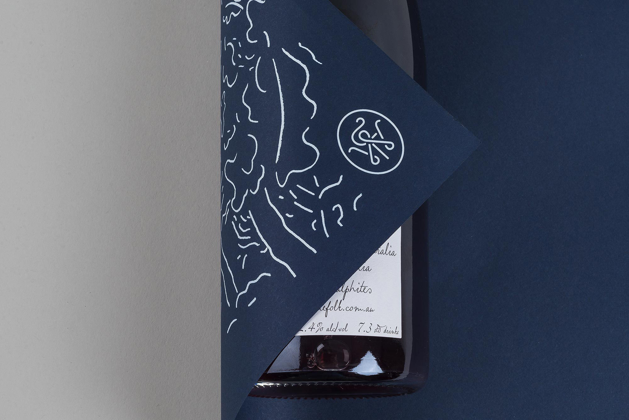
Too old and the brand feels dated. Too new and the wine seems young. We opted for single-line company monogram, as suited to a sommelier’s lapel as a wax seal or wooden wine box. This worked well for both retail and wholesale, translating into digital spaces comfortably.