A restless brand
for theatre’s radicals

Every theatre should have an inventive brand, but especially this one. The Royal Court is well-known as the home of new writing, putting on brand new work from playwrights nightly. But its brand identity wasn’t matching up to that cutting edge reputation. Cue Lovers.
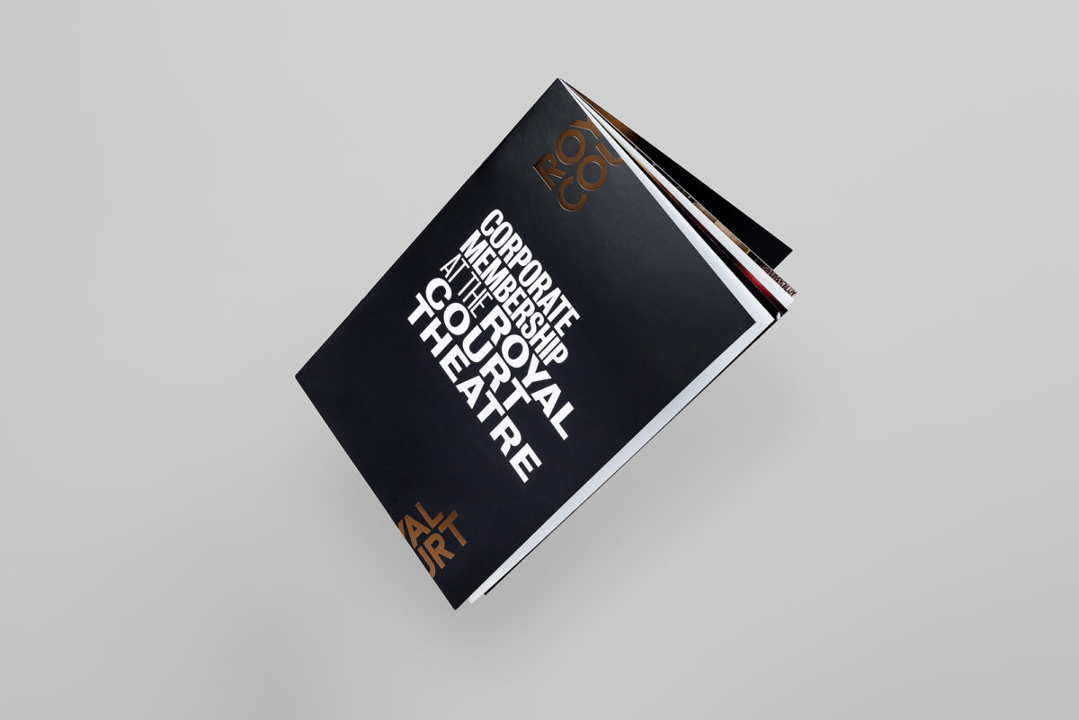
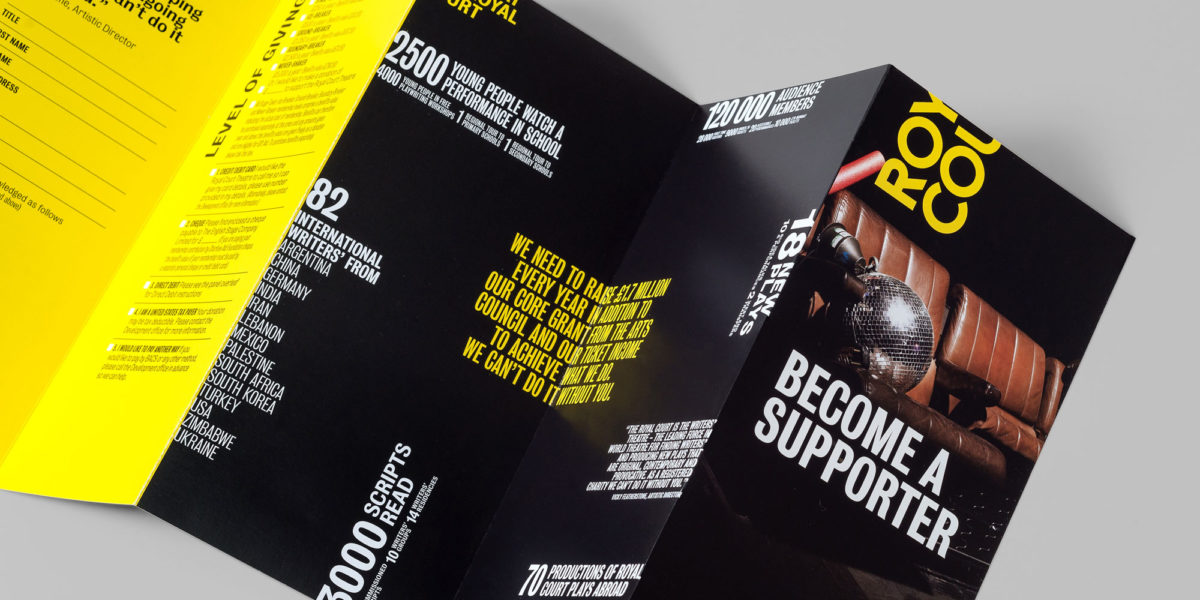
Lovers were invited to sharpen up the Royal Court’s brand identity. If you run a cutting edge organisation you can’t afford to look tired. Embracing a newly defined positioning: “playing on the edge”, we were encouraged to build a bold, boundary-pushing new identity.

Playing on the edge
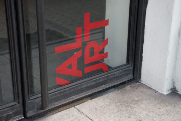
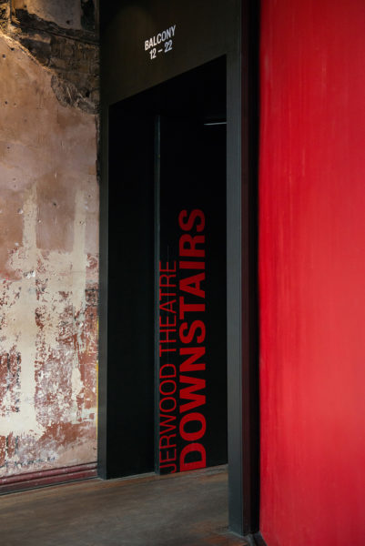
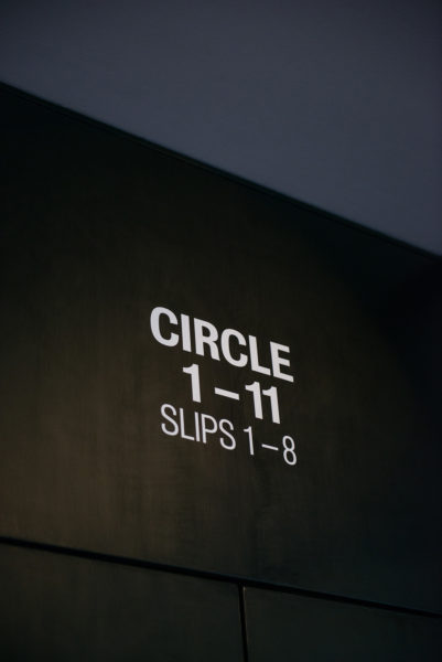
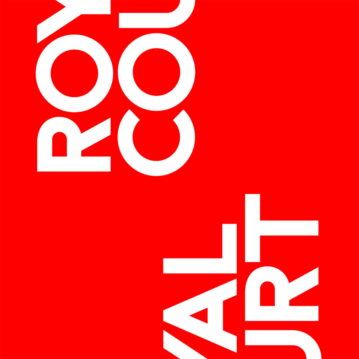
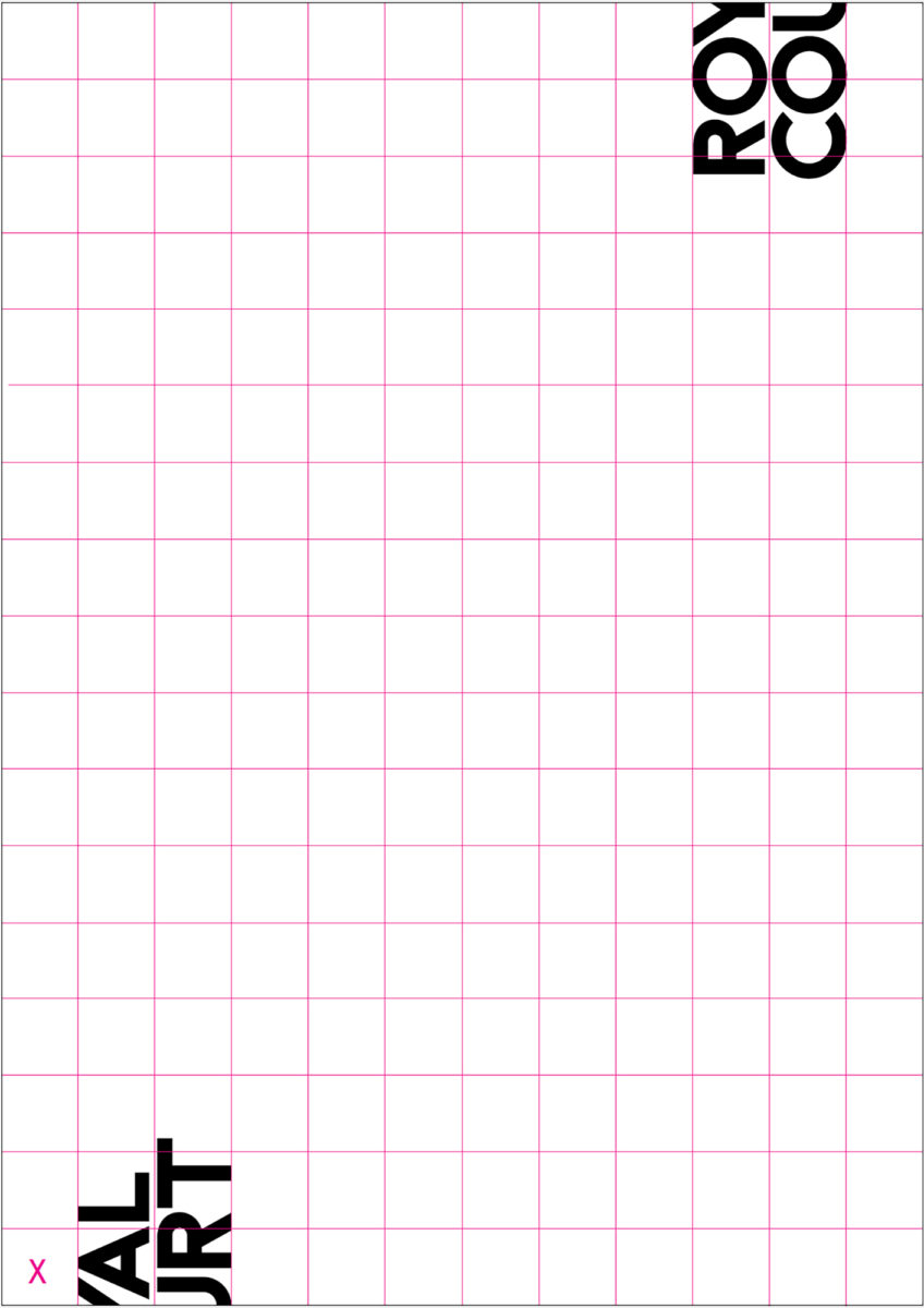
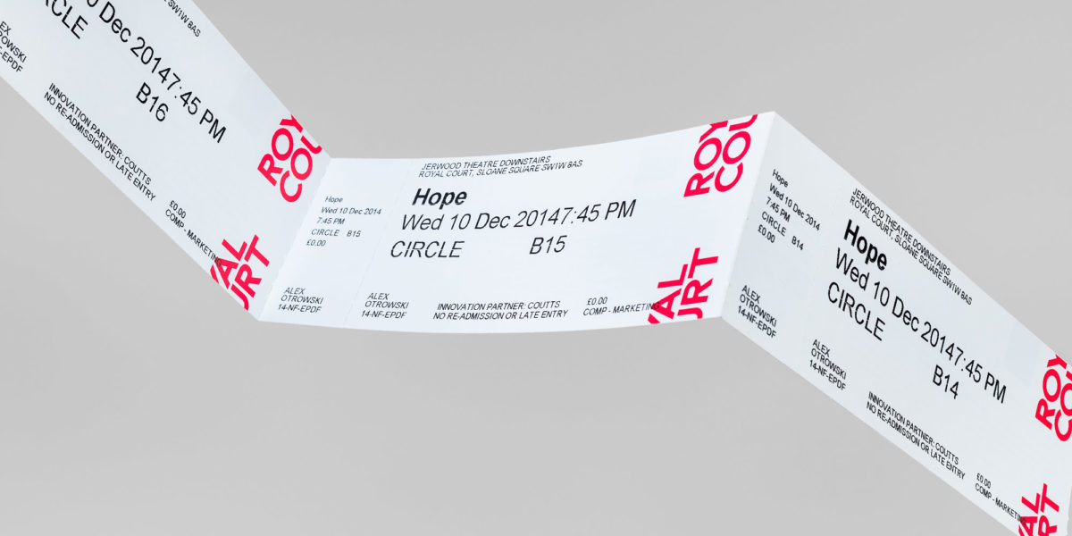
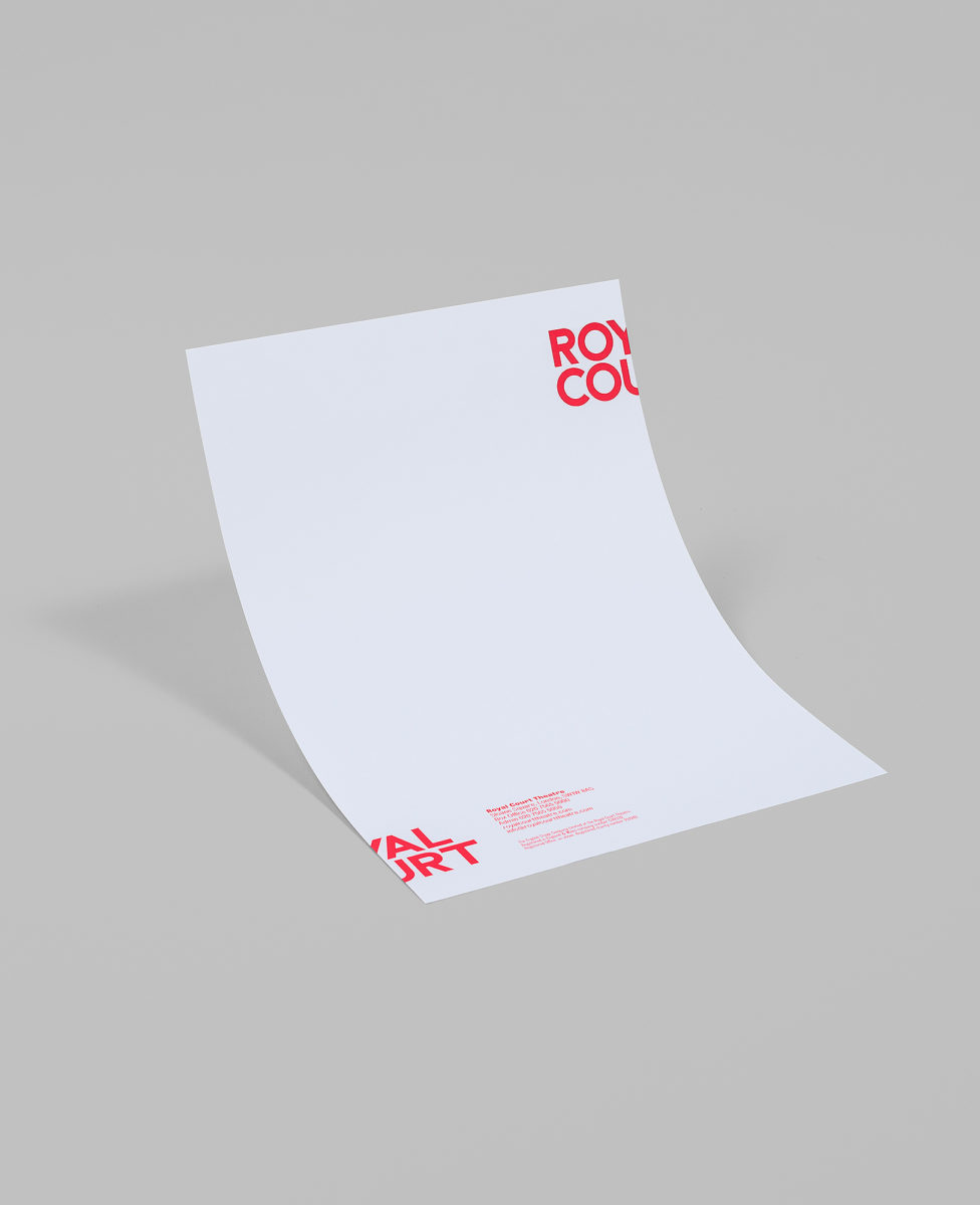
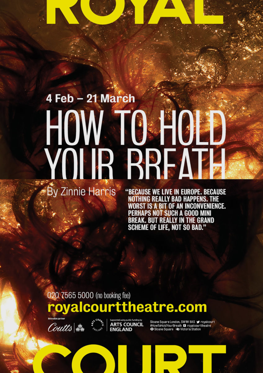
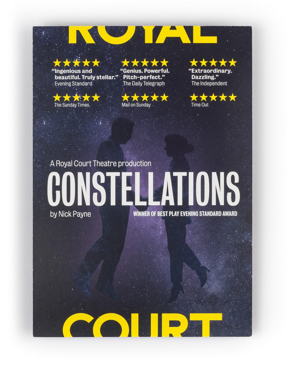
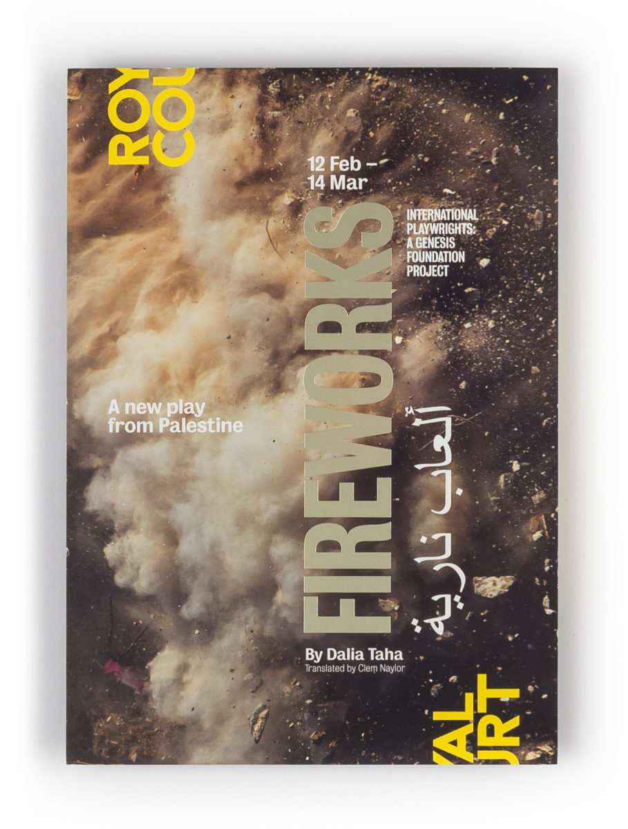
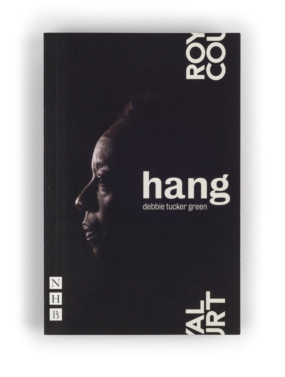
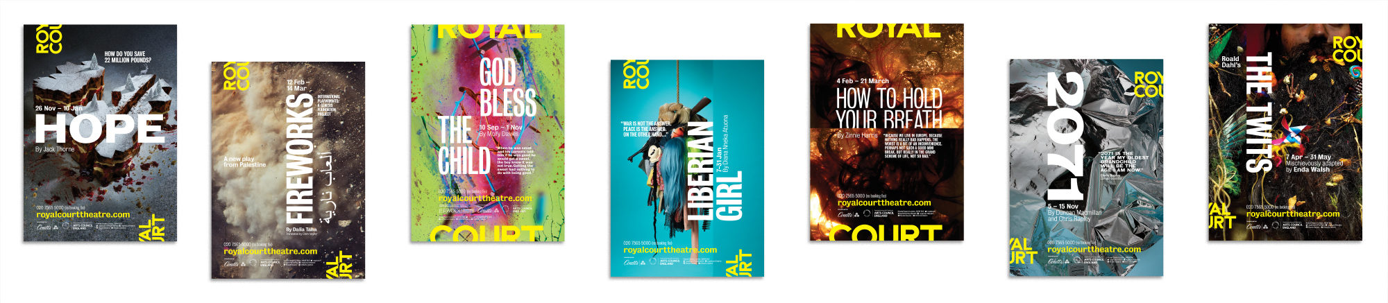
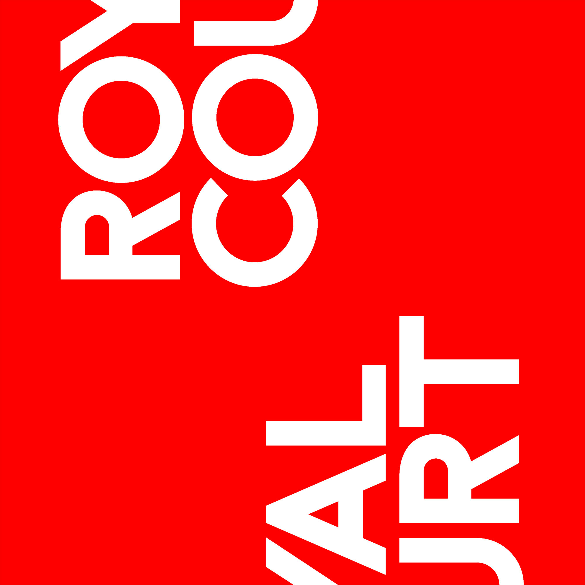
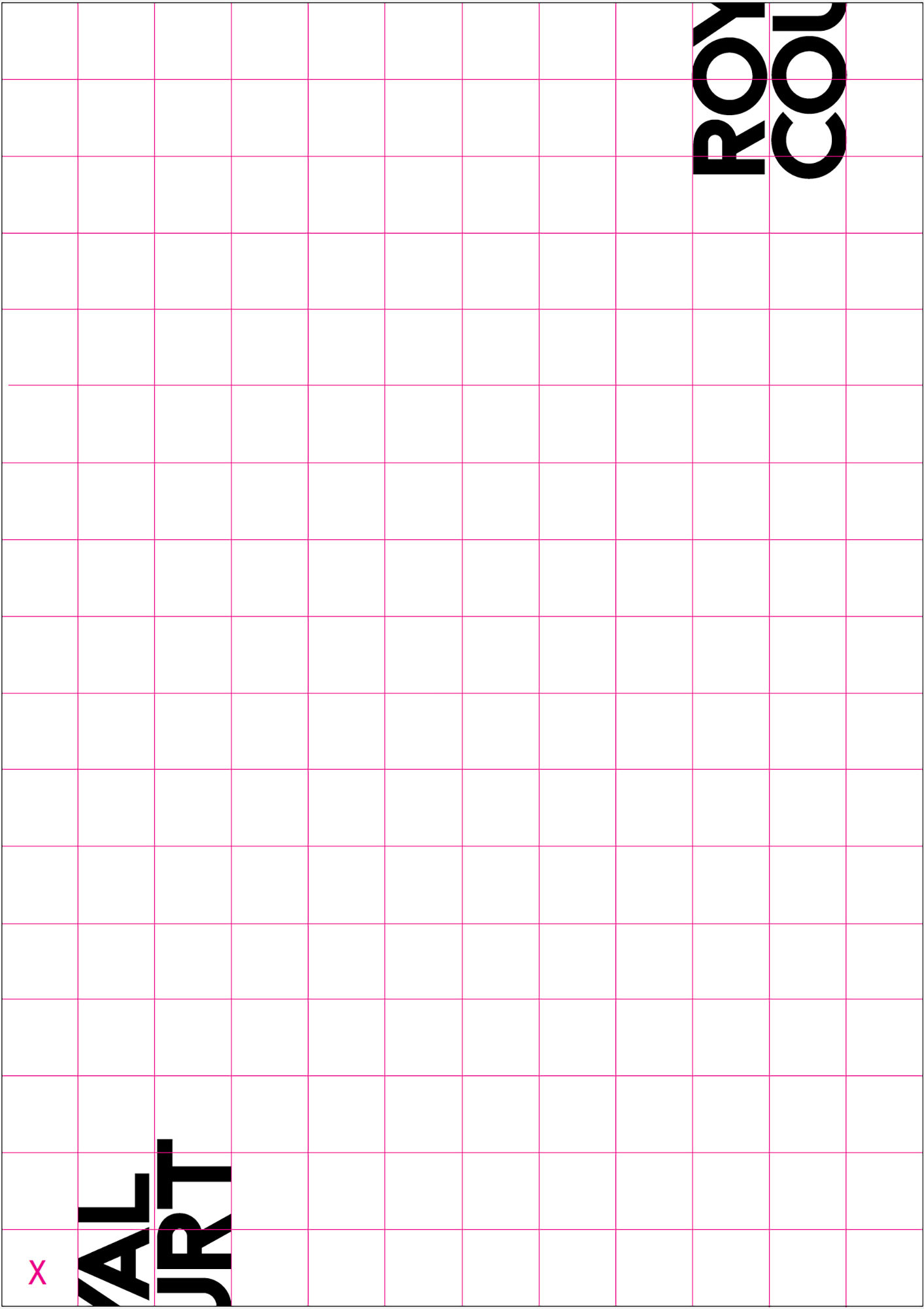
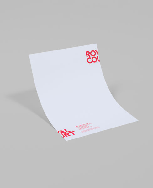
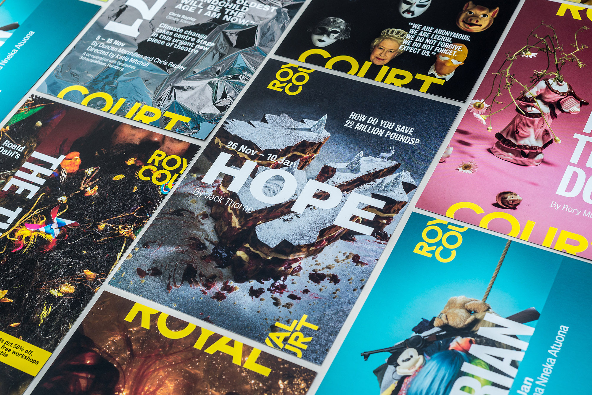
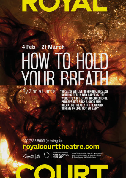
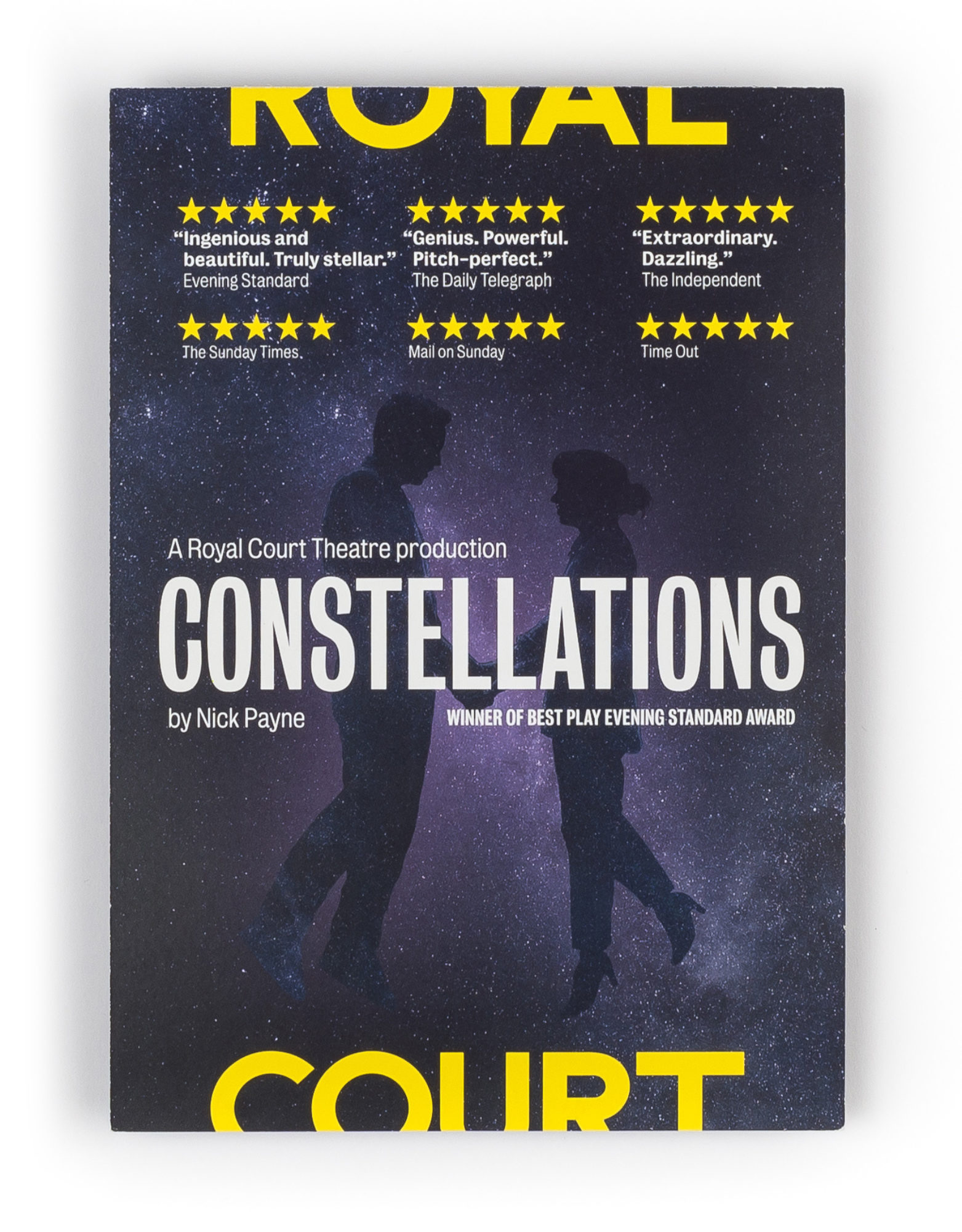
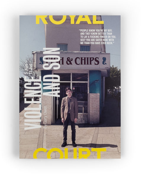
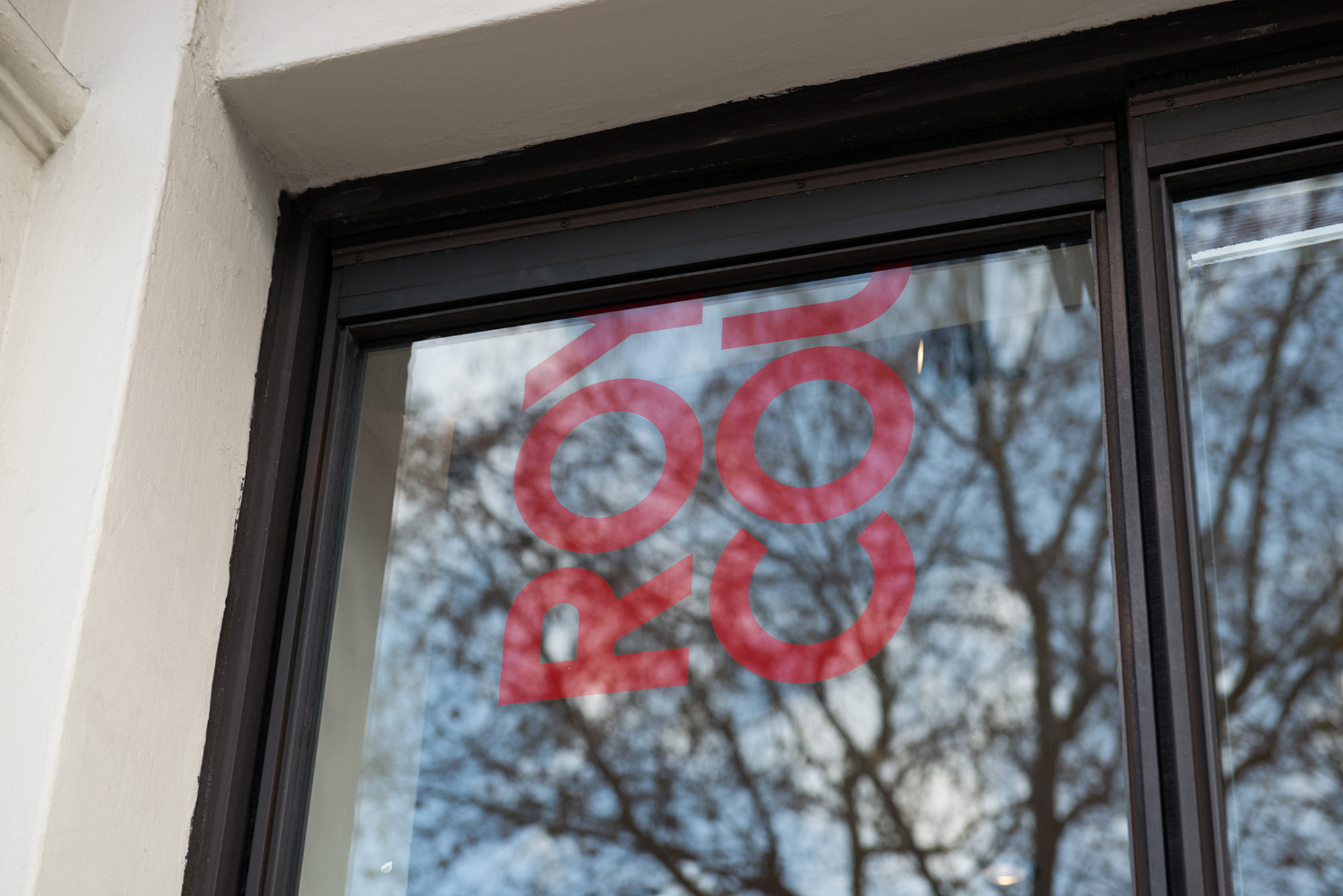
The project’s starting point was the Royal Court’s new positioning: ‘playing on the edge’. This focused strategy was a creative gift that we put to immediate use, creating a fragmented, ‘teleporting’ logo based on a re-draw of the theatre’s iconic front-of-house typography.

Catching Eyes
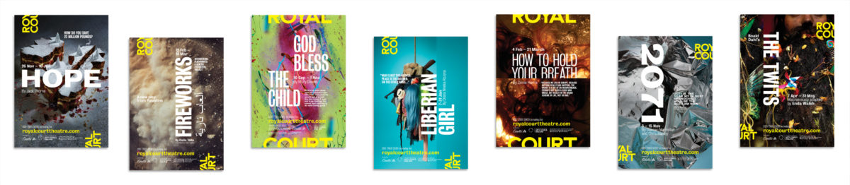
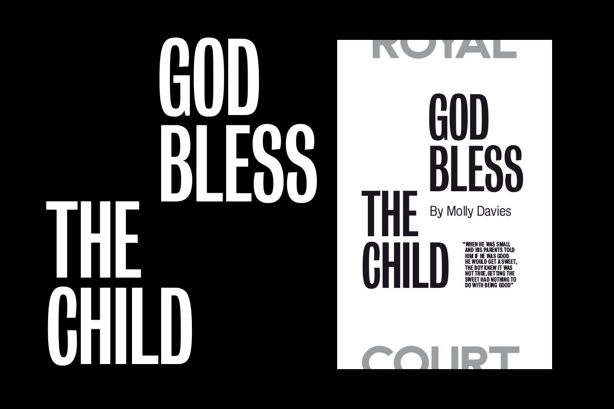
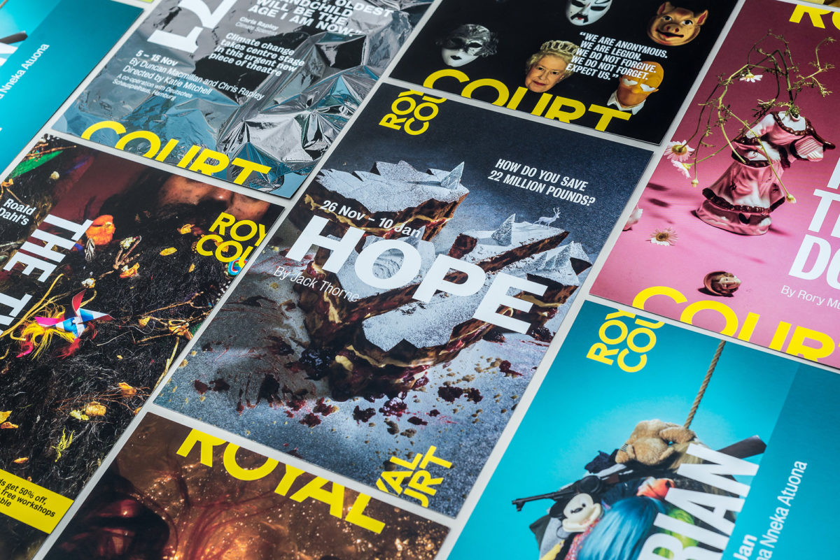
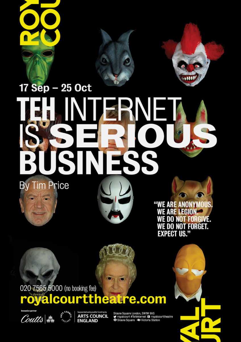
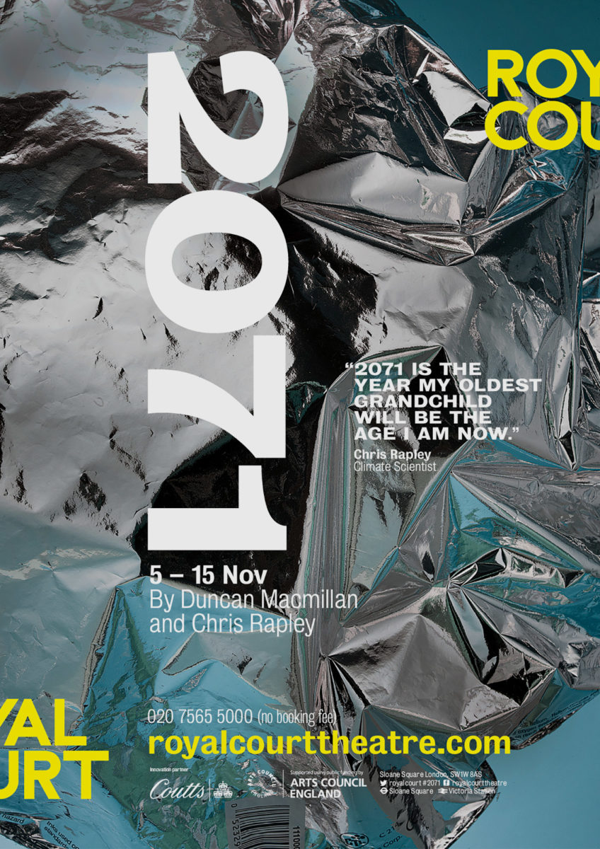
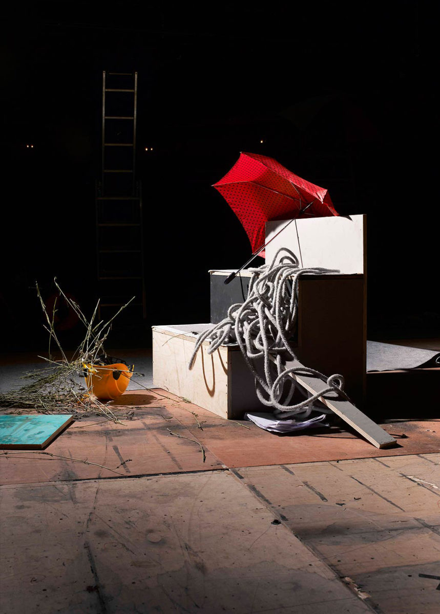
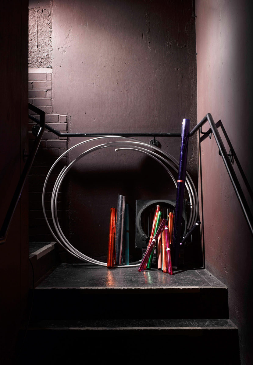
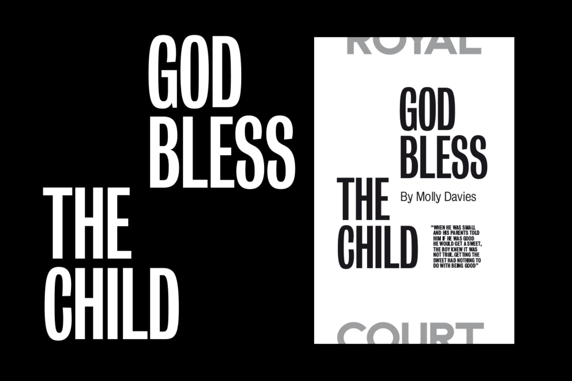
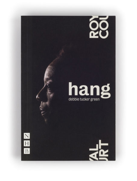
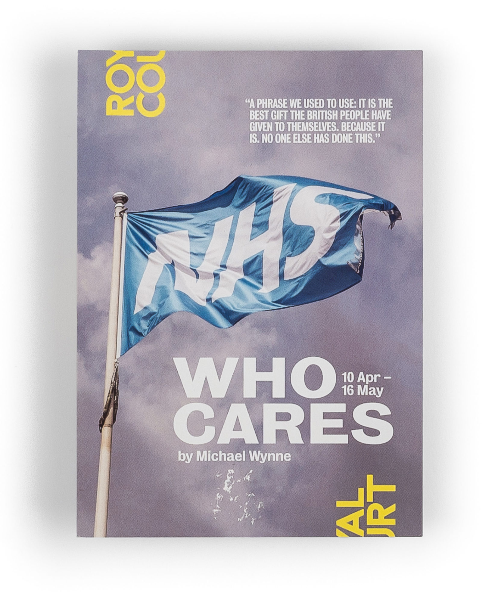
Having a striking and distinctive visual identity system only provides the framework for great communications. You still have to put great content into that framework, so we created a series of new images celebrating the radical new plays being showcased at the theatre.


Making Space
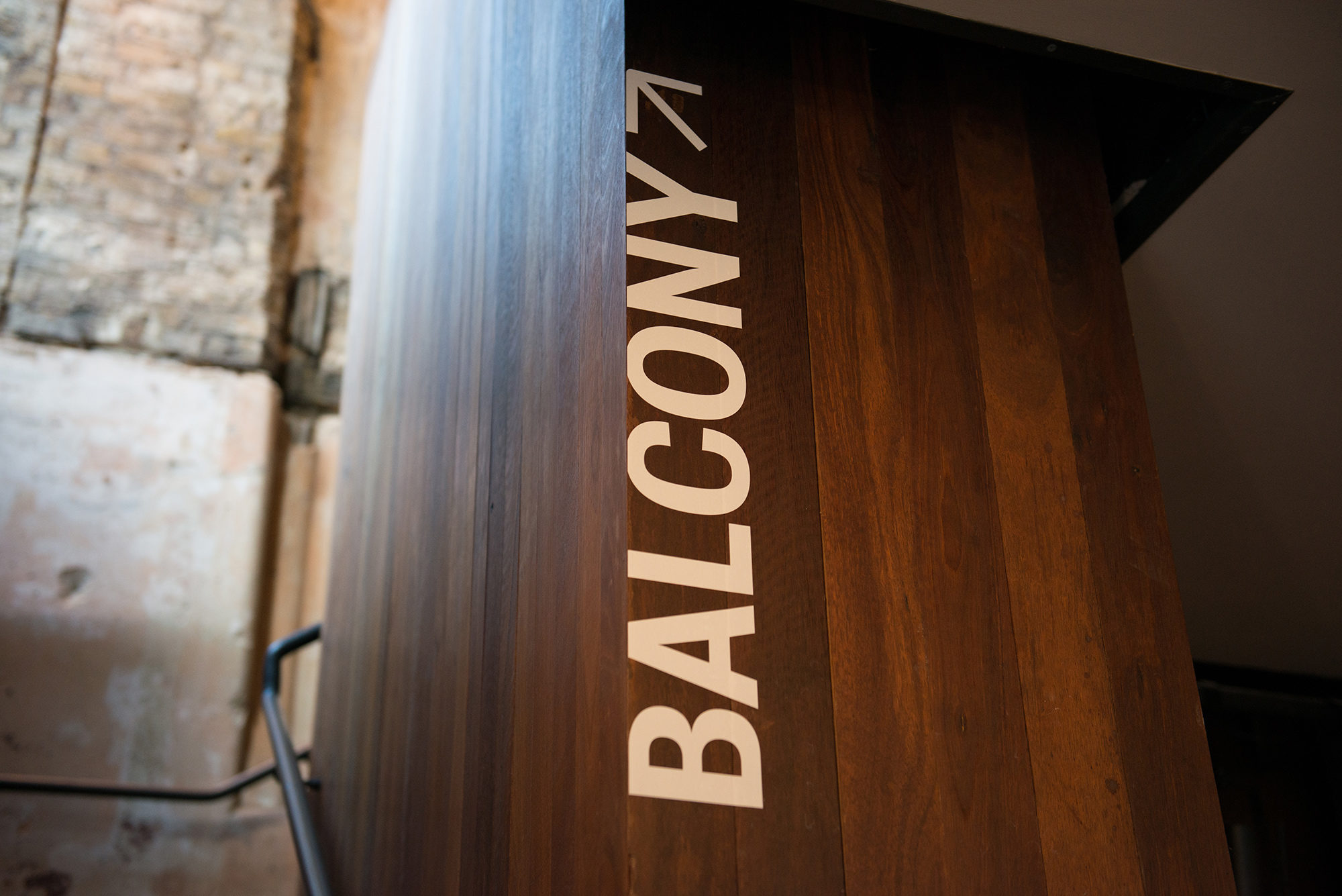
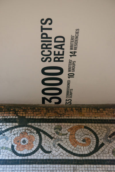
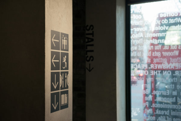
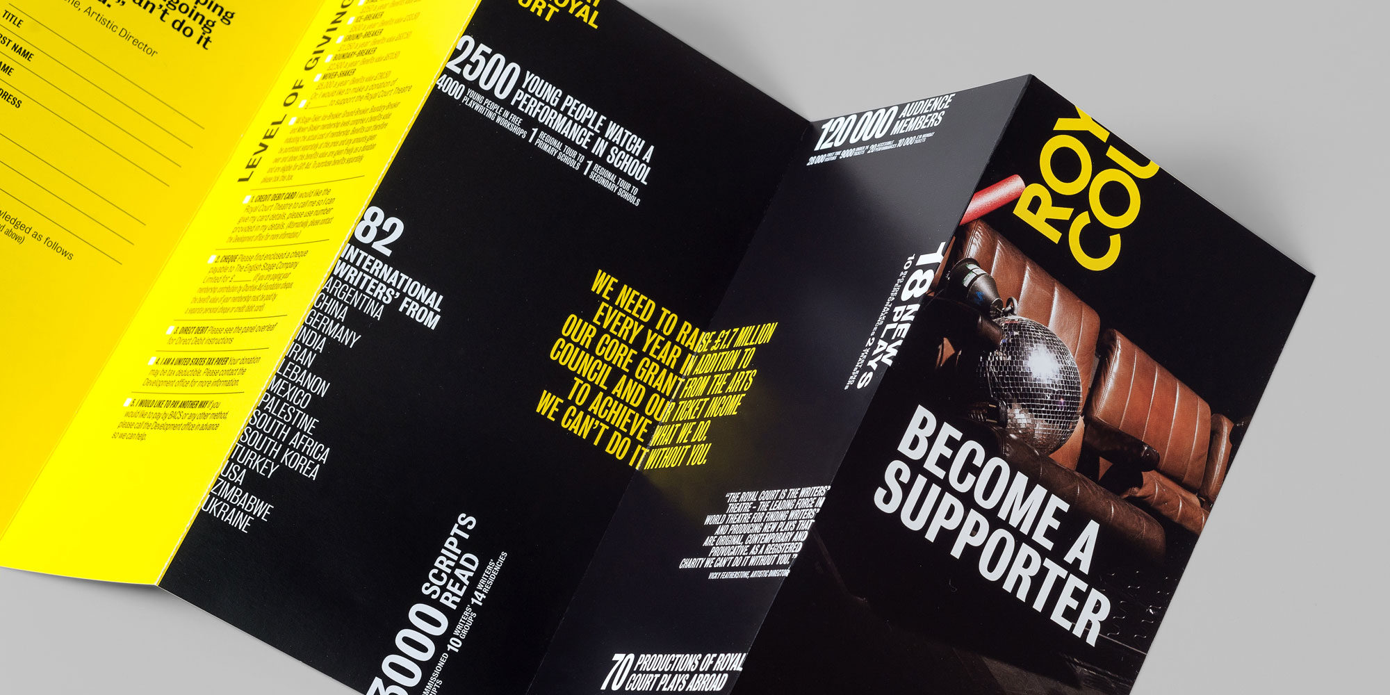
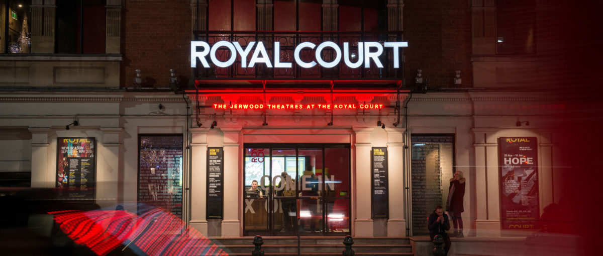
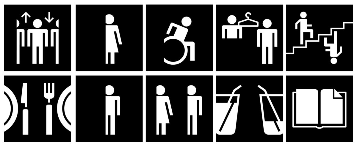
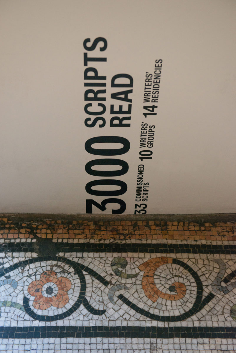
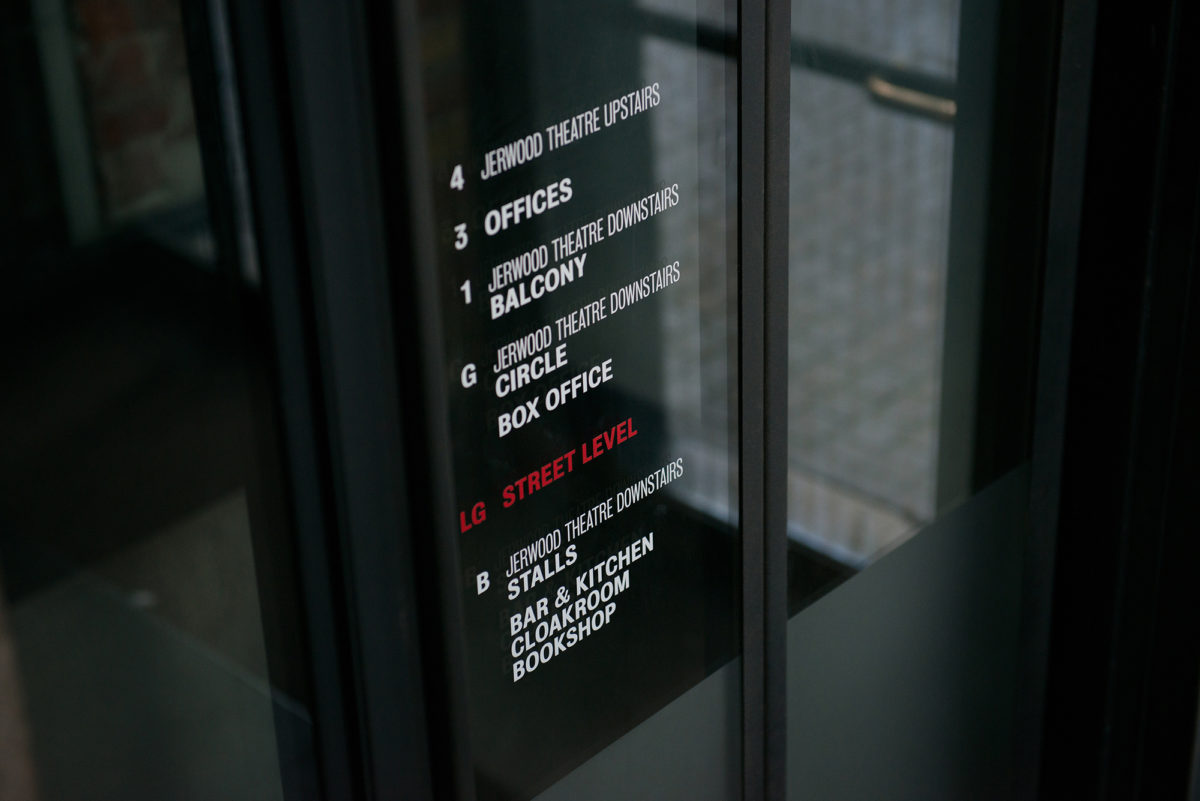
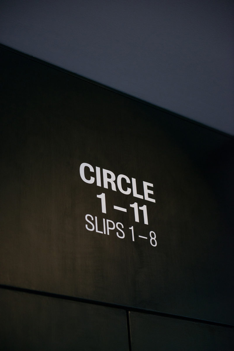
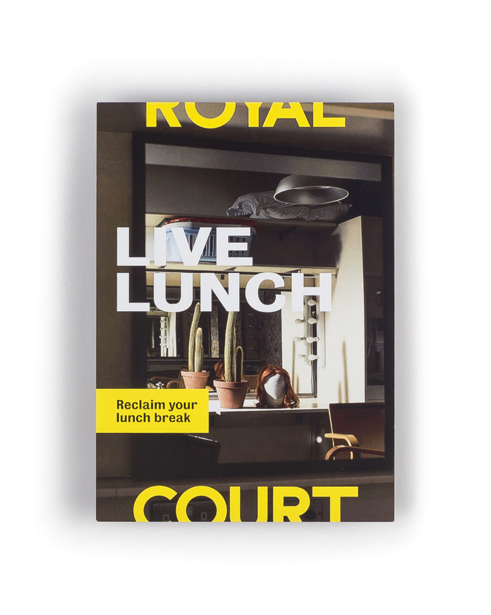
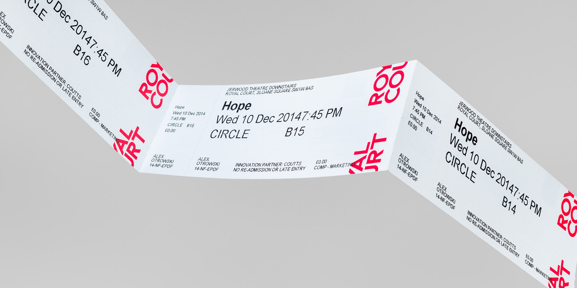
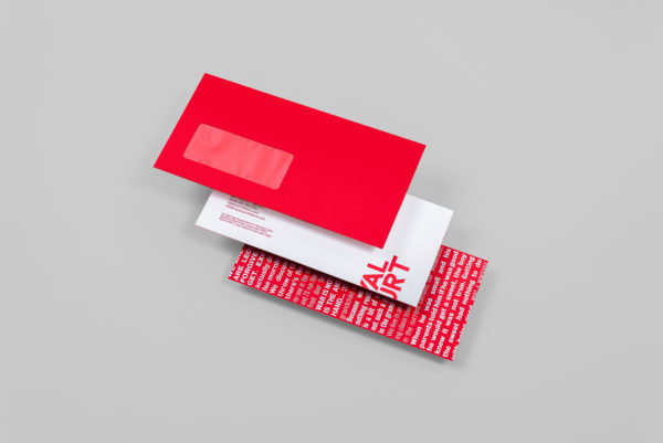
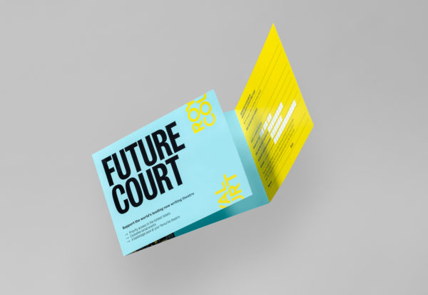
With a single, simple idea at the heart of the brand we were able to run it throughout the theatre itself. This enabled audiences to feel and experience the identity at every twist and turn of the on-site experience, and in all comms from uniforms to the website, tickets to toilet signs.