A mythical brand for
a beloved festival
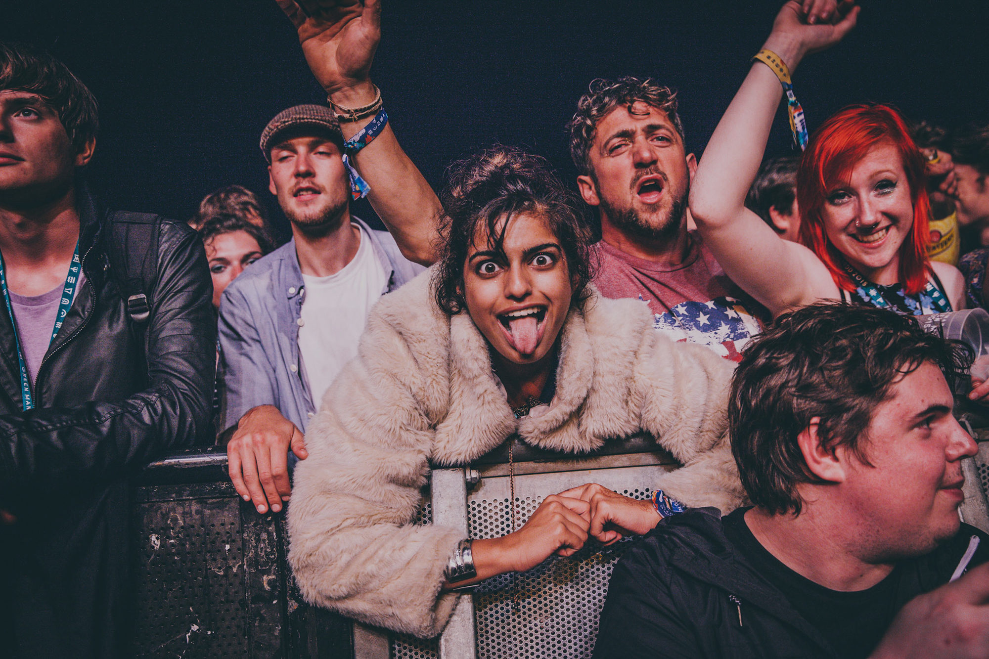
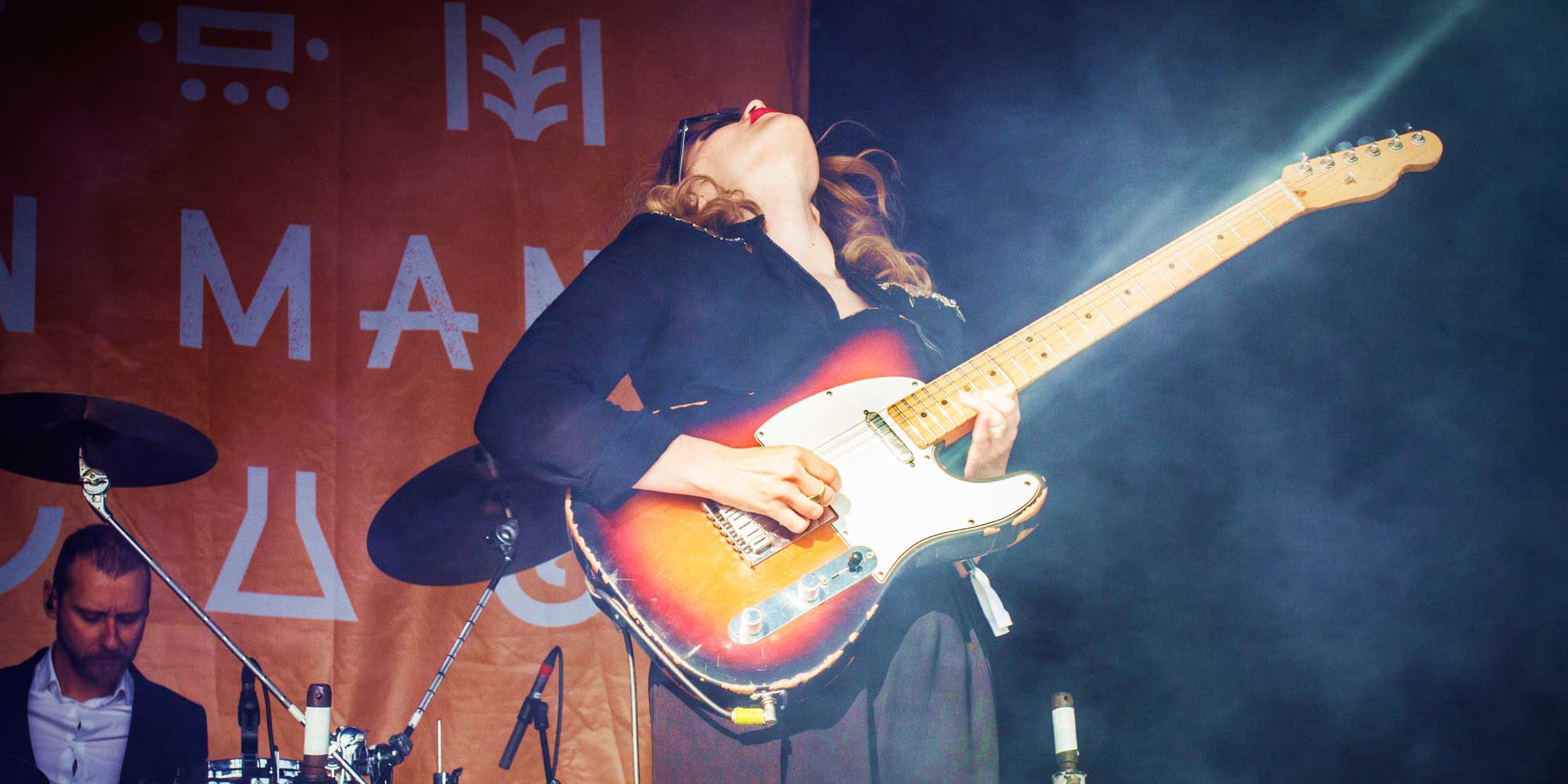
Not many brands can claim to have united a true tribe behind what they do, but the organisers of Green Man festival have. We helped them double-down on their cult status with a new brand identity, converting credibility into something unmistakable and iconic.
Lovers were invited to advise Green Man on how a new brand identity could add value to their world. We would go on to develop a rich and distinctive identity, subsequently much-imitated in the festival category, enhancing audience connection at every touch point.
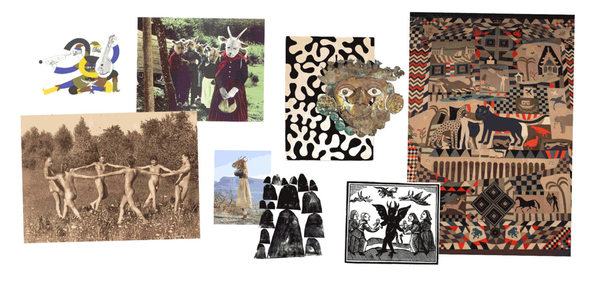
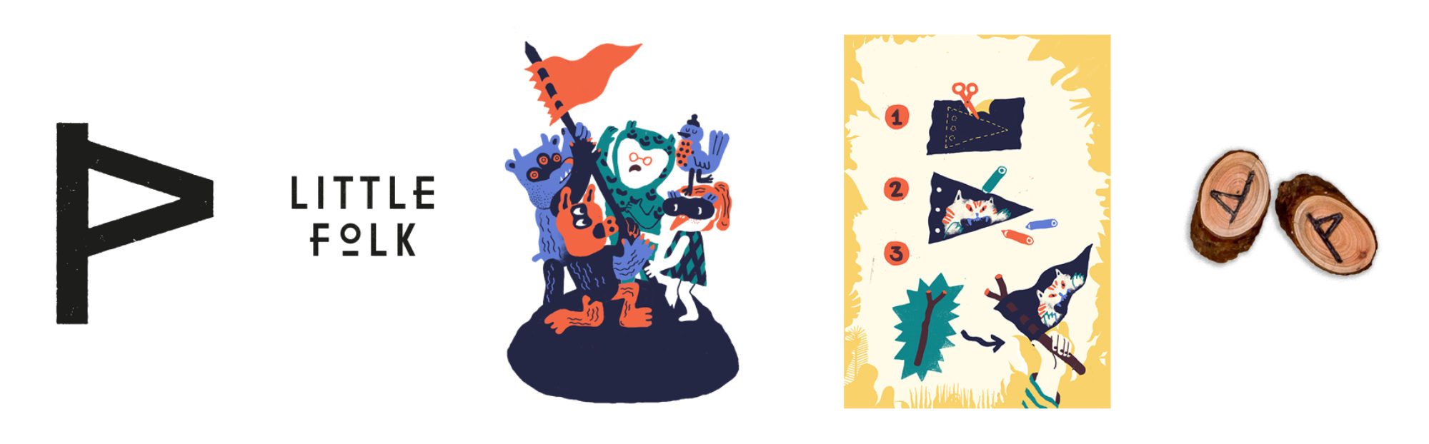
Myth & Legend
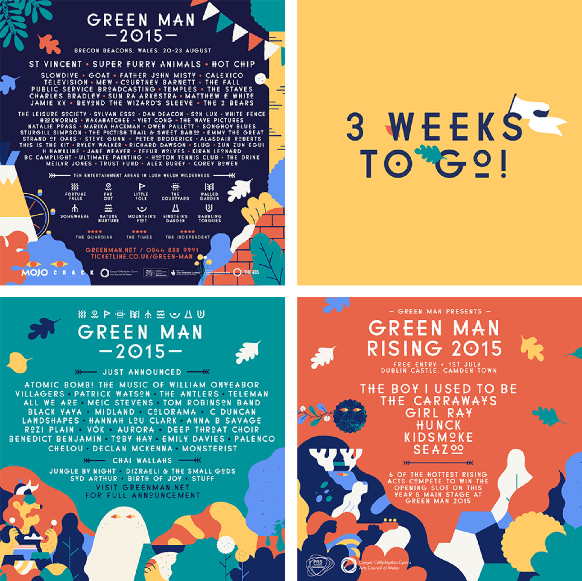
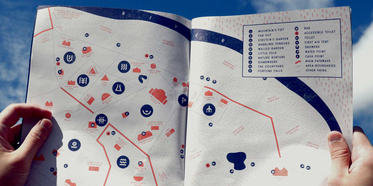
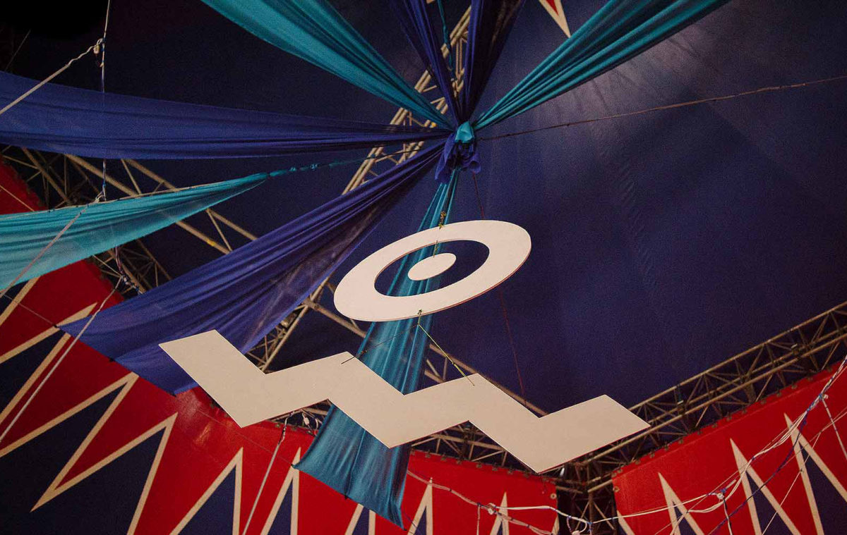
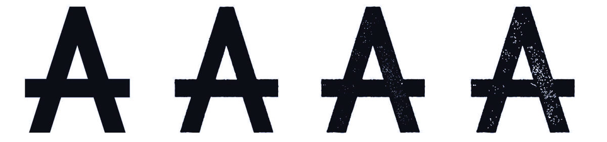
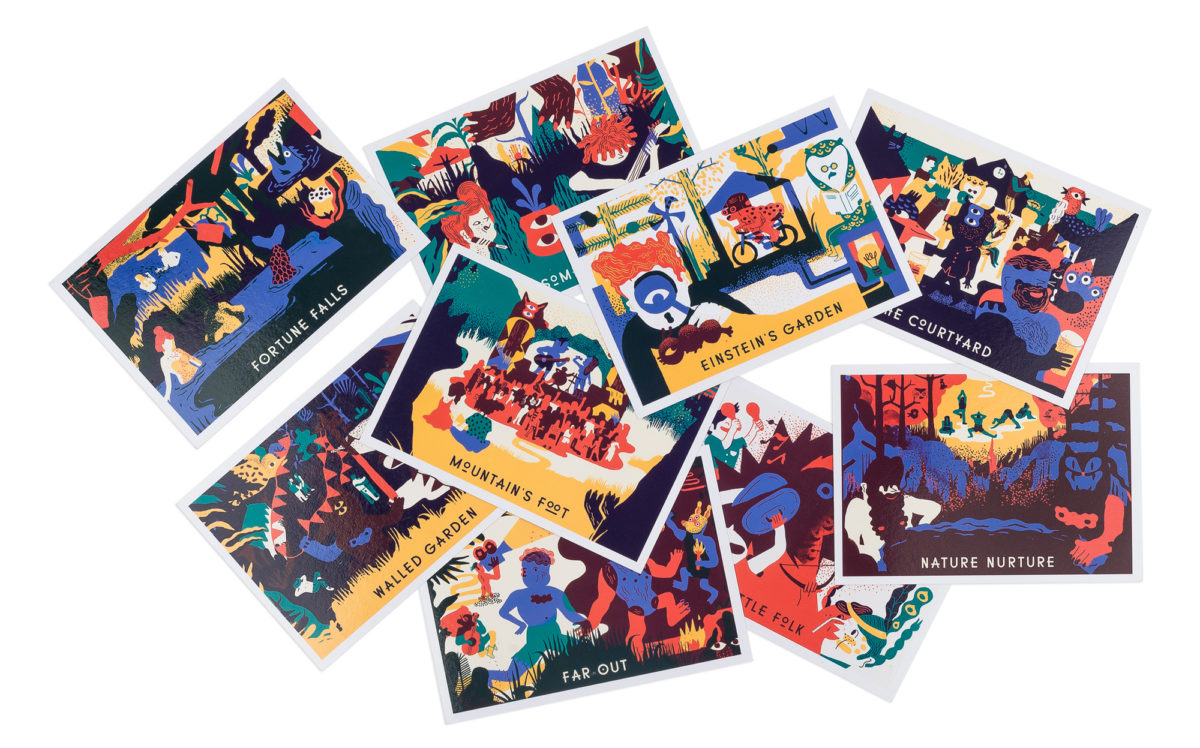
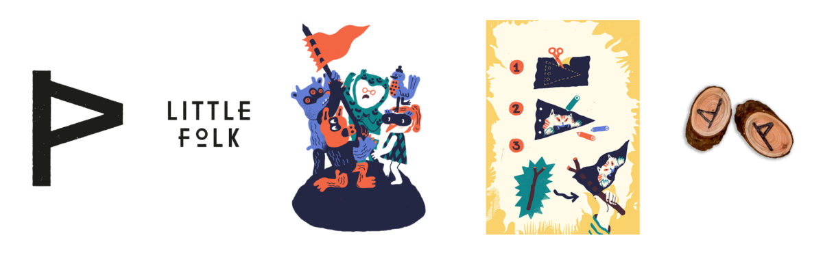
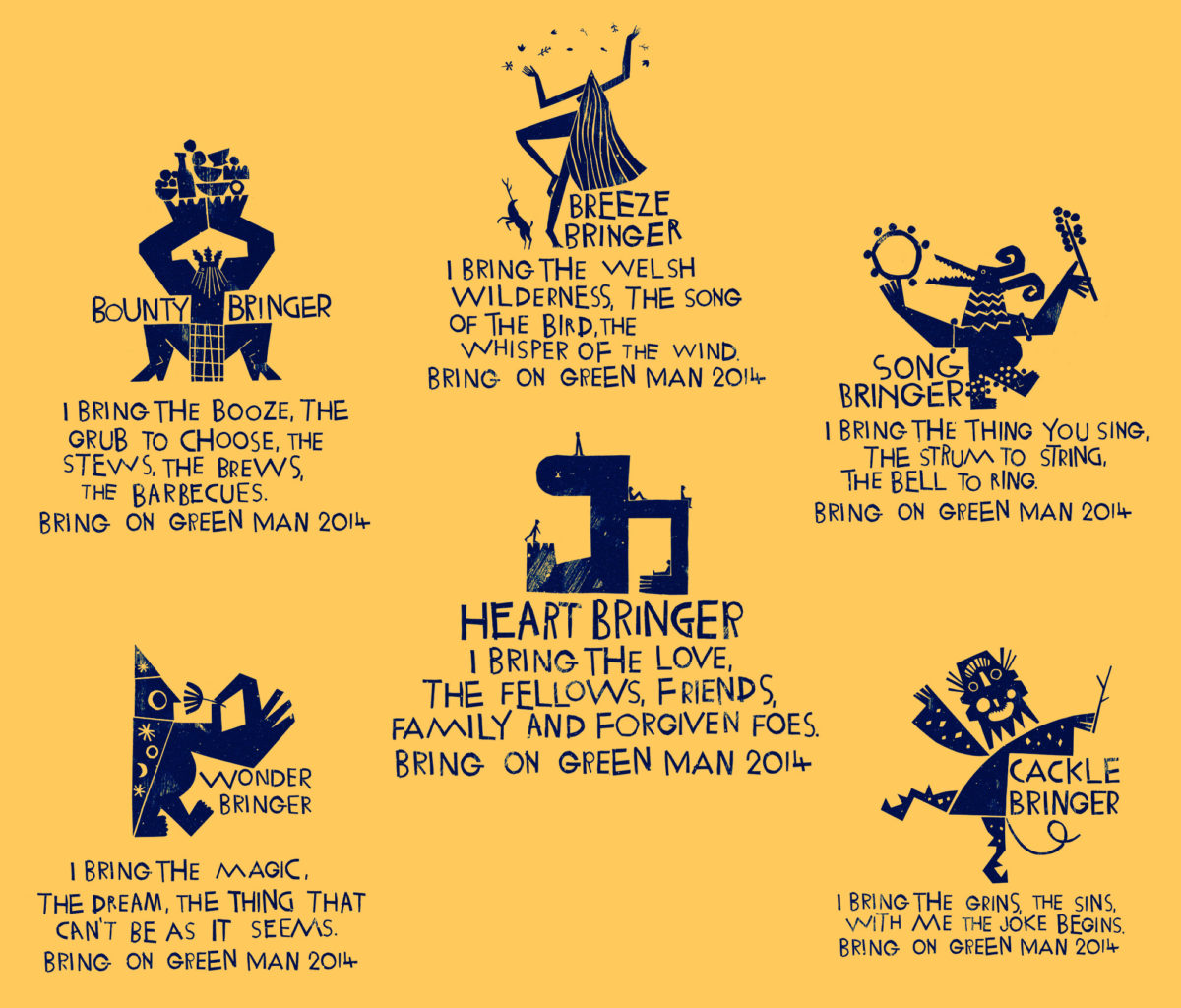
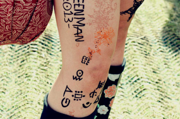
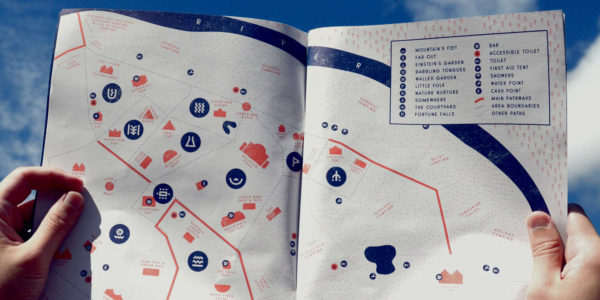
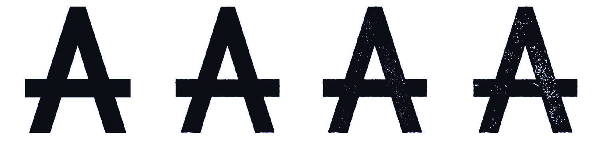
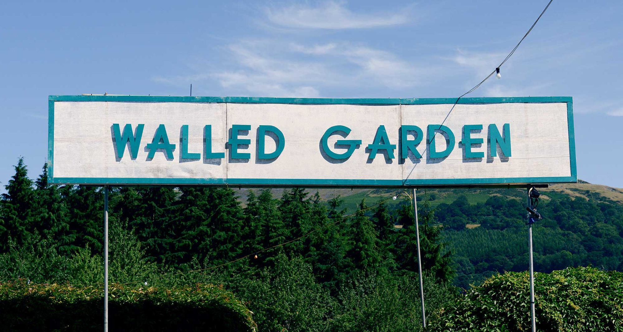
We invented a native tongue for Green Man, blessing each of its ten distinct areas with a rune-like symbol as part of an omnipresent and distinctive typeface. This codified identity gave us a way to brand but also sub-brand the festival, whilst retaining some vital mystery.


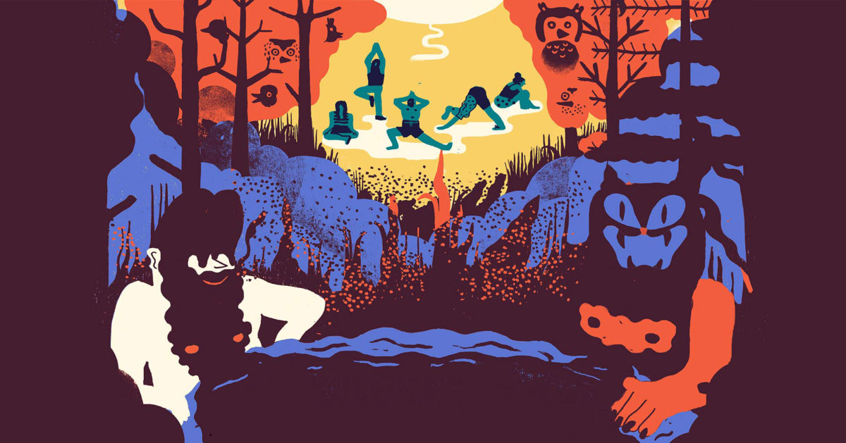
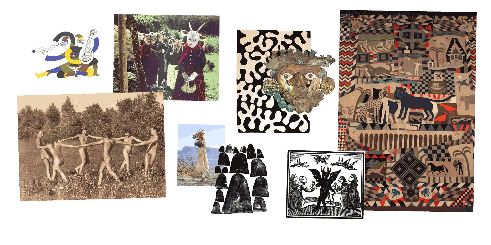
Going Pagan
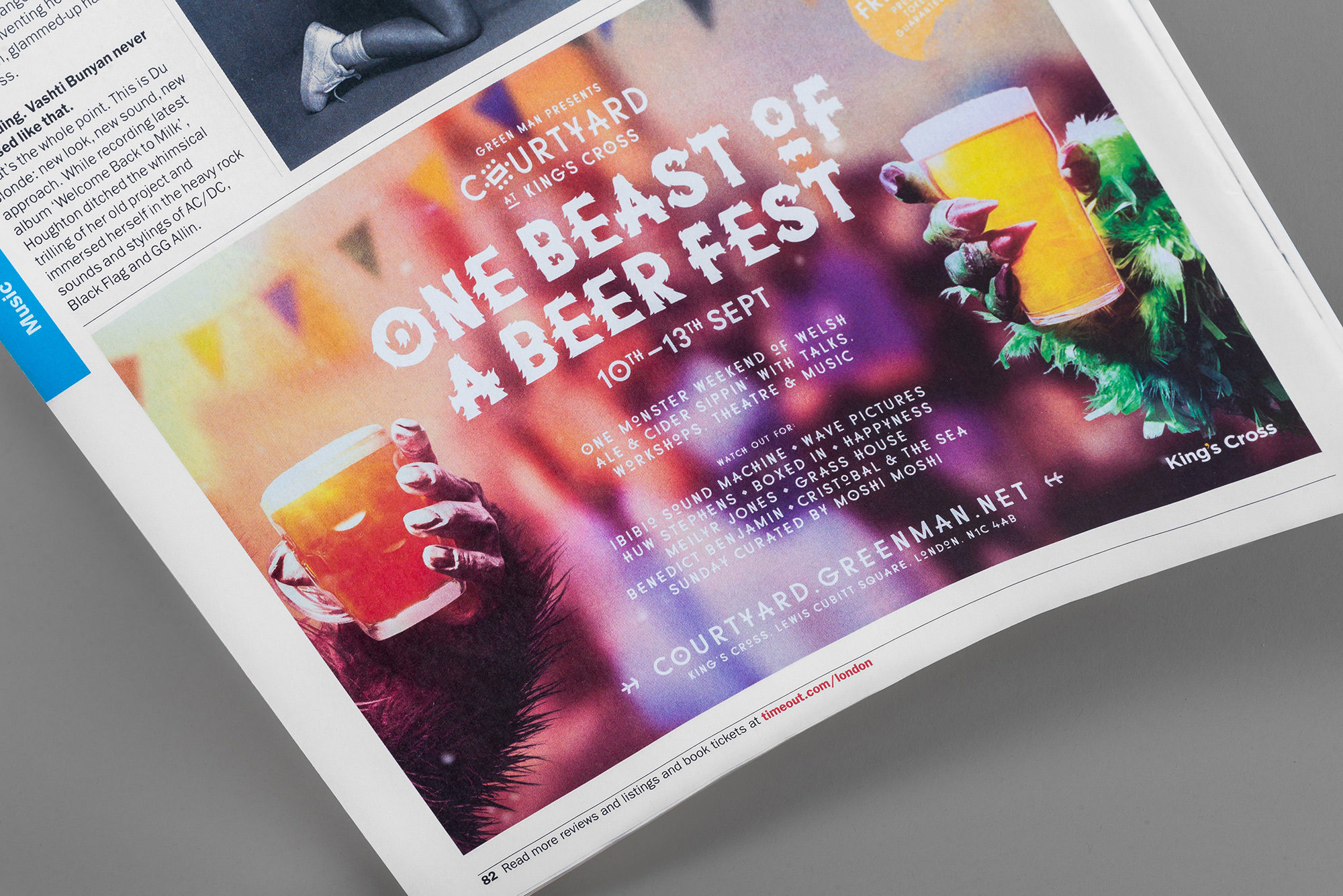
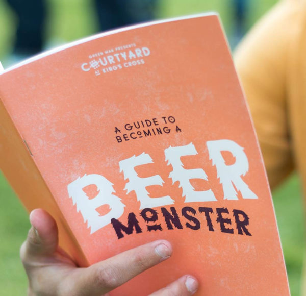
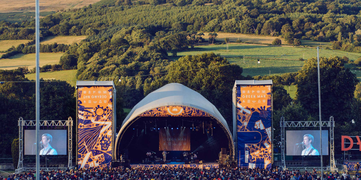
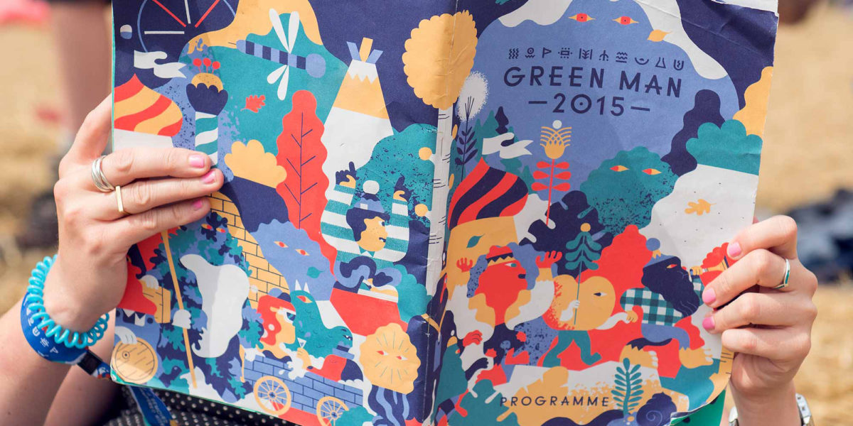
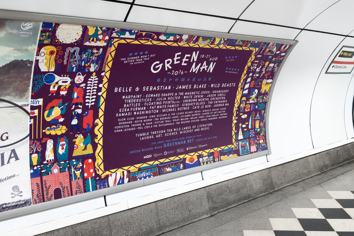
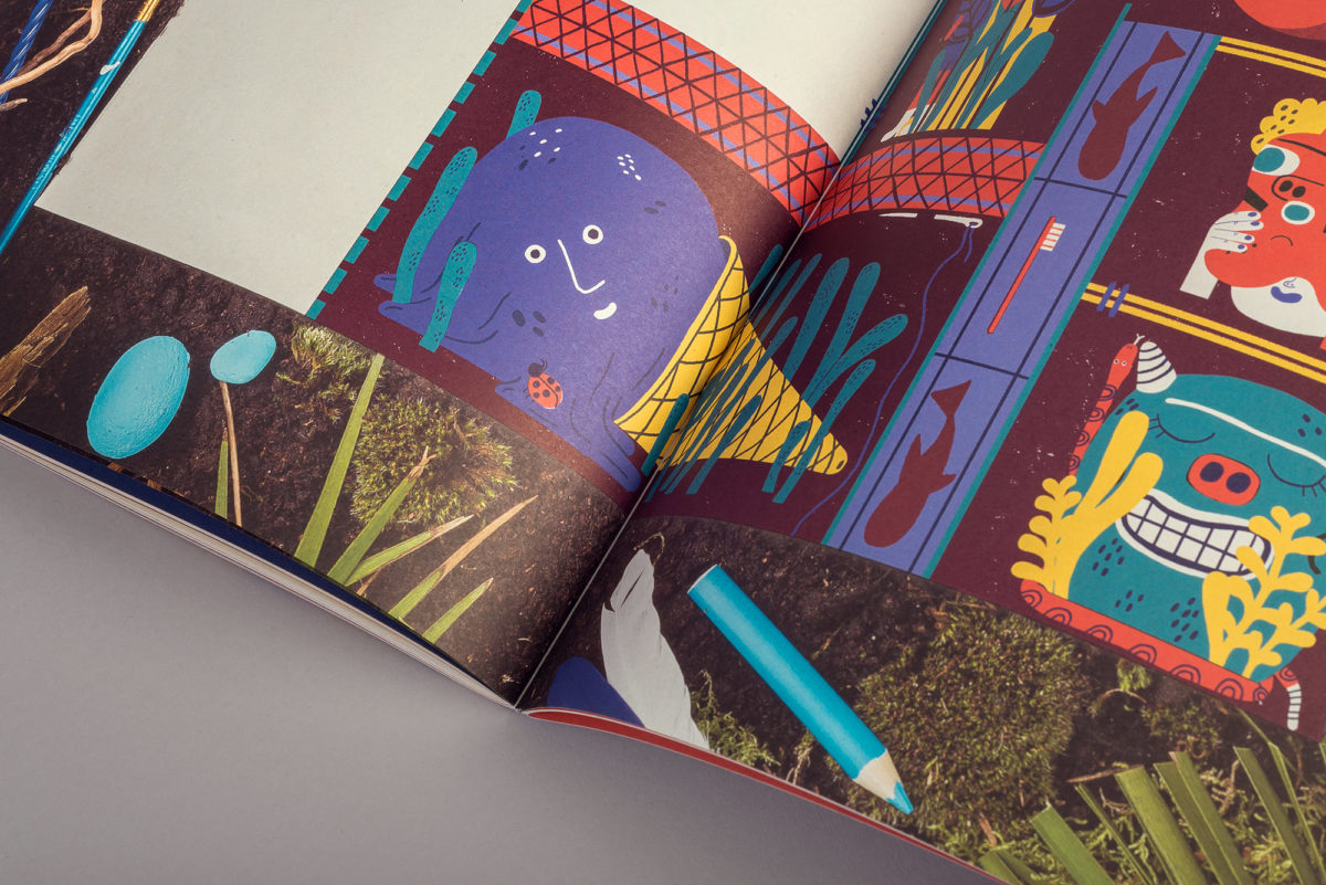
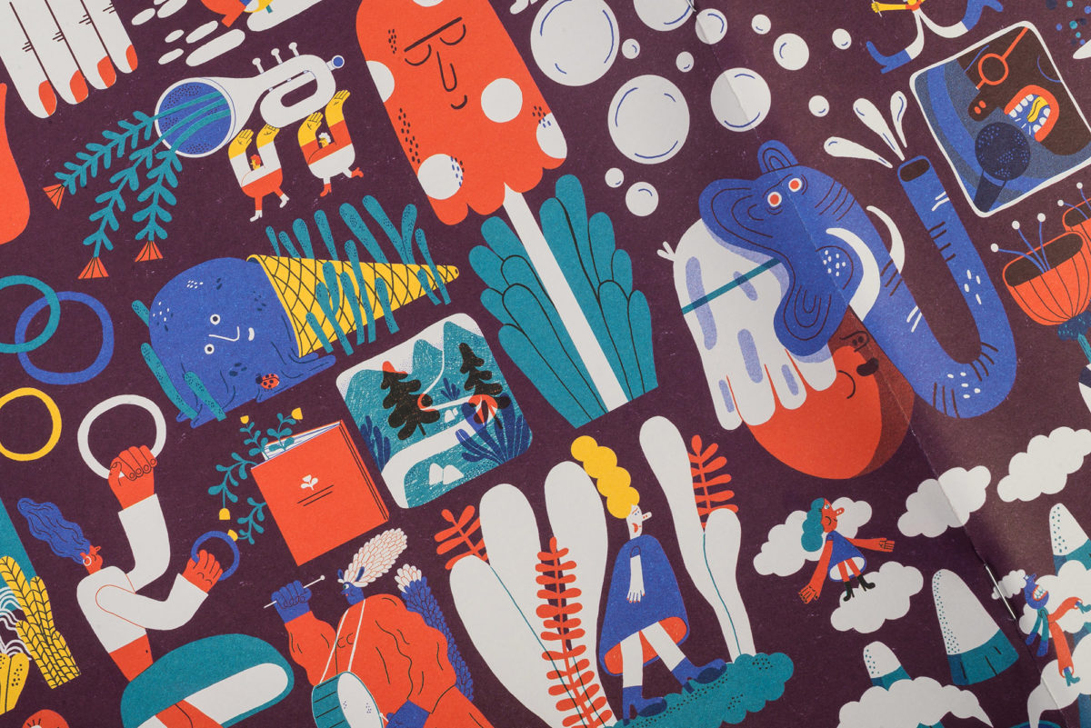
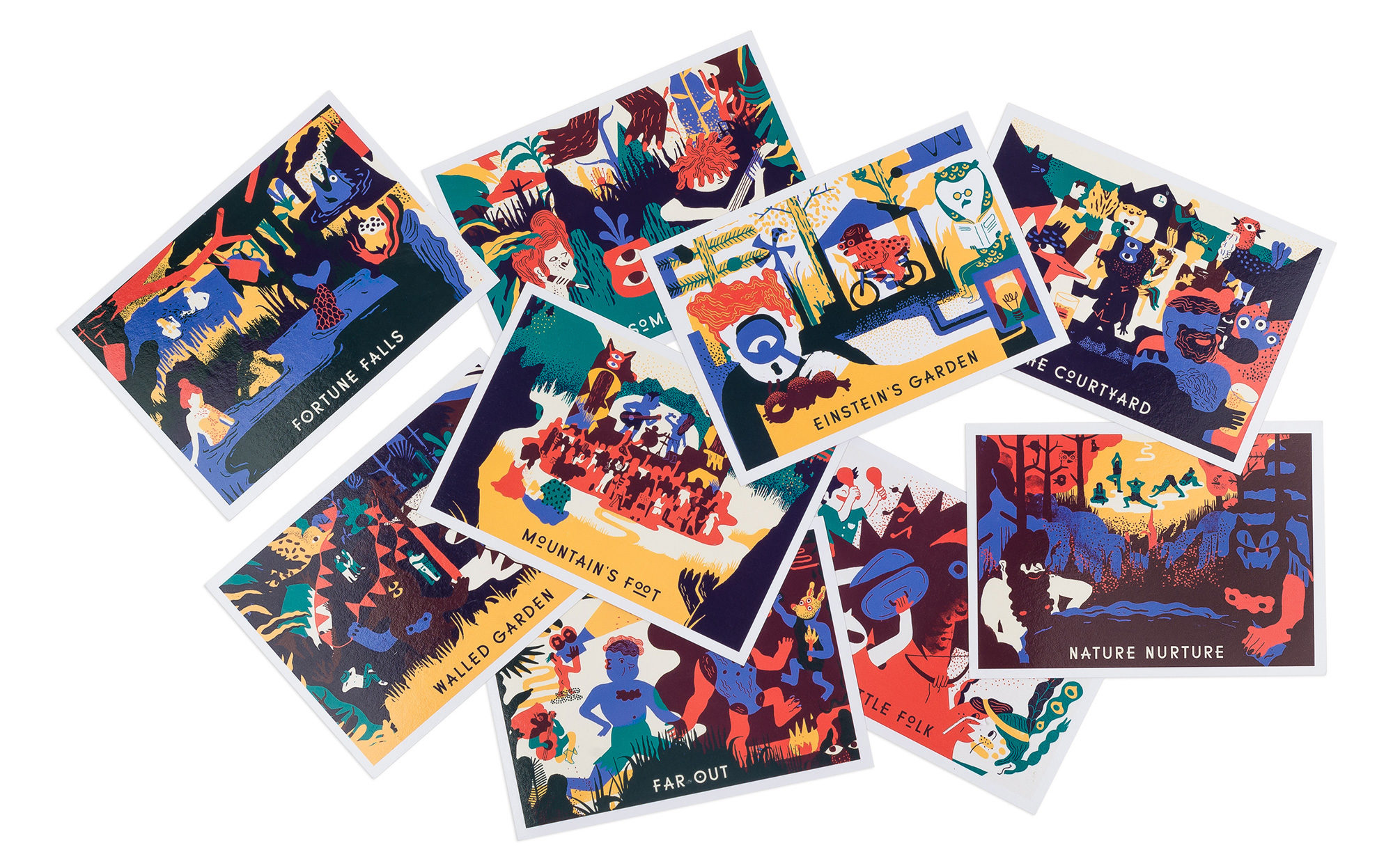
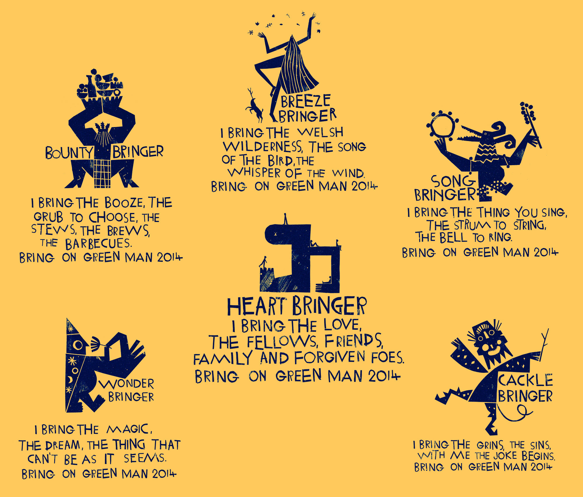
We flooded the Green Man world with rich, wild and strange illustrations capturing the atmosphere of the event itself. We appointed a different artist each year to bring these to life, allowing the identity to grow and update from year-to-year, much how folk tales evolve.

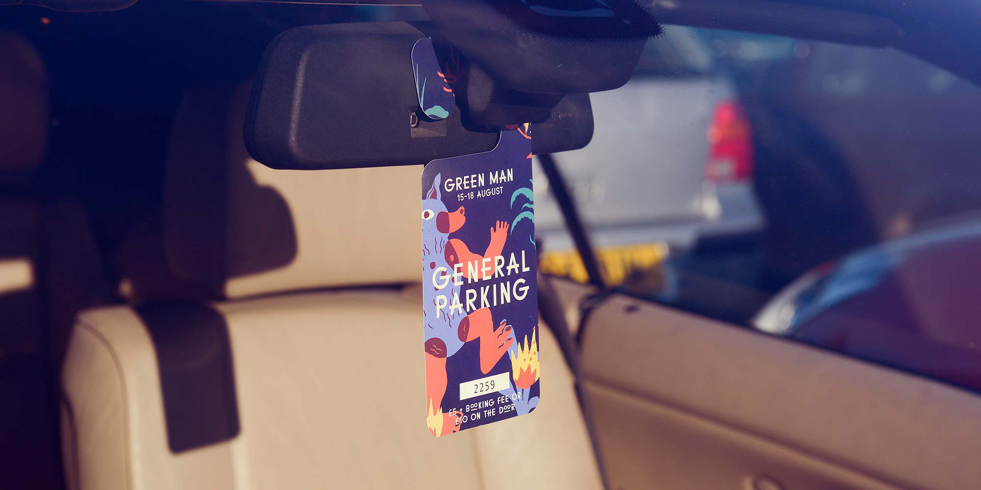
Nice Touch
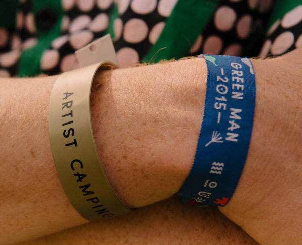
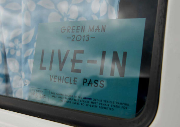
The humble car parking permit, we learned, is one of the first things Green Man go-ers receive in the post. We ditched the old A4 black-and-white print out approach and created some genuinely wonderful hangers to get fans excited about their future trip.
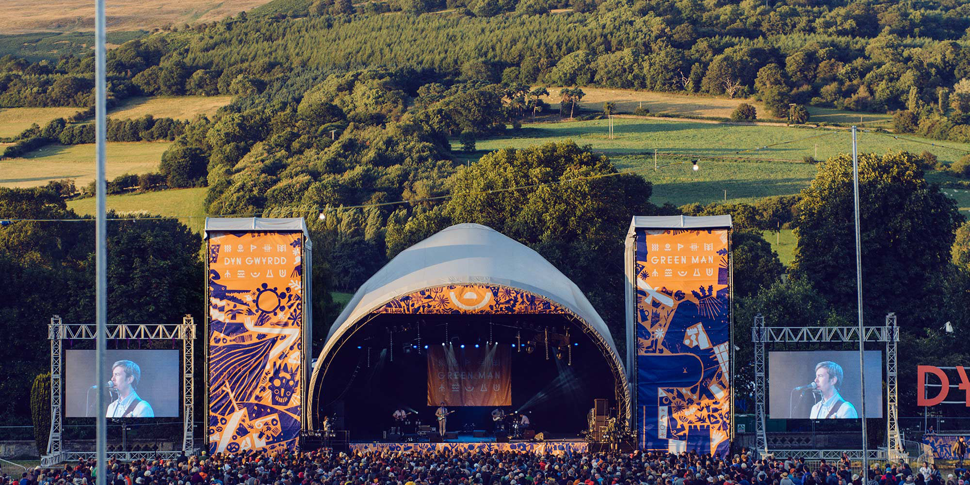

It’s An Experience
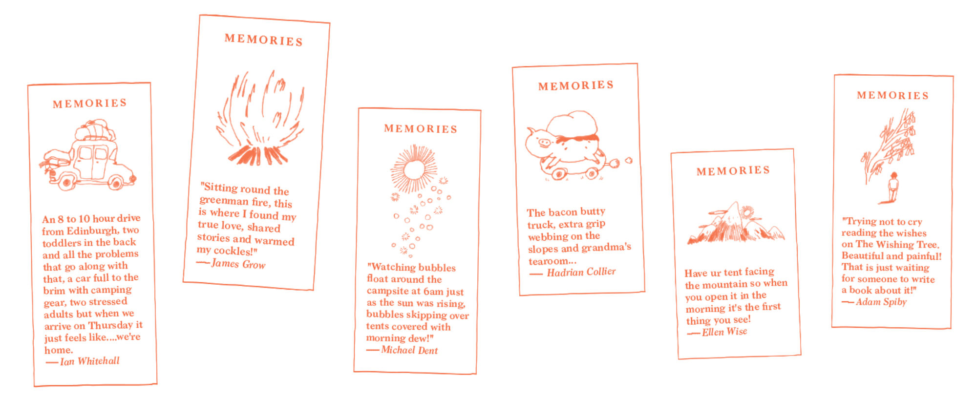
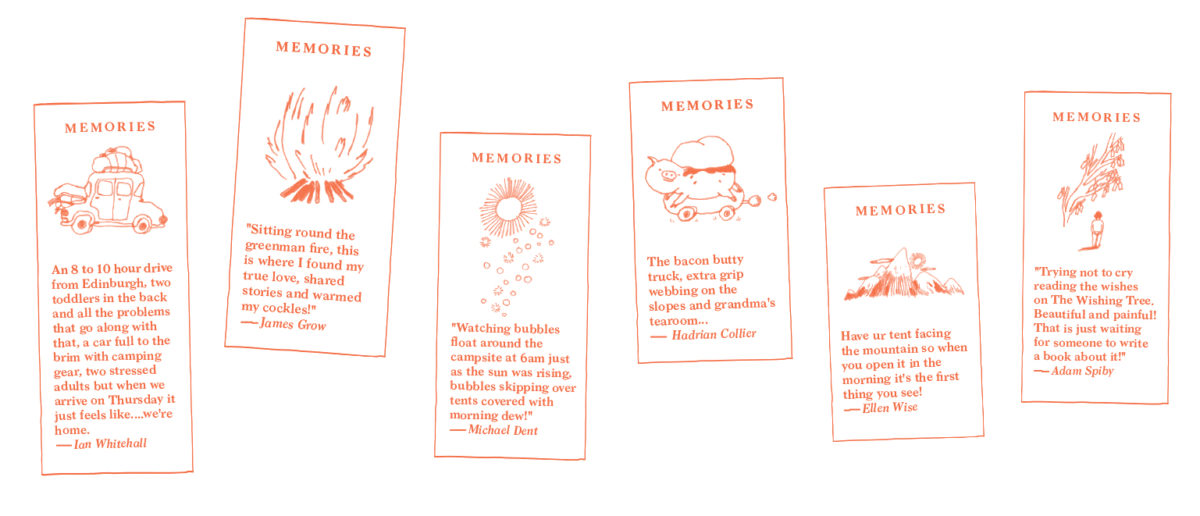
At Green Man you become immersed in world that’s visually surprising. We made sure the Green Man website would capture this feeling, since tens of thousands of ticket seekers would all visit it ahead of each year’s festival, including newbies trying to understand the vibe.