A calm brand inviting
people to become nature
James & Helena want more of us to realise we could become part of nature after we die. They run Tithe Green, a uniquely beautiful group of natural burial sites dotted around the UK. So how to brand something most of us don’t understand, or are even afraid of?
Lovers were invited to position Tithe Green as leaders in their category. First defining the core ideas at the heart of the brand, we developed a new visual identity, messaging and tone of voice framework, bringing everything to life through a new online presence and on-site touchpoints.
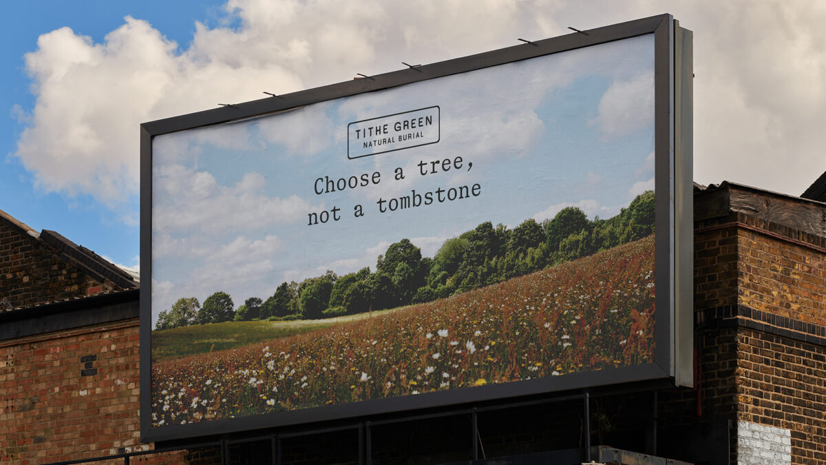
Choose a tree,
not a tombstone
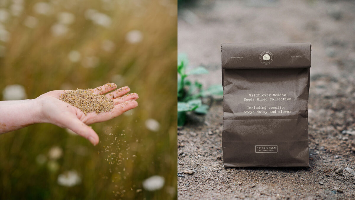
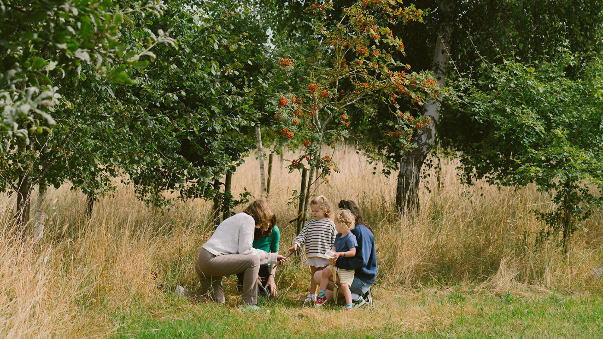
At Tithe Green, natural burial means being buried in a woodland or wildflower meadow using only natural materials, with the option to plant a tree in that spot. We let this simple service detail live as the brand’s main message, gently distancing from traditional cemeteries.

Calmly
Hospitable
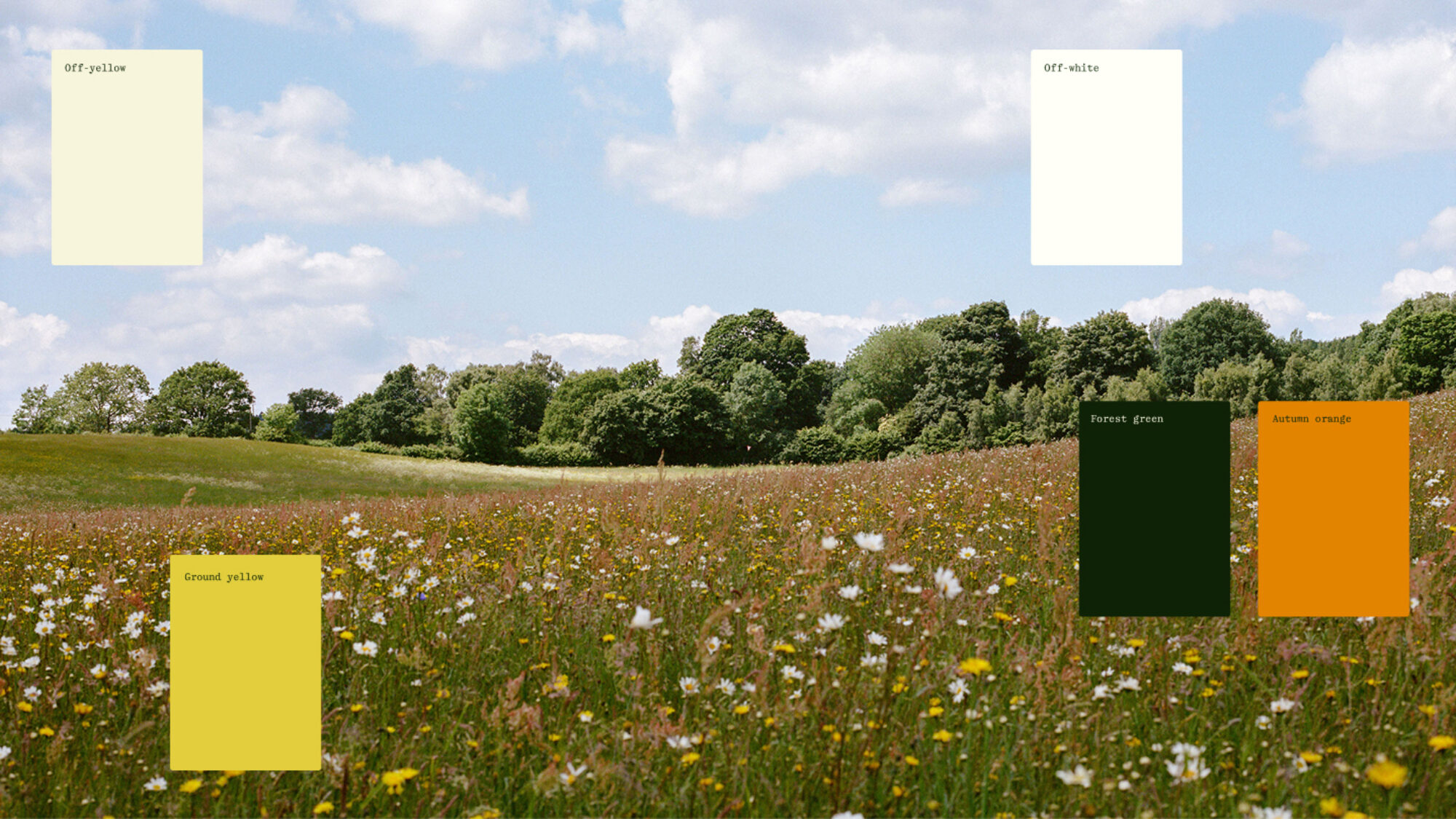
A lot of death-related service brands out there make strange visual choices, from the oddly gothic to the weirdly cheerful, and everything in between. We went unfussy and straightforward, reminiscent of great hospitality and trustworthy outdoor experiences.
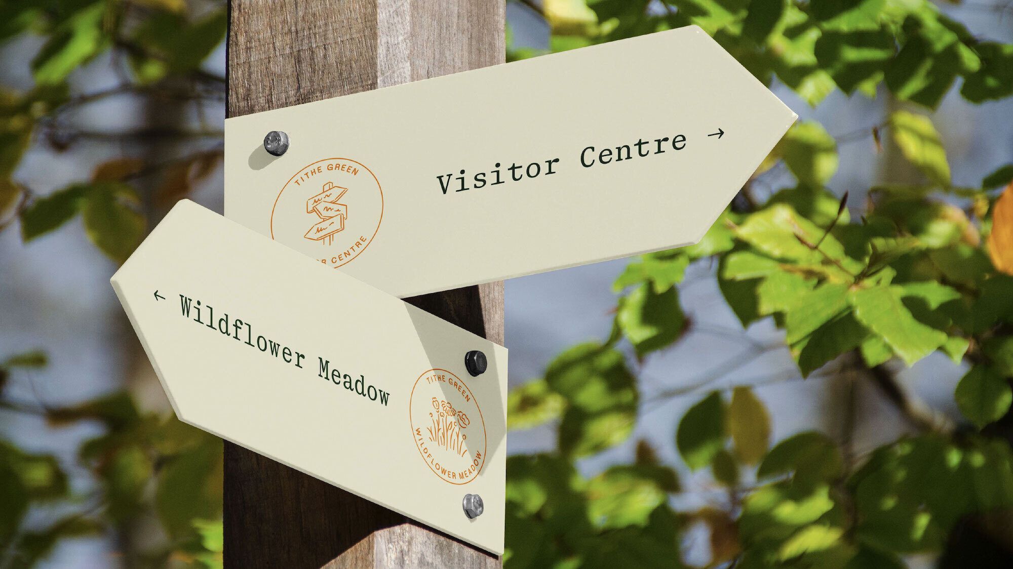

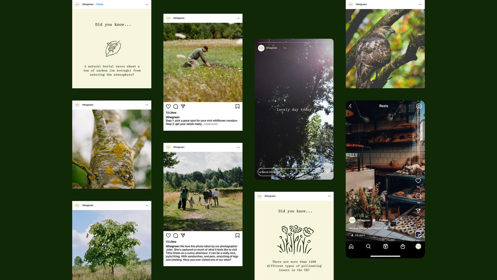
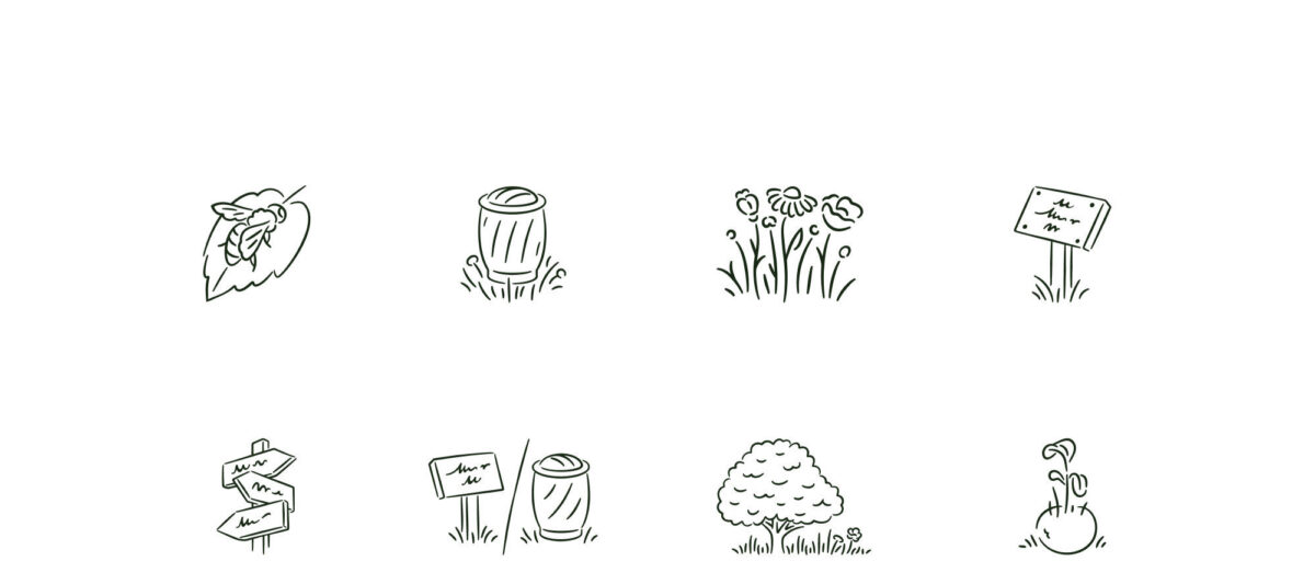
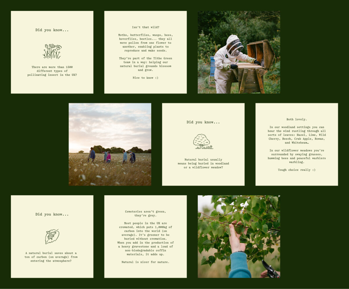
There’s quite a bit to explain about natural burial, so the brand had to be equipped with visual assets to help build understanding. We created a set of illustrations to help customers latch onto certain ideas, key terms and parts of the ‘how this works’ process.

Show, Guide,
Provide
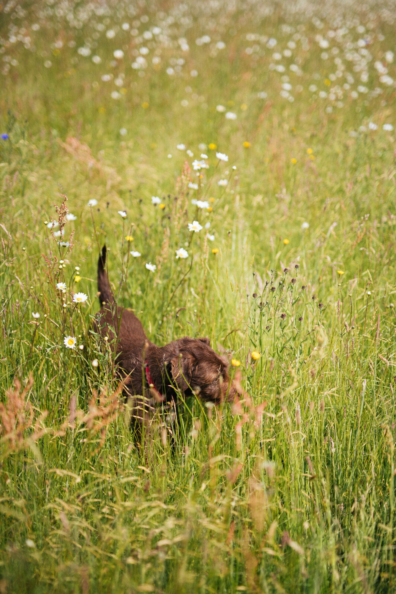
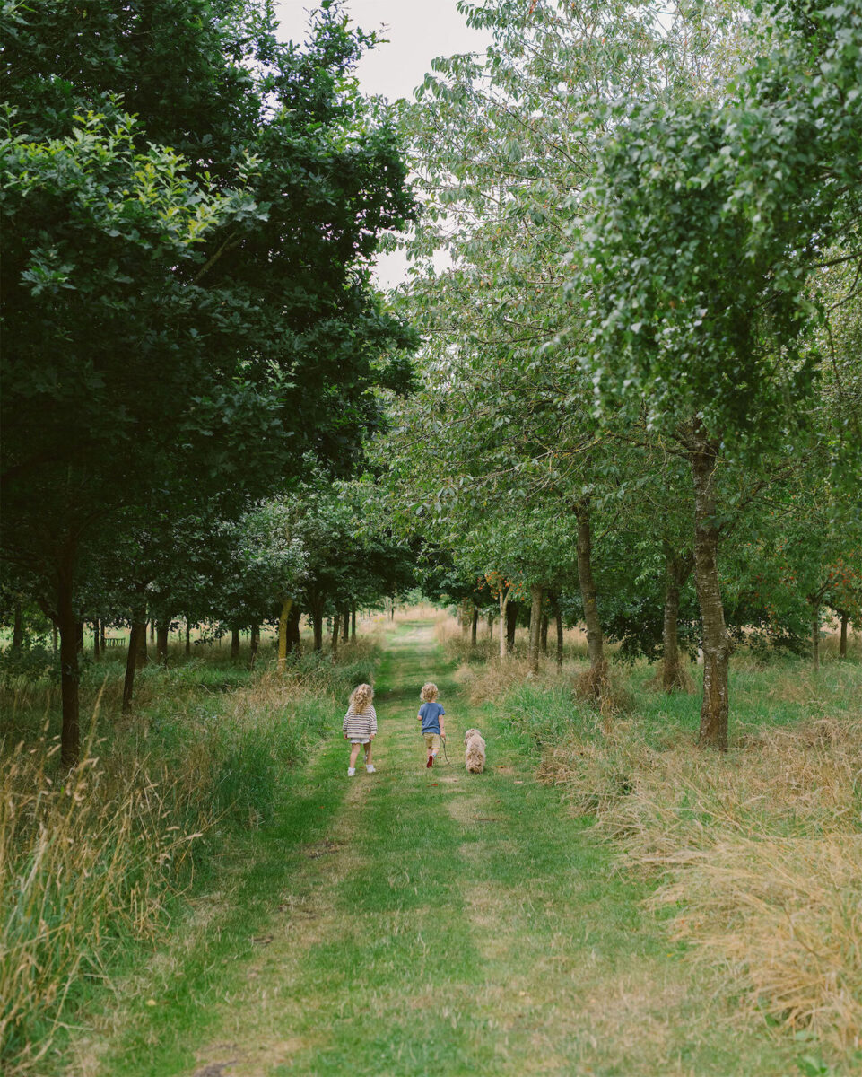
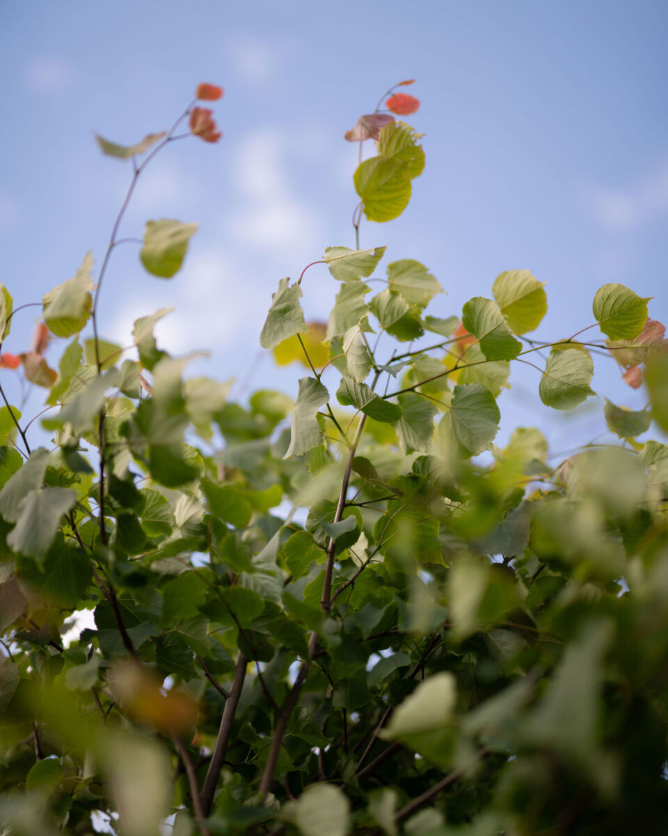
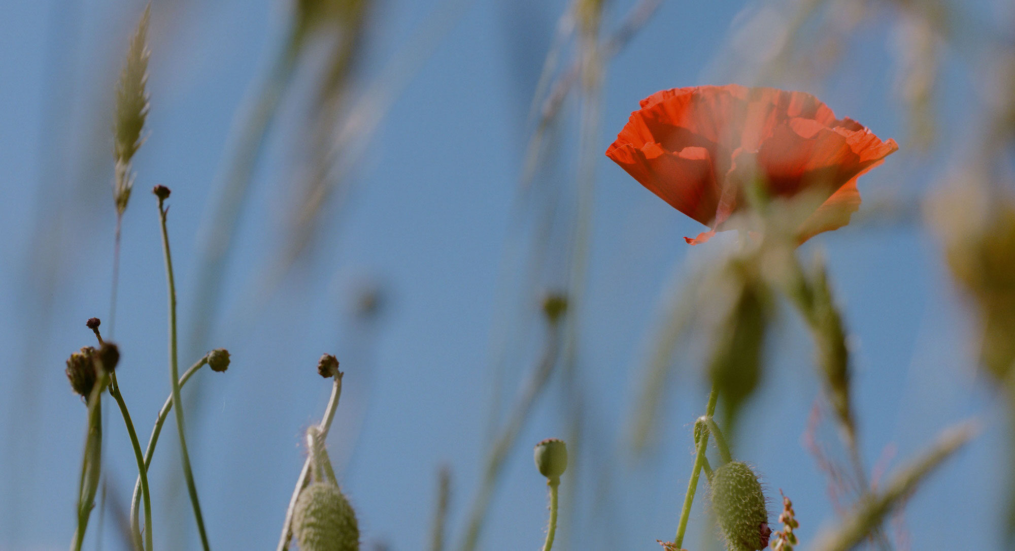
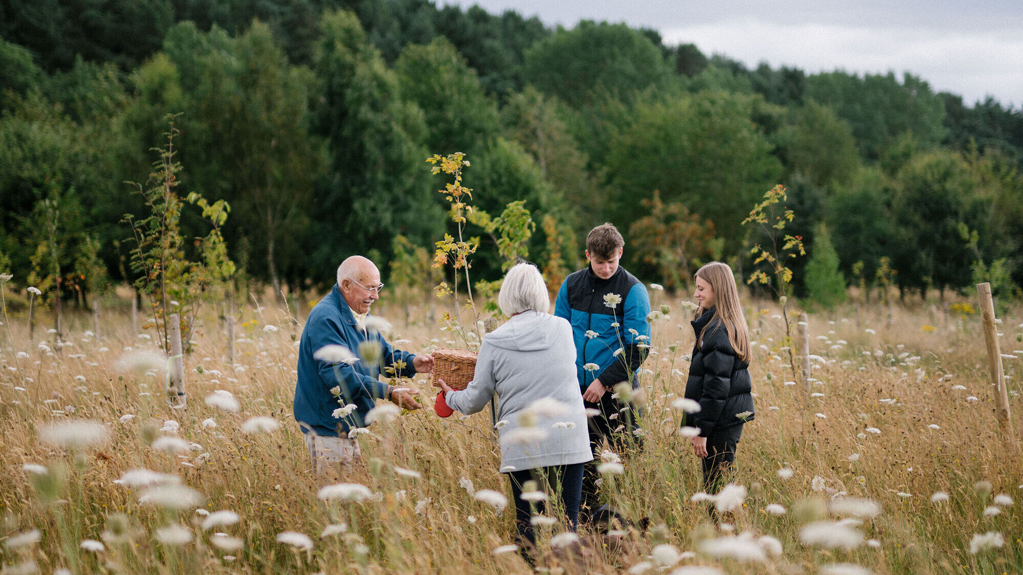
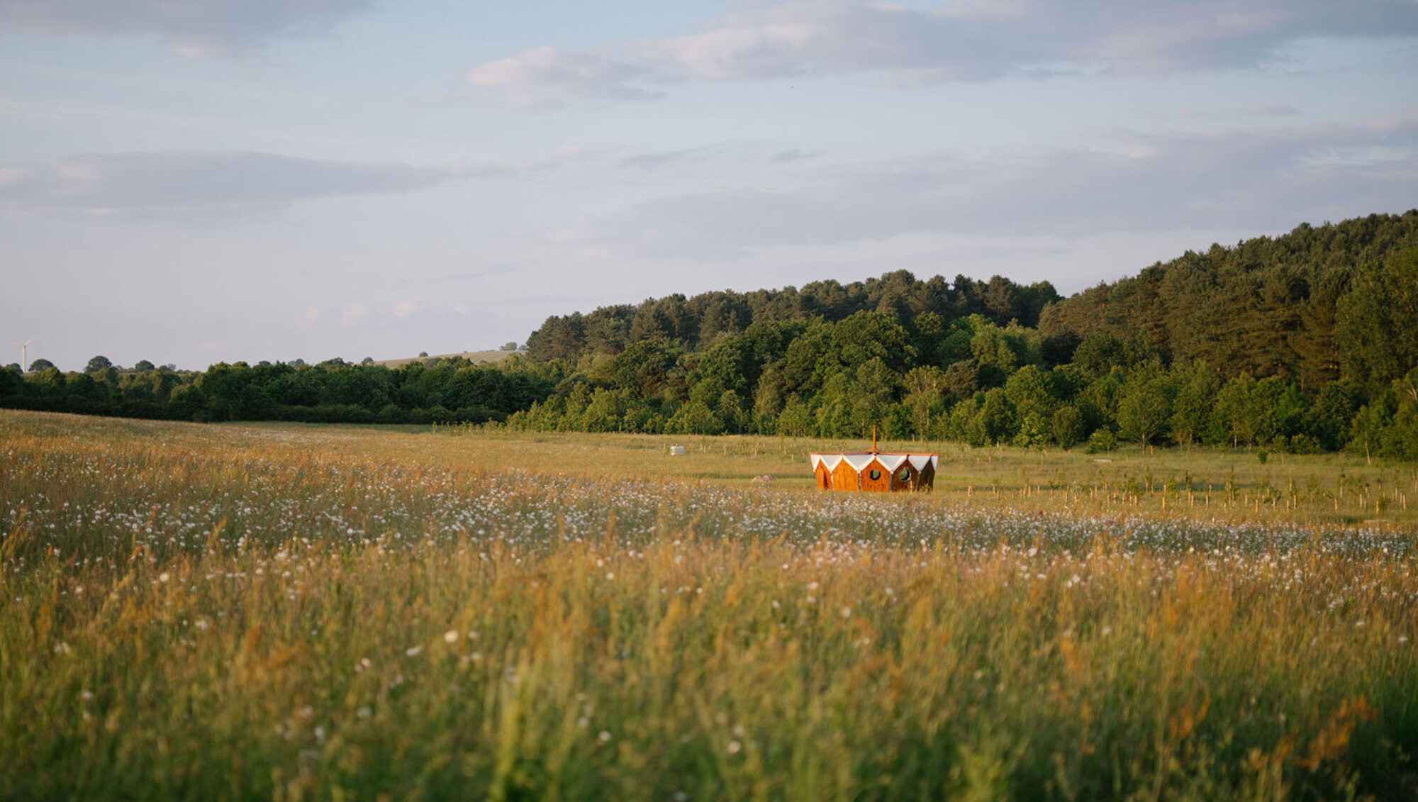
Sometimes the best way to understand something is to see it, and with Tithe Green that’s very much the case. We commissioned sensitive new photography and video capturing how alive and beautiful the sites are, chirruping with wildlife and swaying branches.


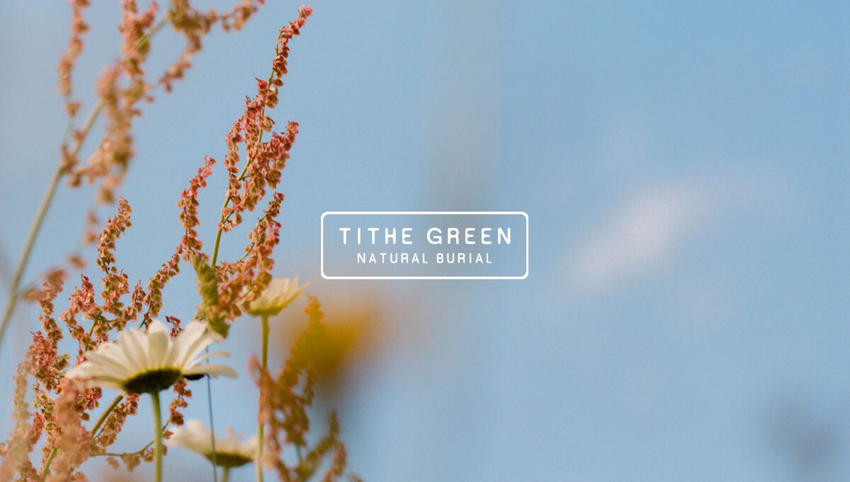
Digital
Windows
Tithe Green’s website is where grieving people need to understand what natural burial is, navigate the options available, and ultimately make bookings and purchases. We felt it was vital they could see the place at all times, through elegant, honest video and imagery.
A ‘No Rush’ Voice
We developed a distinctive new tone of voice for Tithe Green, anchored in core principles the team were already naturally using to guide customers. The big balancing act to refine was the subtlety of when we’re informing, and when we’re inviting people to choose something.
“Lovers were the sensitive, all-in partner we really needed. The quality of listening and attention to detail in their approach across everything: design, imagery, wording, has been tremendous. We’re really proud of how our brand can show up now.”

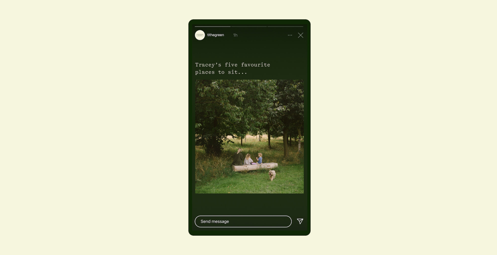
Making
Conversation
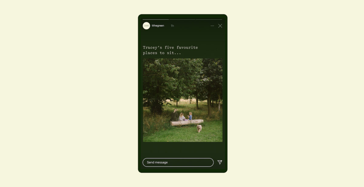
Whilst there are quite a few brands pushing to open up conversations about death in the UK (we’re still not very comfortable talking about it) we felt we needed to keep Tithe Green’s social media presence quite focused on the sites themselves, the nature, and local partners.