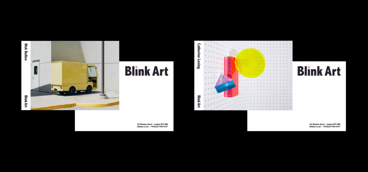
A playful brand for
Blink Art’s talent pool
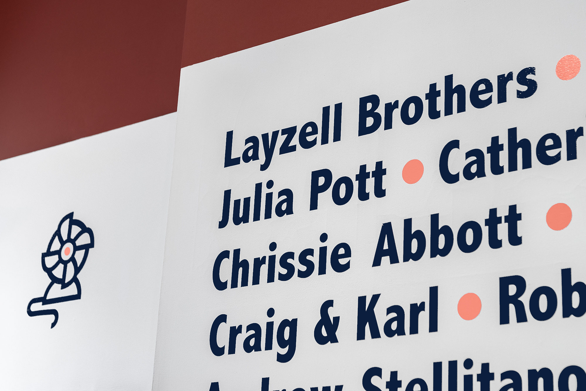
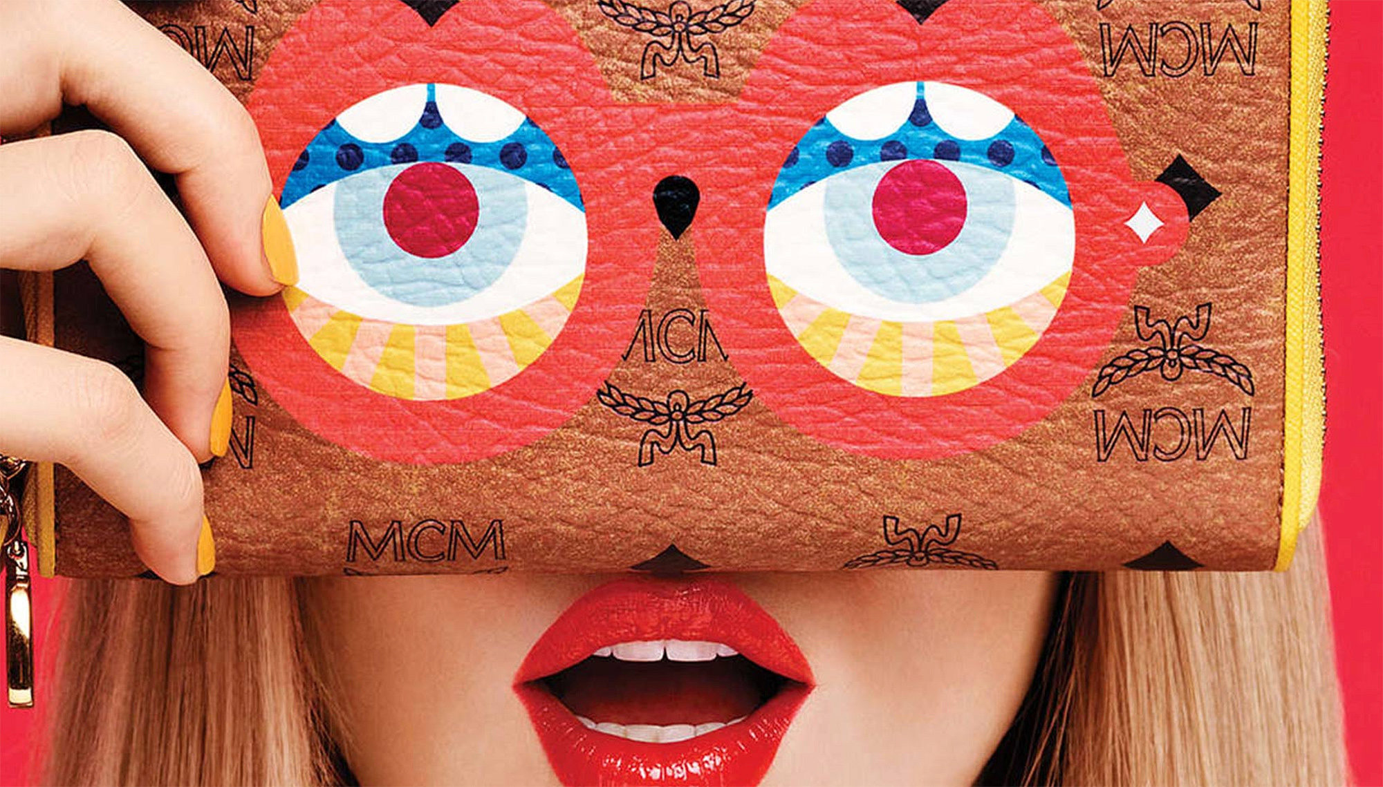
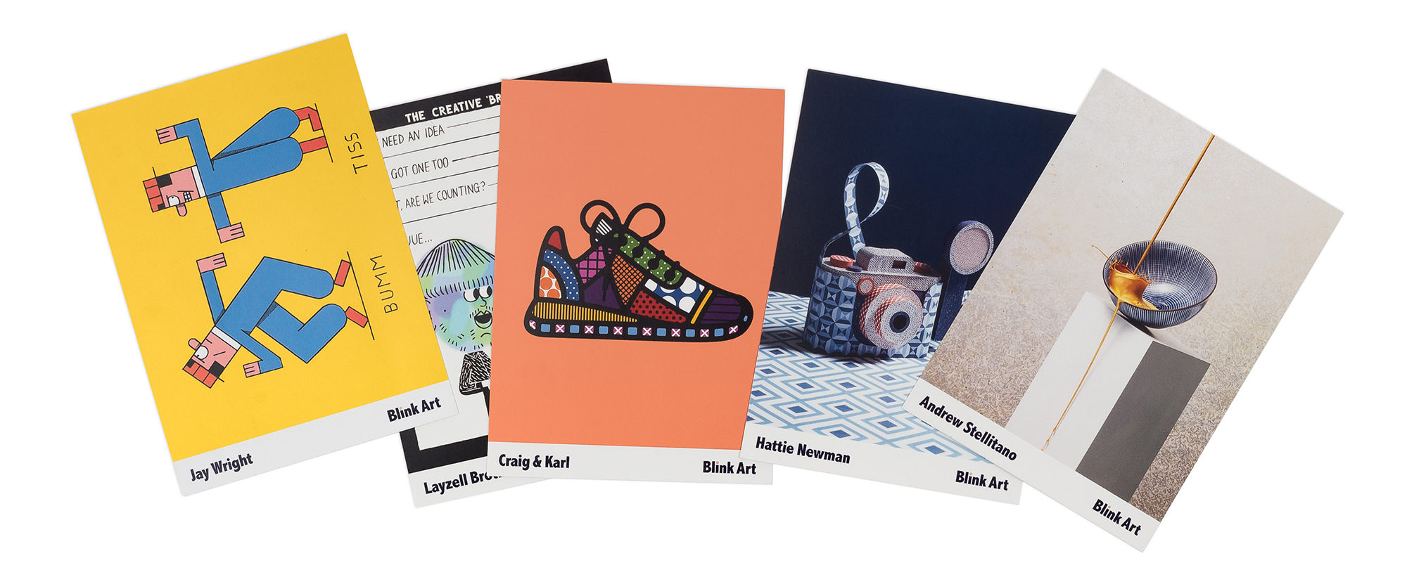
The Blink Art team manages a roster of commercial artists with different styles. Their brand would have to somehow feel reflective of the energetic visual talent in this group, without being too biased towards any one visual direction. Maybe we could just typeset ‘Blink Art’? Nah.
Blink Art needed a bold identity to rally its roster of artists and project a fun, flexible image to clients. Essentially a business-to-business brand, it could have stayed quite straight. But we wanted to make sure it conveyed a sense of visual fun and possibility.


Made you look
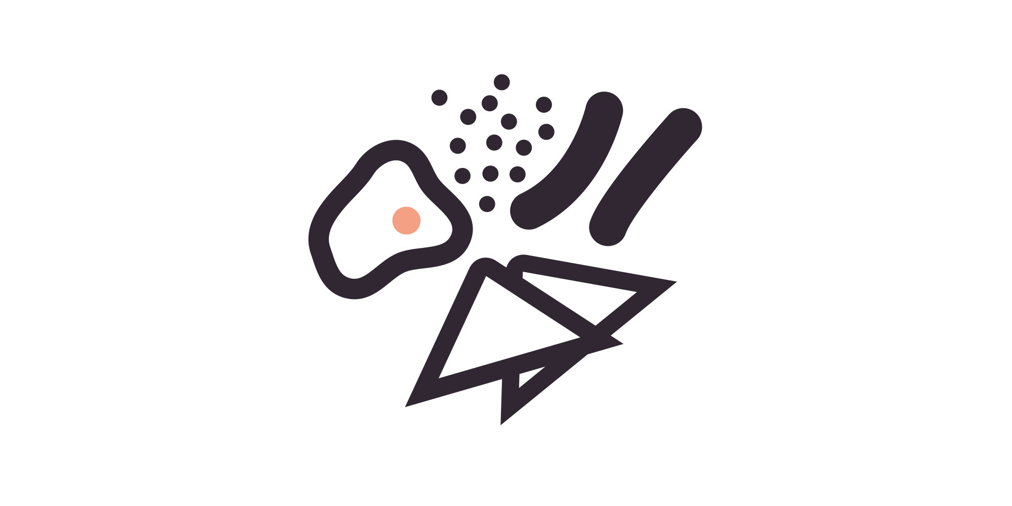
Branding is about visual consistency, but visual change has its advantages too. We built an identity system that refreshes itself constantly without losing its distinctiveness, keeping the atmosphere fresh and adaptable. This helped capture a feeling of possibility.
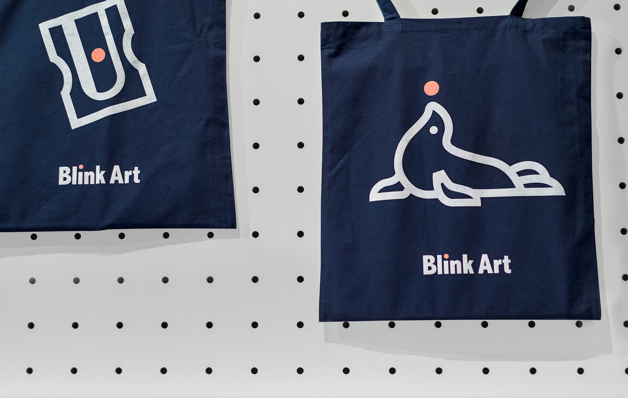
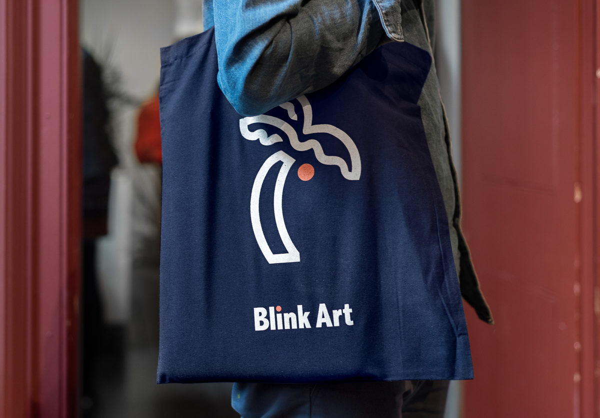
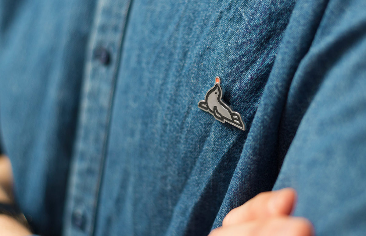
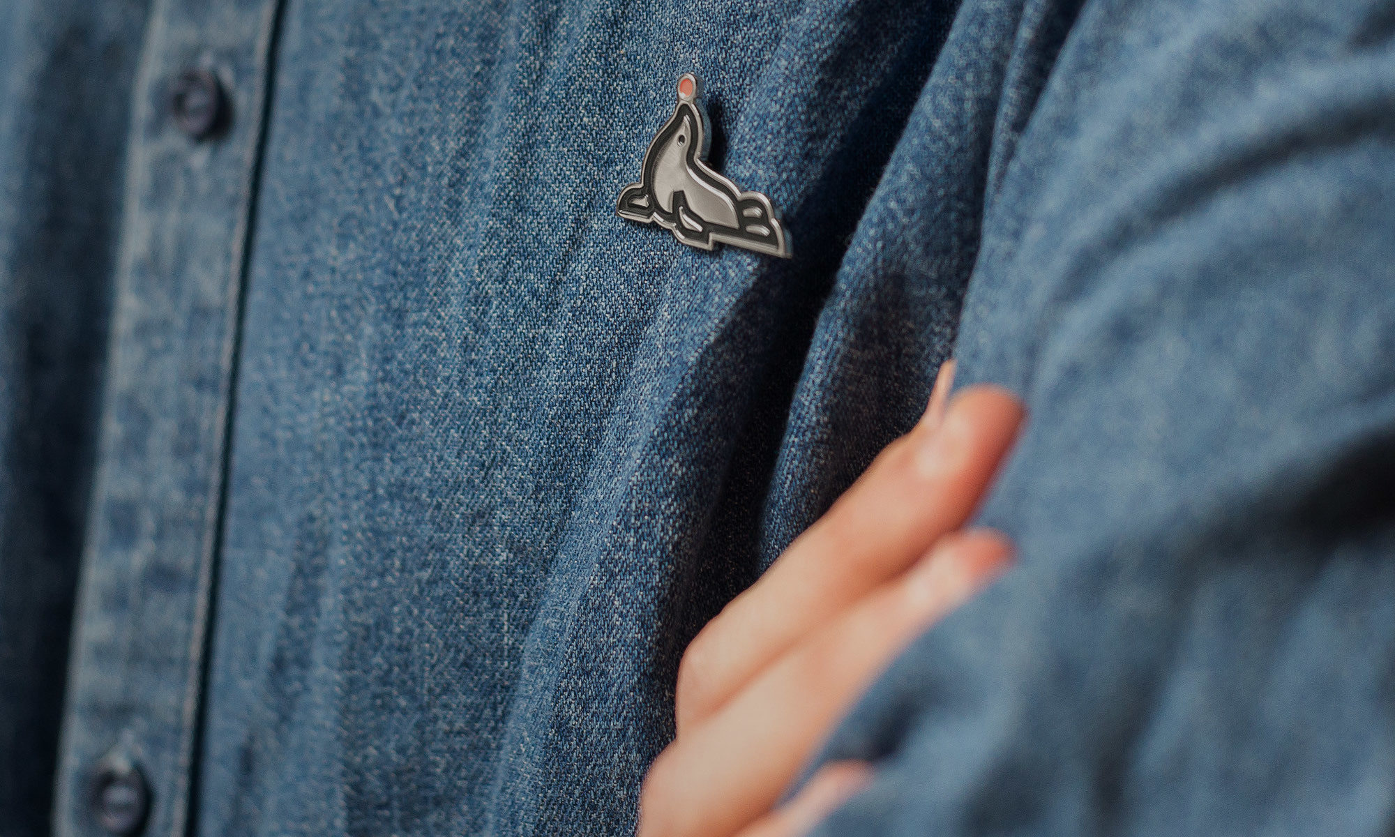
The Little Tittle
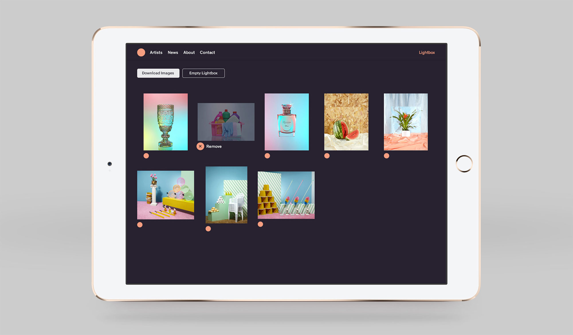
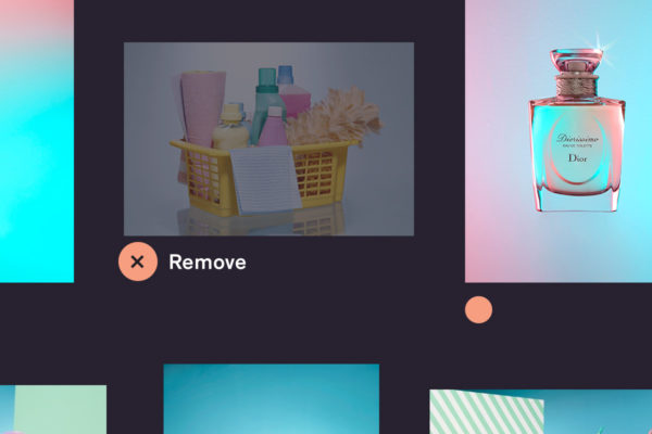
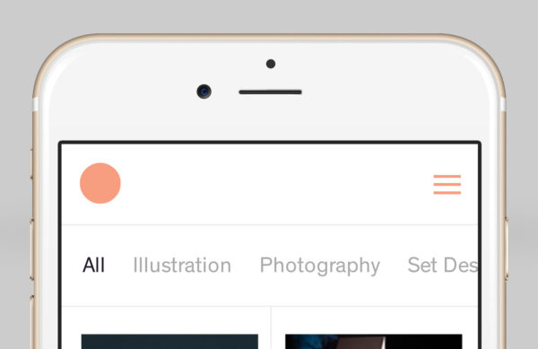
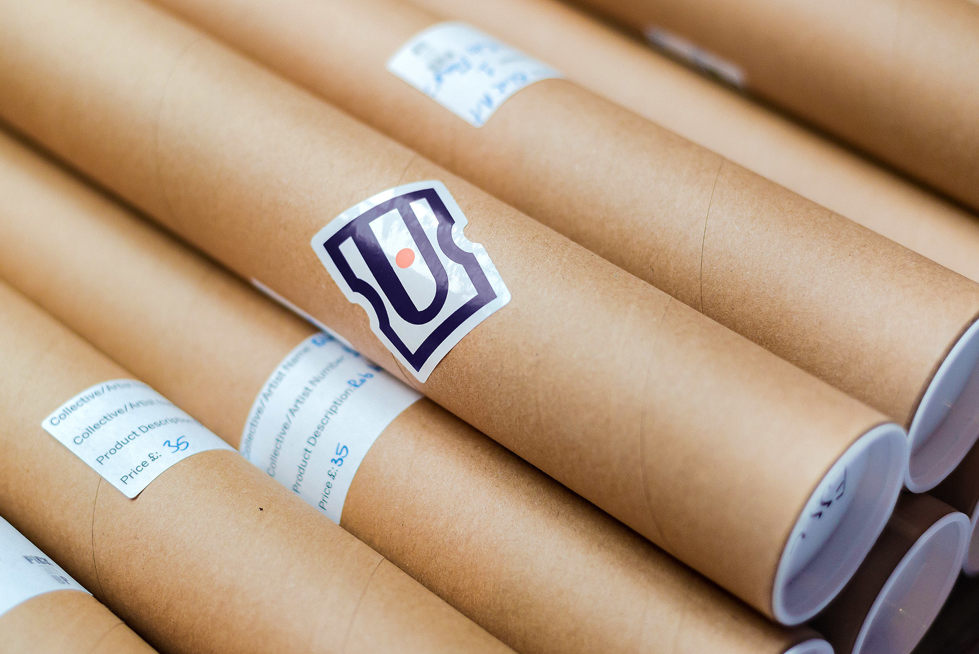
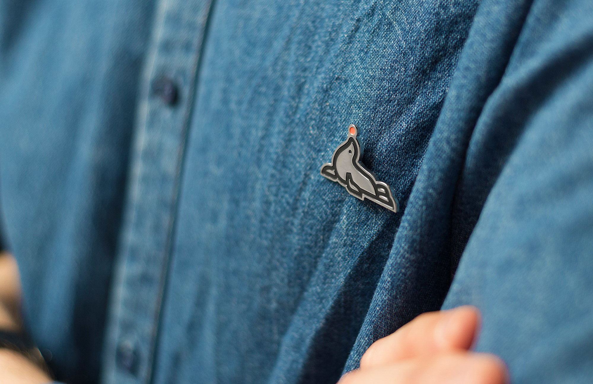
We ran with the idea of a playful-yet-useful pink tittle (this is the correct typographic name for the dot on a lowercase ‘i’ not something rude) and allowed it to play a functional role in the Blink Art website as a badging device enabling users to save favourite images.